Case Study / 04 BlitzMind 2025

Adapt, don't interrupt.

A six-month solo thesis where the research killed my original idea — and the rewrite became the project. An adaptive gaming controller that reads biometrics silently and changes the game itself, instead of telling the player to calm down.

Role

Solo · 100% me
Research · UX · System · Build · Marketing

Context

Honours Bachelor's Thesis
George Brown College, 2025

Timeline

6+ months
Full thesis cycle

Disciplines

Generative research · Synthesis · System design · Prototyping · Brand & marketing

30+
Player surveys
5
Long-form interviews
200+
Showcase attendees
13
Product screens shipped
Highlights

Five frames, one product.
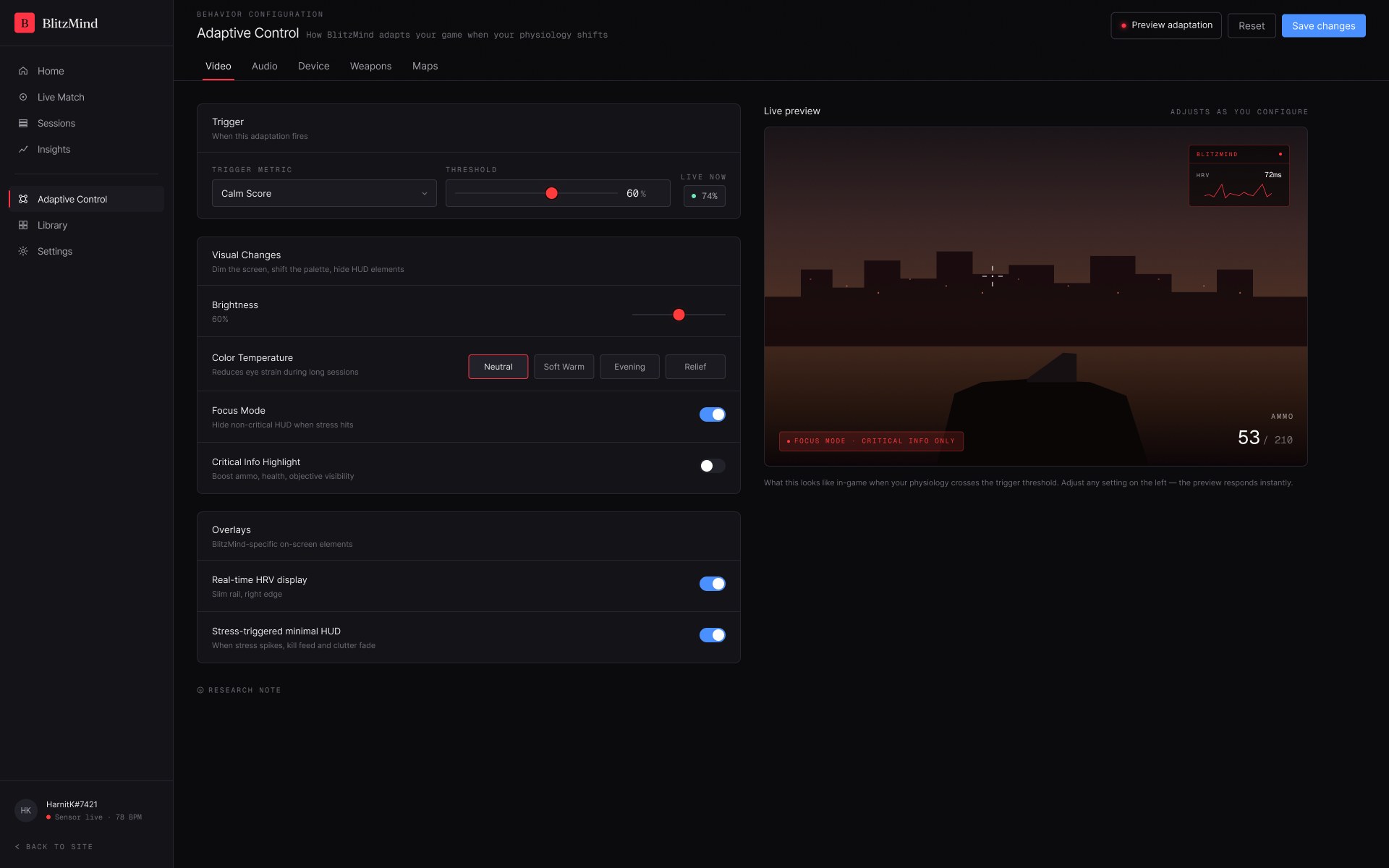
BlitzMind adaptive control panel — video adaptation settings with live in-game preview
H1 — Adaptive control panel The thesis
H2 — Onboarding flow Loop
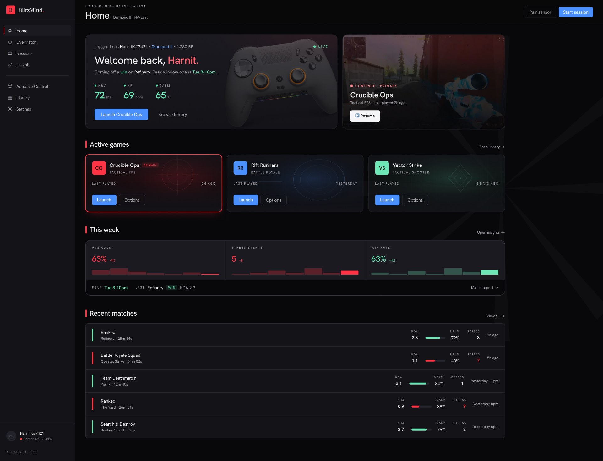
BlitzMind home dashboard — live biometrics, active games, weekly performance
H3 — Home dashboard UI
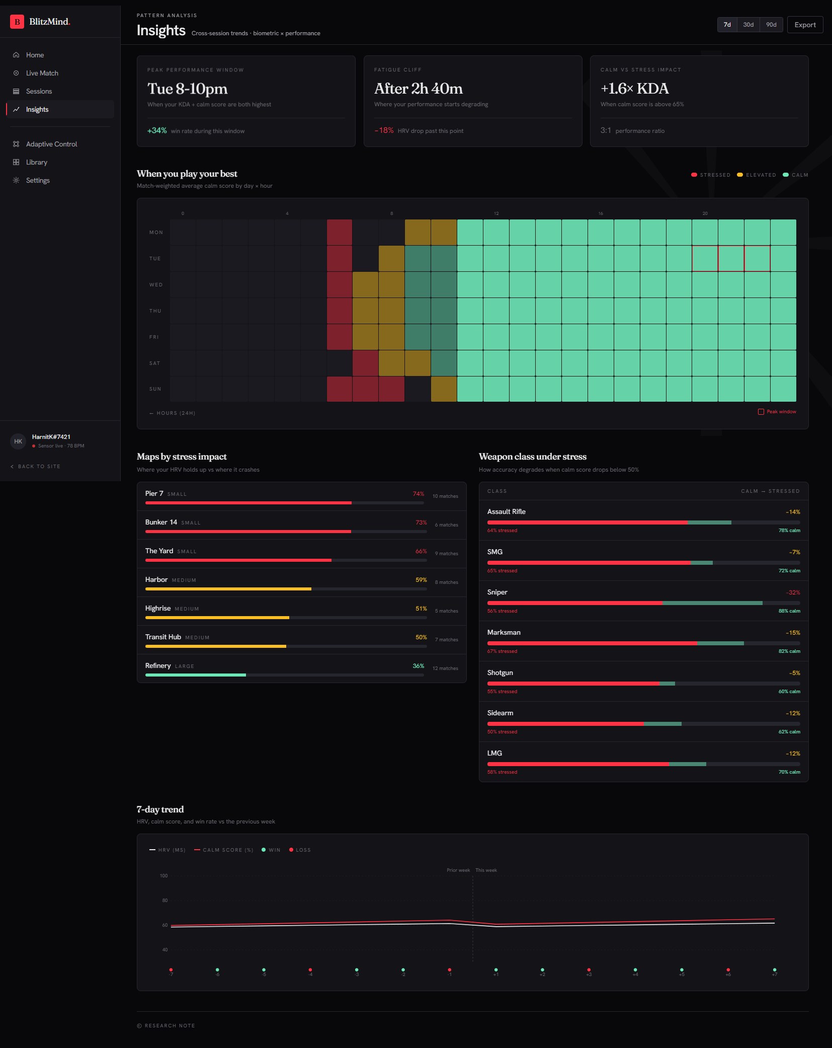
BlitzMind insights — biometric-by-performance pattern analysis and heatmap
H4 — Insights Analytics
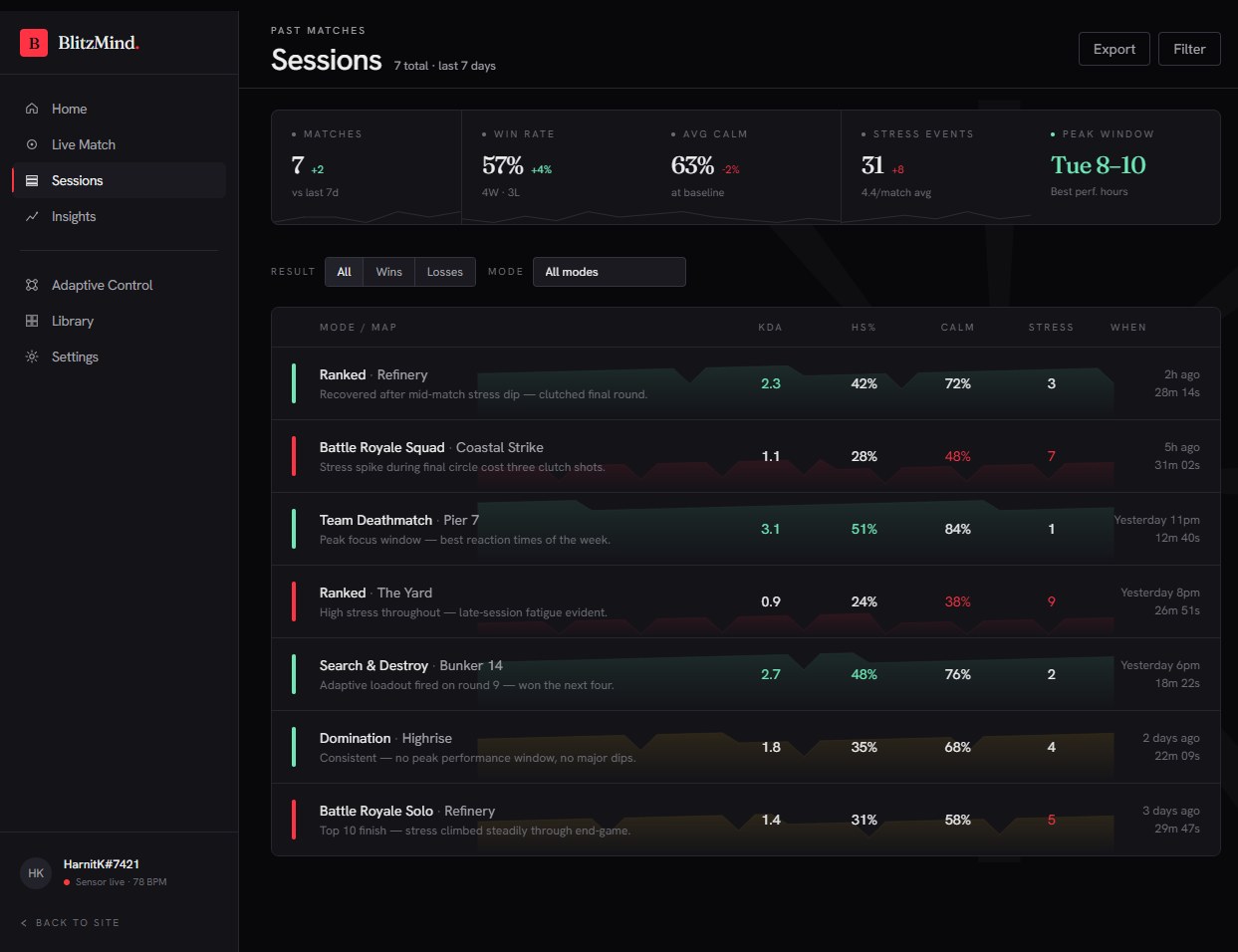
BlitzMind sessions — every past match scored on KDA, calm, and stress
H5 — Sessions Analytics
01. Kickoff · The brief I started with
The premise

Build an emotion-coaching controller.

I came off four months at Muse by Interaxon working on biofeedback — and I'm a competitive gamer myself. The original premise sat at the intersection of both: a controller that watches your physiology while you play, notices when stress climbs, and gently tells you to take a breath. A coach in your hand, for the moments where rage is about to cost you the match.

On paper it was clean. Biofeedback is a proven tool for self-regulation; gamers visibly struggle with tilt; the hardware was within reach. I had the technical conviction, a clear user (the mid-to-high-skill competitive player), and a thesis brief that rewarded ambition. I started building the proof-of-concept the same week the project kicked off. The plan was to validate the idea with a quick survey, then iterate on the alert design.

The survey ran for two weeks. The plan died at the end of week three.

02. Discovery · Testing the assumption
Generative research

30 surveys, 5 interviews, one inconvenient finding.

I ran two parallel tracks. Secondary research to map the emotional terrain of "game rage" beyond the surface, then primary surveys and interviews to stress-test the assumption that players actually want to be told they're stressed.

R1 — Secondary research · community forum & behavior analysis Open in new tab ↗

The forums told me something the brief had missed. Game rage isn't just a temper problem — it's a response to a stack of things at once: personal investment in the outcome, the public dimension of competitive play, the frustration of in-game systems that feel arbitrary. "I don't even see that type of rage happen in outdoor sports," one Reddit comment read. The intervention couldn't treat rage as a single variable to suppress. The feeling was the tip of a much bigger iceberg.

That reframe shaped how I wrote the primary research. Instead of asking "would you use a stress-reduction tool?" I asked players how they handle losses, what helps them recover between rounds, and how they feel about anything that interrupts the match. The wording mattered. The answers I got were the ones the original brief needed to hear.

R2 — Primary research · 30-player survey Open in new tab ↗

The feedback was unanimous. Direct stress alerts mid-game were described as more annoying than helpful. Multiple respondents reached for the same metaphor without prompting — a backseat driver telling them to calm down during the exact moment they needed the most focus. The interviews backed it up: five out of five rejected the alert-based model. They wanted help, but not while the round was live.

That gave me the constraint the project actually needed. Whatever I built had to work around the player, not at them. The intervention had to be invisible during the match — and everything I'd designed up to that point depended on it being visible. Three months of work pointed in the wrong direction. The honest move was to let it go.

03. Synthesis · Research into artifacts
From transcripts to a person

Turning a stack of transcripts into a picture you can point at.

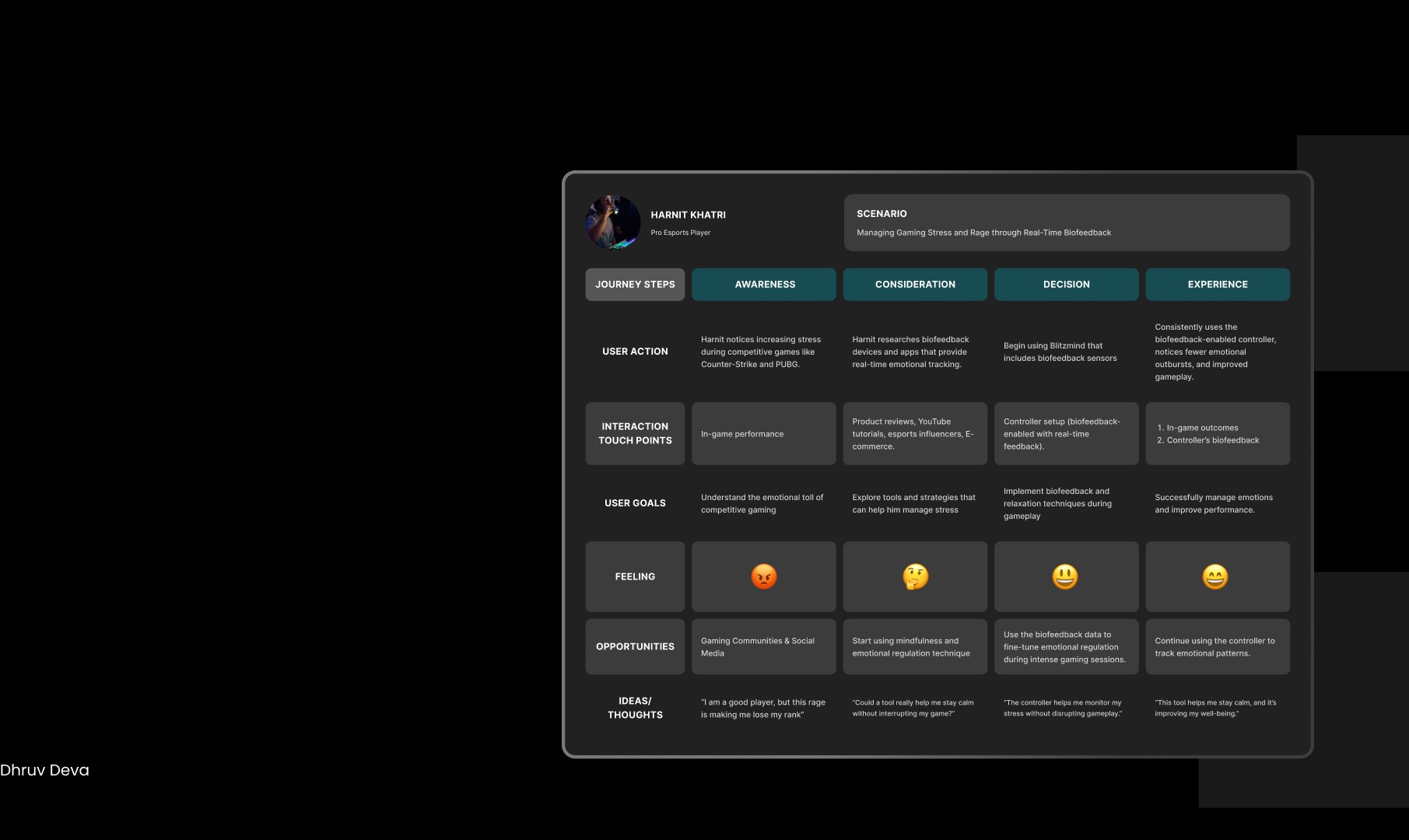
I worked the five interviews and thirty survey responses into two artifacts: a primary persona built from the strongest single interviewee, and an adoption-arc journey map that traced how that persona would find, evaluate, and integrate the product. The artifacts gave the next phase a concrete user to argue with.

Process · How I got here From 5 interviews and 30 surveys to one persona — show me the work The clustering step that sits between the raw research and the polished persona below. Click to expand.
P1 — Affinity map · interviews & surveys → 4 themes → insight Open in new tab ↗
S1 — Persona · Harnit Khatri (composite from interviews) Open in new tab ↗

Harnit is built from the strongest of the five interviewees — a pro-tier Counter-Strike and PUBG player, 25–30 hours of competitive play per week, the kind of player who feels rank drops in his stomach and stays up too late after losses trying to claw back lost rating. He's the harshest test of the product because the stakes are real to him in a way a casual player can't replicate.

His two pull-quotes do most of the heavy lifting downstream. "Stress is impacting my performance and personal life" says yes, the problem is real. "Biofeedback tools could help manage emotions without distractions" says exactly what the original brief got wrong — the help is welcome, the interruption is not. Those two sentences became the constitution for everything I built after.

Adoption journey map — Harnit Khatri's path through Awareness, Consideration, Decision, and Experience stages of using BlitzMind
S2 — Adoption journey map · Awareness → Consideration → Decision → Experience Synthesis

The journey map tracks Harnit across the four stages of adoption, with a row for what he's doing, what he's feeling, what he needs, and the moments where BlitzMind has to earn its place. Reading it end-to-end made the design problem obvious: the product had to be useful enough at Awareness to get him to try it, and quiet enough at Experience to make him keep it. The interruption-based version failed the second test before it even earned the first.

04. Insight · The reframe the product turns on
The shift

Stop treating stress as a problem to fix. Start treating it as a signal to design around.

The synthesis pointed in a direction the original brief had refused to look. If players wouldn't accept the controller talking to them, the controller had to act on the game instead. Read state silently; adapt the game's behavior in response. The principle is six words long and it governs every interface decision downstream.

A1 — The pivot · system artifact Open in new tab ↗
05. System · One source of truth
Design system v1

Three surfaces, three roles, one language.

The controller UI, the mobile companion app, and the marketing site each had different jobs — telemetry overlay, deep-dive analysis, 30-second pitch. They had to feel like the same product. Fraunces for display, Inter Tight for the interface, Geist Mono so anything reading as data reads as instrument-grade. Color is semantic, never decorative.

A2 — Design system v1 · color, type, spacing, components, motion Open full system ↗
06. Hardware · The thing in your hands
Build first

The UX runs on silicon, briefly.

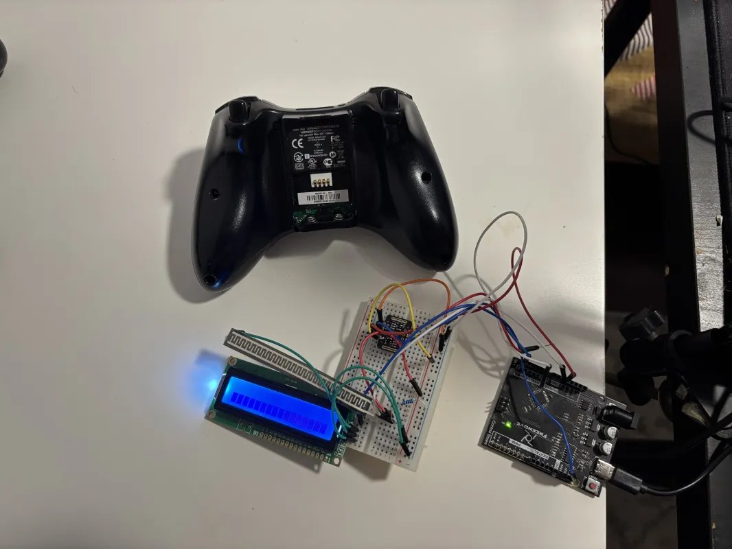
The screens come later. Before any wireframes, there had to be a thing that could actually sense the player — a controller shell, a board, a couple of sensors, and a readout to prove the loop was real. Toggle the overlay below to see what each piece of the prototype does.

BlitzMind hardware prototype — Xbox 360 controller shell next to a breadboard mounting the PPG sensor, microcontroller, and LCD readout
P0 — Hardware build · tap to label components 5 callouts
A5 — Hardware → signal → adaptation pipeline Open in new tab ↗

The signal pipeline is local and fast — no cloud round-trips, no buffering. The game adapts inside the moment, or it doesn’t earn the right to adapt at all. The next sections show how this hardware loop became screens.

07. Wireframes · Low-fi structural exploration
Low-fi · greyscale

Answer the structural questions first.

Before any pixels got expensive, I drew the flow as low-fi wireframes — greyscale, layout-first, no color polish. The job at this fidelity was structural: does the flow read? Can the player get from cold start to first match without a manual? Six anchor screens, sized for the answer. The polished mid-hi prototype lives in the next section.

Process · Before the wireframes The flow I defined before drawing a single screen Onboarding, match cycle, and settings — mapped as a UX flow so the wireframes below had a structure to answer to. Click to expand.
P2 — UX flow map · three lanes · defined pre-wireframe Open in new tab ↗
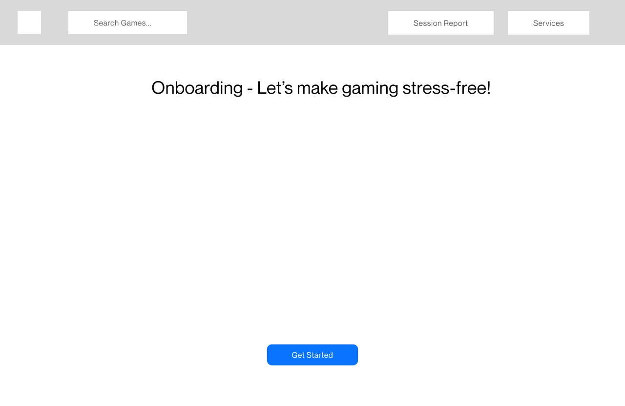
Wireframe — onboarding entry screen
W1 Onboarding entry Cold-start splash. One CTA, no friction.
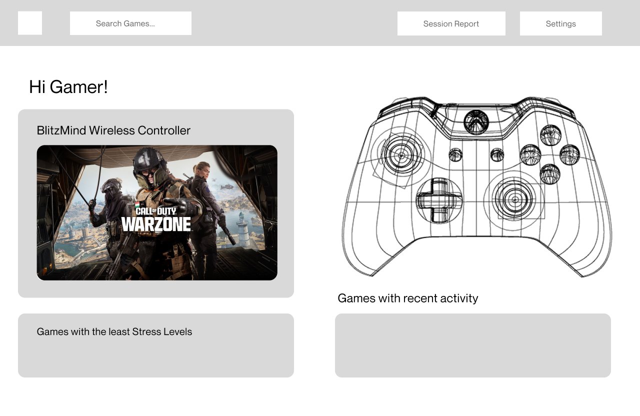
Wireframe — home dashboard with controller diagram
W2 Home dashboard Active game card on the left, controller on the right.
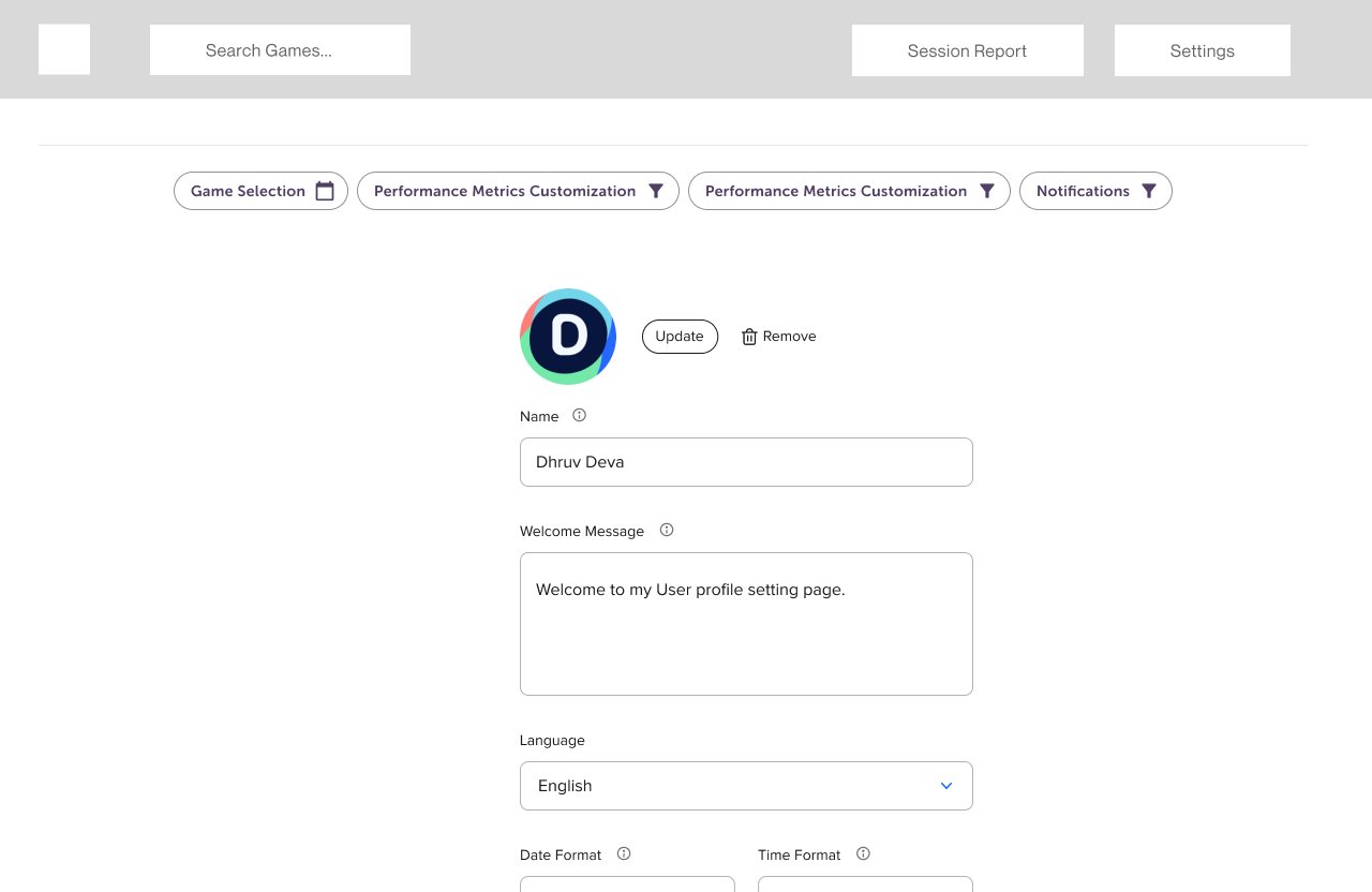
Wireframe — settings, profile tab
W3 Settings · Profile Identity layer. Plain. Findable, not featured.
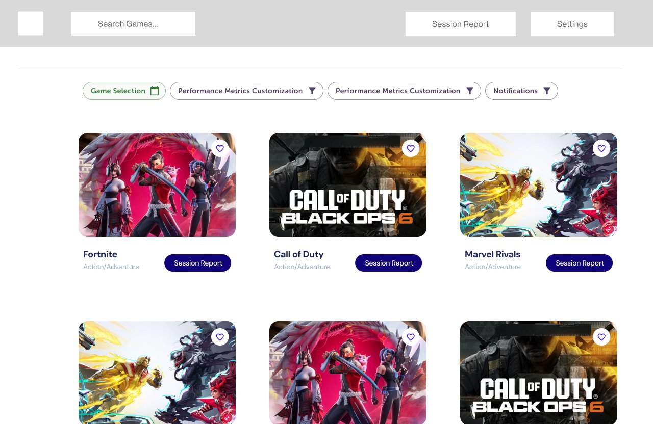
Wireframe — settings, game selection grid
W4 Settings · Game selection Per-title adaptive control. One row of pills, one grid of titles.
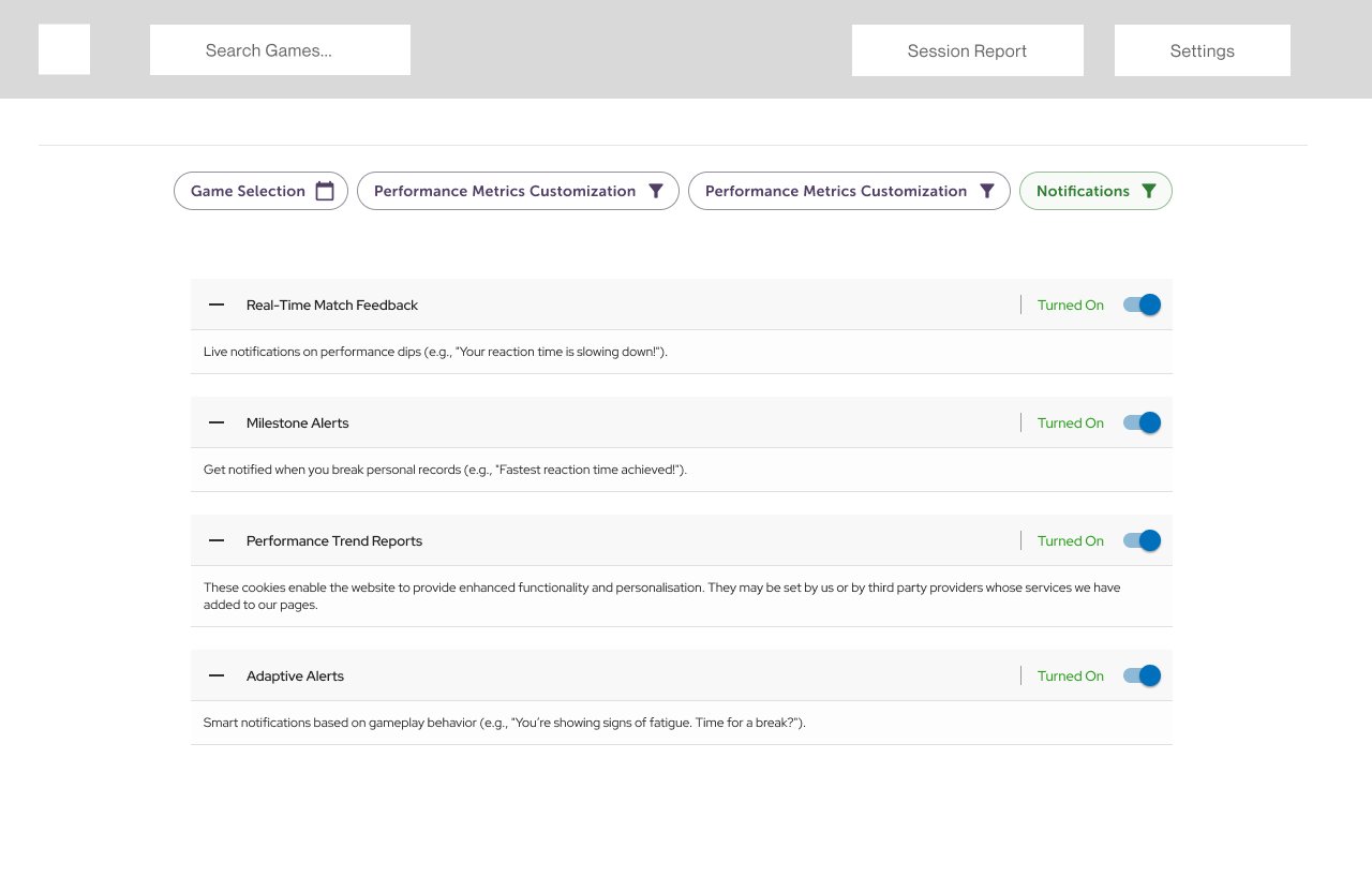
Wireframe — settings, notifications panel
W5 Settings · Notifications Four toggle types. Each with a one-line plain-language description.
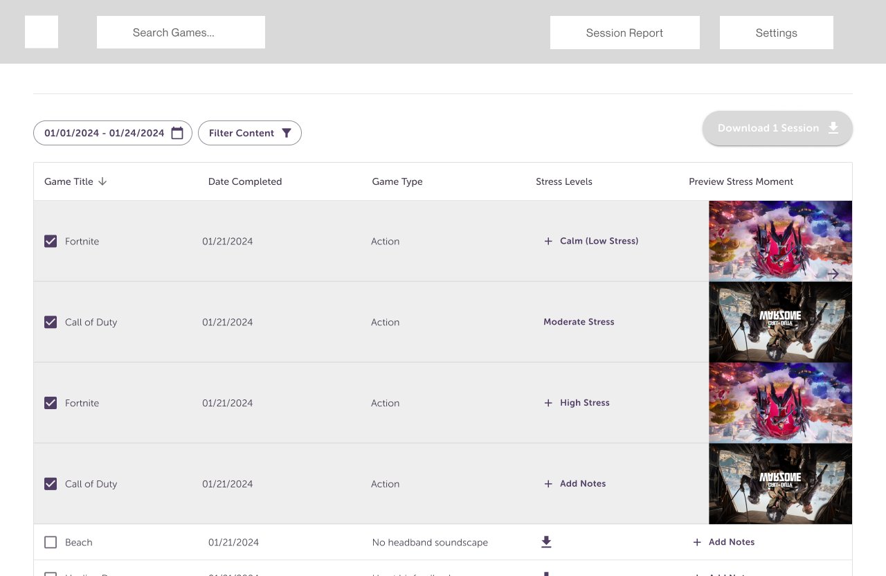
Wireframe — session report table with stress levels per game
W6 Session report Post-match transparency. Calm vs stress, per game, scrubbable.

The wireframes answered the structural questions and exposed two surprises — the dashboard wanted a controller diagram on the right (not the left), and the session-report needed to be a list-first view (not a chart-first view). Both calls survived into the mid-hi prototype and the shipped product.

08. Figma Prototypes · Mid-hi exploration
Mid-hi · pre-deploy

Color in, components in, still in Figma.

With the structure settled, I moved into mid-hi prototypes inside Figma — tokenized type and color, real components, interactive flow. This is the layer where the design system met the wireframes and the product started to look like itself, before any of it ran in code.

P1 — Mid-hi prototype · click through the flow Open in Figma ↗

The prototype is what stakeholders saw before deploy. The next section is the shipped, working product running on real code — same flow, same tokens, deployed at blitzmind.vercel.app.

09. Product · From principle to a product you can use
Shipped, live

Not a slideshow — a product you can actually use.

Mid-fi answered "does this read?" The shipped product had to answer "does this run?" I built the companion app as a full working build — deployed at blitzmind.vercel.app — covering onboarding, the home dashboard, cross-session analytics, and the adaptive control panel where the whole thesis lives. Walk through the key surfaces below, or open the live app and try it yourself.

S1 — Onboarding · welcome → pair → calibrate → preferences Try it live ↗
BlitzMind home dashboard — live HRV/HR/calm readout, active games, weekly stats, recent matches
S2 — Home dashboard · live biometrics, active games, weekly performance Open the live product ↗
S3 — Analytics Sessions · every match, scored
1 / 2
Sessions screen — past matches list with KDA, headshot %, calm score, stress events per game
Past matches, each scored on KDA, calm, and stress — the raw log behind every insight.
Insights screen — peak performance window, calm-score heatmap by day and hour, maps by stress impact, weapon accuracy under stress, 7-day trend
Cross-session pattern analysis: when you play your best, which maps break you, how each weapon class degrades under stress.
Where the thesis lives

The adaptive control panel — "adapt, don't interrupt," made a setting.

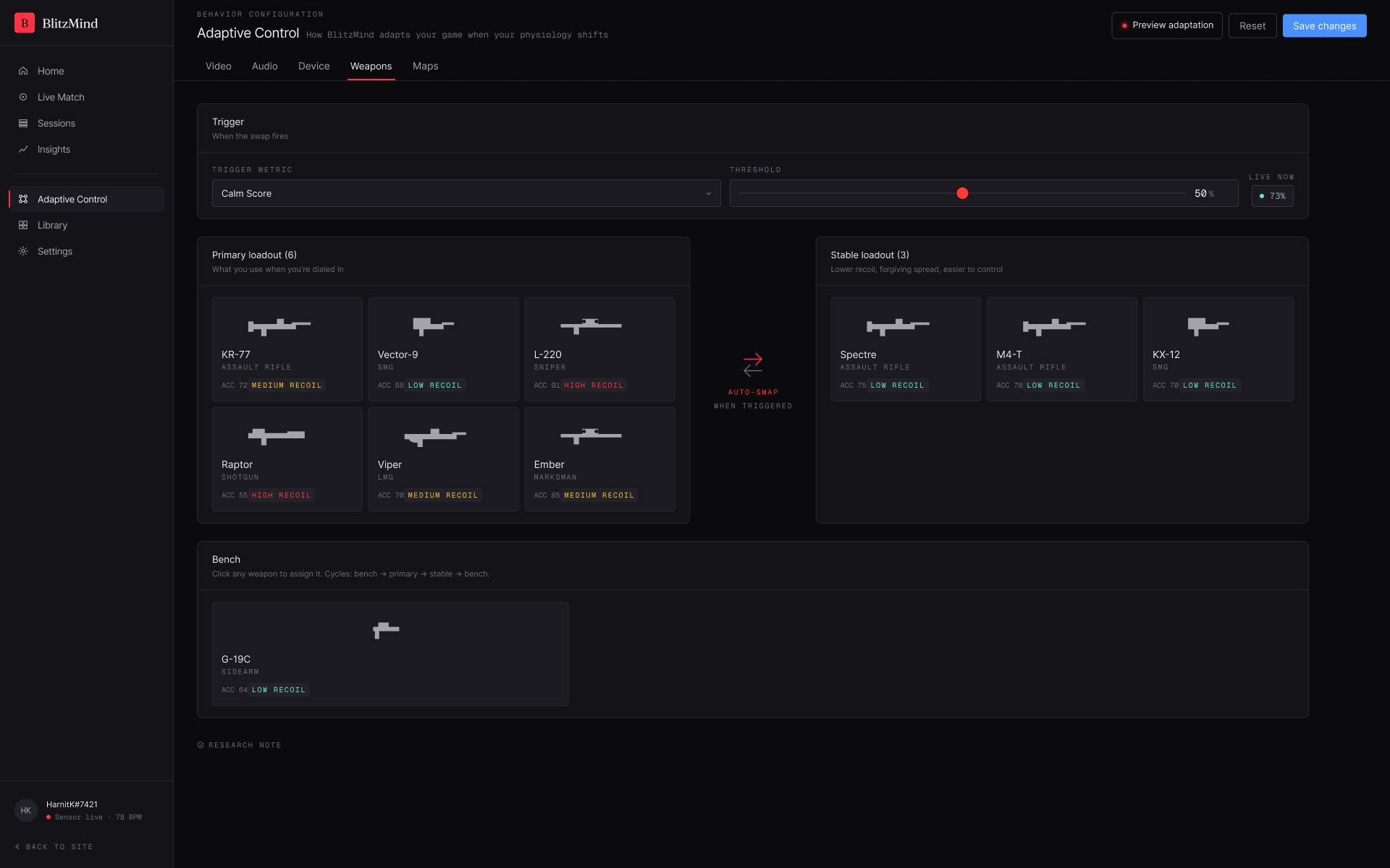
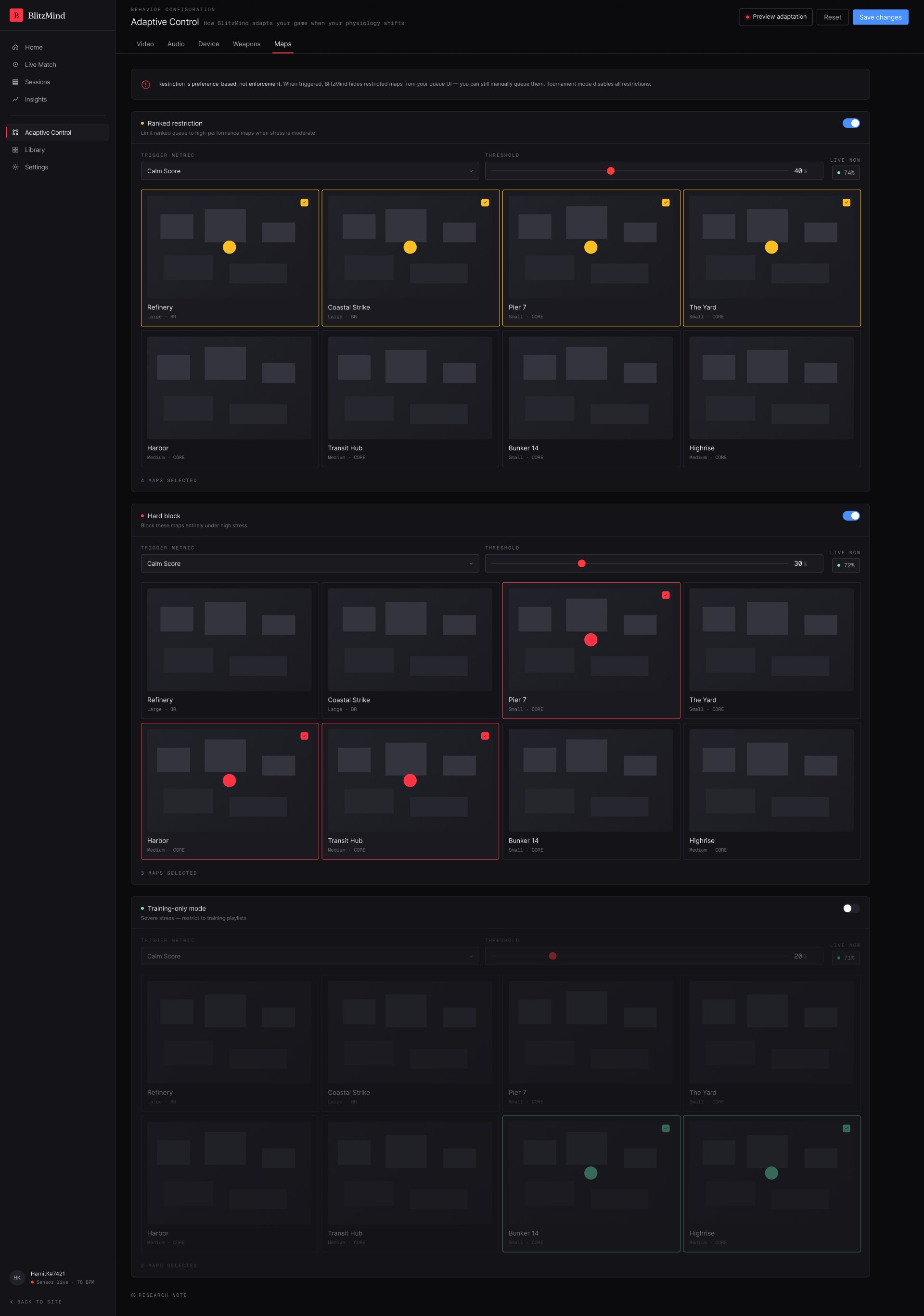
This is the screen the whole project points at. Five domains — video, audio, device, weapons, maps — each with its own trigger metric, threshold, and behavior. When your physiology crosses a line you set, the game adjusts on its own. No pop-up, no "take a breath." The adaptation just fires.

S4 — Adaptive Control Video · dim, focus mode, minimal HUD
1 / 5
Adaptive Control — Video tab: trigger on calm score, brightness, colour temperature, focus mode, live in-game preview
Video — when calm drops below your threshold, the screen dims, HUD clutter fades, and critical info stays. Live preview responds as you configure.
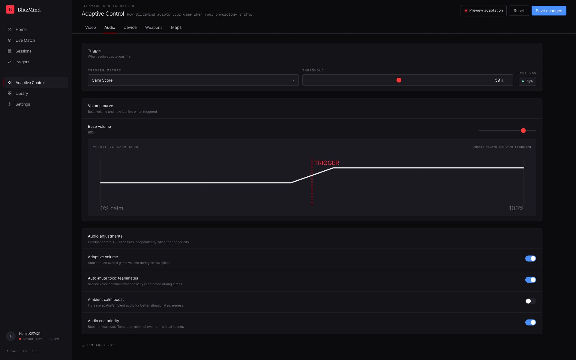
Adaptive Control — Audio tab: volume-vs-calm curve with trigger point, adaptive volume, auto-mute toxic teammates, audio cue priority
Audio — a volume curve that eases off under stress, auto-mutes toxic voice chat, and prioritises footsteps and reloads over noise.
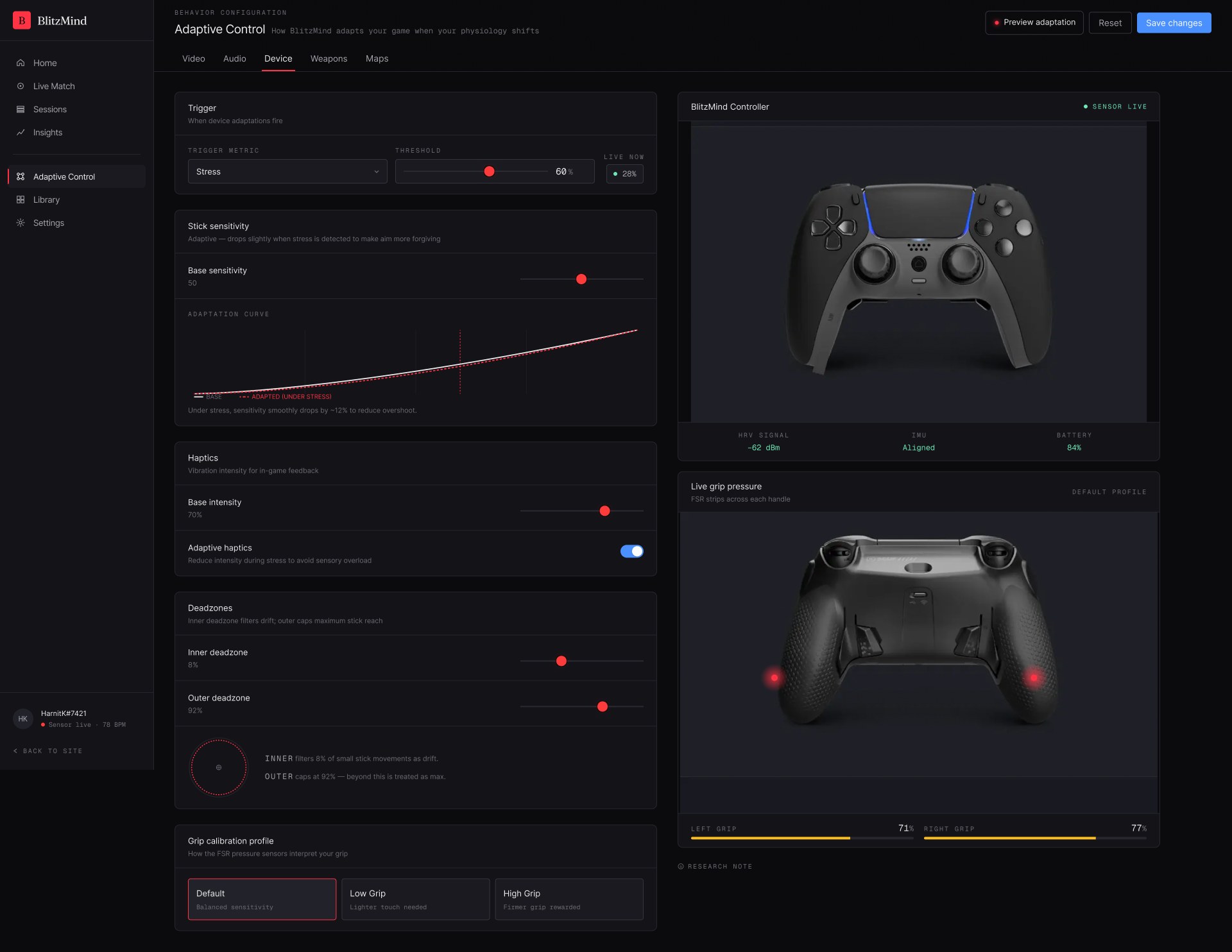
Adaptive Control — Device tab: stick sensitivity adaptation curve, haptics, deadzones, live grip-pressure readout from the controller
Device — under stress, stick sensitivity smoothly drops ~12% to cut overshoot, haptics ease to avoid sensory overload, all read live from the controller's FSR grips.
Adaptive Control — Weapons tab: primary loadout vs stable low-recoil loadout, auto-swap when triggered, weapon bench
Weapons — when the trigger fires, BlitzMind auto-swaps your primary loadout for a lower-recoil, more forgiving set, then hands it back when you settle.
Adaptive Control — Maps tab: ranked restriction, hard block, and training-only mode, each triggered at different calm thresholds
Maps — three escalating tiers: soft-restrict the queue at moderate stress, hard-block your worst maps under high stress, drop to training-only when it spikes.
Research note — why heart-rate variability? for the non-gamers in the room

Every adaptation above is triggered by the same signal: heart-rate variability (HRV) — the tiny beat-to-beat timing changes in your pulse. It matters because it's the one input that tells the system something the game itself can't know.

A game engine knows what's happening on screen — your ammo, your position, the scoreboard. It has no idea whether you're in a white-knuckle final-circle fight or calmly walking across an empty map. Your body does. When stress rises, HRV drops in a way that's measurable within seconds, before you'd consciously notice it yourself.

That's the whole reason BlitzMind reads physiology instead of in-game stats: your heart rate is the only place the "am I actually under pressure right now?" signal exists. The controller's medical-grade PPG sensor samples it off your grip, on-device, in real time — and that reading is what decides whether any of the adaptations on this page should fire.

10. Decisions · Forks & evidence
The decision log

Every "why did you…" has a row.

The forks that shaped the product. Each row pairs the option I rejected against the one I chose, with the research finding or constraint that tipped the call. No decision here is aesthetic-only.

A3 — Decision log · rejected vs chosen, with evidence Open in new tab ↗
11. Launch & reception · The showcase
Designed it, then pitched it

A working concept isn't enough.

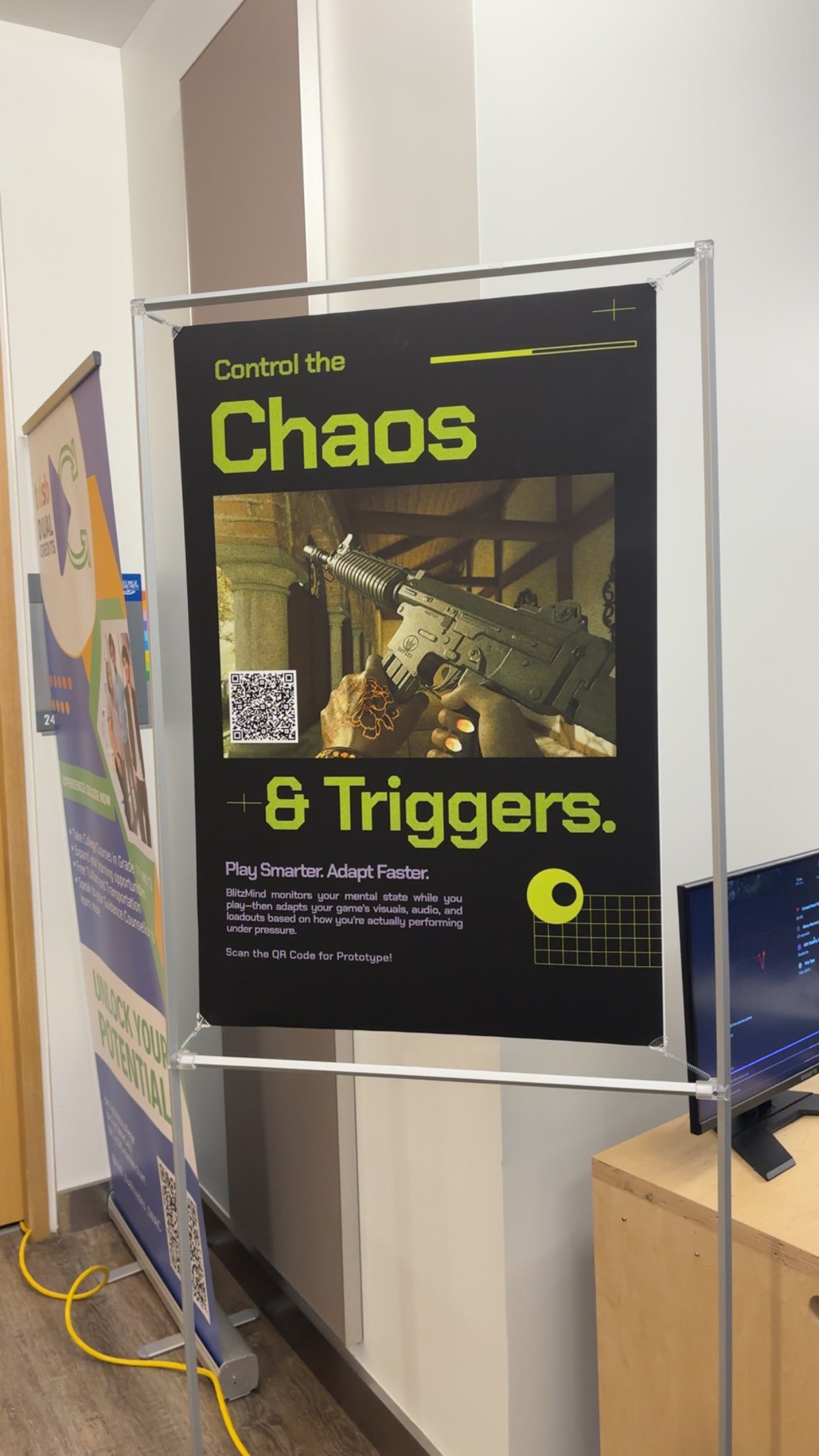
A product needs a story you can tell in thirty seconds — so I built the trailer, the poster, and the booth flow myself. Same tokens, same principles, different surface. If a stranger walked past the showcase, the marketing had to do the work the product would do later.

The booth · 200+ attendees

Gamers loved it. Non-gamers were honestly a little confused.

The clearest signal of the showcase was the audience split. Gamers got it instantly — they understood the problem from their own competitive lives, and they wanted to play with the system as soon as I described it. Non-gamers were polite, but the proposition just didn't land. Worth naming honestly: this isn't a product for the casual or non-gaming audience, and the showcase made that visible.

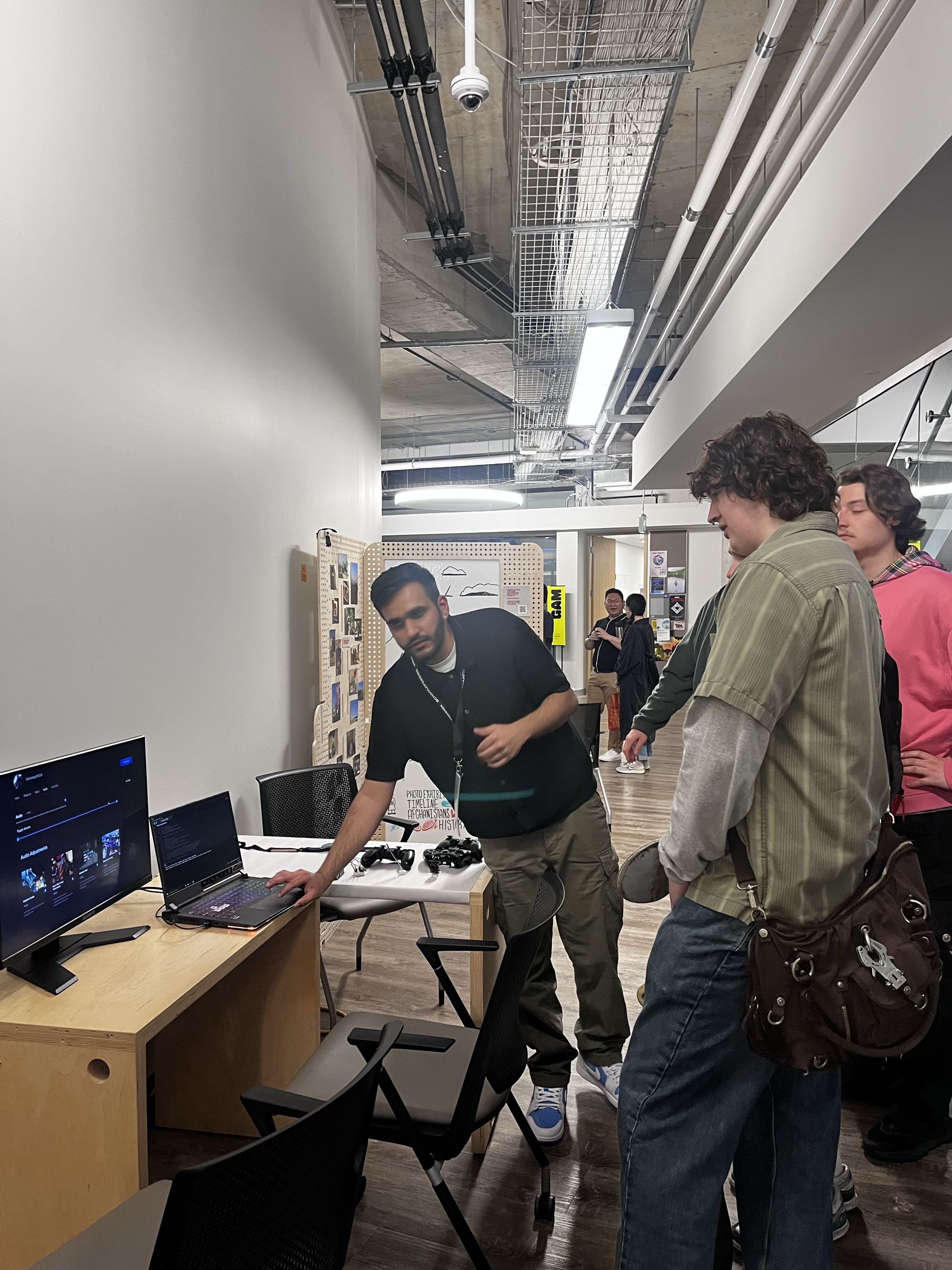
I ran the booth as a small workshop. I'd put the device in someone's hands and let them watch their own BPM and heart rate appear on the readout. The PPG sensor's red light always got a reaction. Then I'd walk them through the companion app prototypes — the same illustration language they'd just seen in the live data, which made the connection click. Then the settings they could imagine tuning for themselves. Then the trailer.

The moment that landed hardest was always the same one: the realization that BlitzMind uses heart-rate variability as input because there's no other way for the system to know whether you're in a critical fight or just walking through a quiet patch of the map. The game can't tell BlitzMind that. Your body can. People who hadn't thought about it before would pause, work it out, and then ask the right next question.

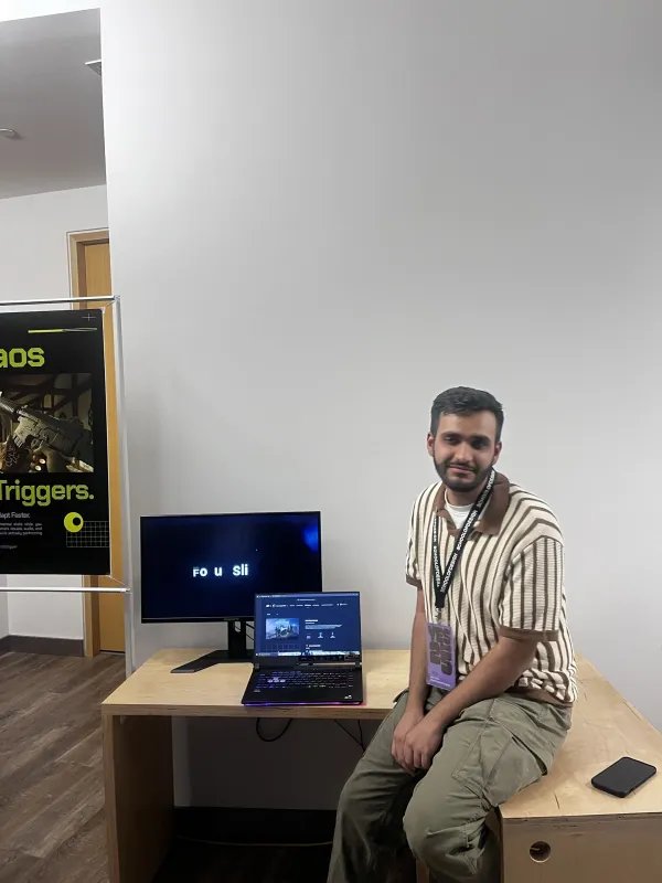
Dhruv standing next to the BlitzMind exhibition setup — poster on the left, demo monitor on the right
M1 — Thesis showcase, George Brown College April 2025
M2 — Booth walkthrough · companion app + controller Loop
A visitor reviews the BlitzMind companion app while Dhruv demos the adaptive controller
M3 — Workshop demo · visitor interaction April 2025
What I'd do next

What I'd take into the next build.

Takeaway

The hardest part wasn't the hardware. It was being wrong on purpose.

The first version of this thesis had a complete answer ready to go. Sensors, alerts, a calm coach in your hand. The defendable instinct was to refine that answer until the research agreed with it. Instead, the research disagreed, and the only honest move was to let the brief die and rewrite it.

Reframing is harder than refining. The maturity isn't in defending the original idea — it's in noticing when the question is wrong and rebuilding from the new one. "Adapt, don't interrupt" wasn't in my first proposal. It was the residue of being willing to be wrong, in public, on a thesis I'd already started.

Next case study

Muse by Interaxon

Open in Figma