Winning back digital trust.
A four-person team rethinking the SDM Digital Pharmacy with Loblaw Digital — addressing declining online transactions and rebuilding the prescription refill experience around clarity, accessibility, and trust.
A four-person team rethinking the SDM Digital Pharmacy with Loblaw Digital — addressing declining online transactions and rebuilding the prescription refill experience around clarity, accessibility, and trust.
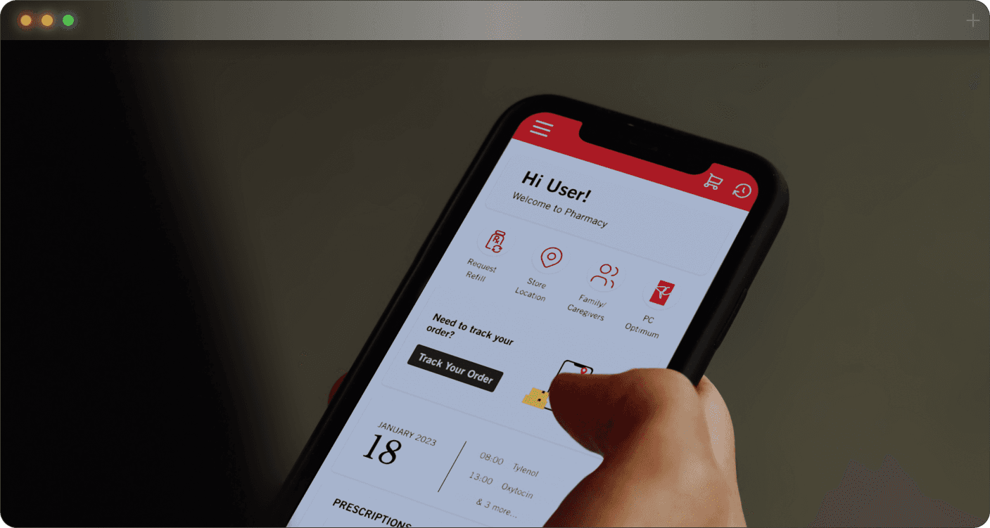
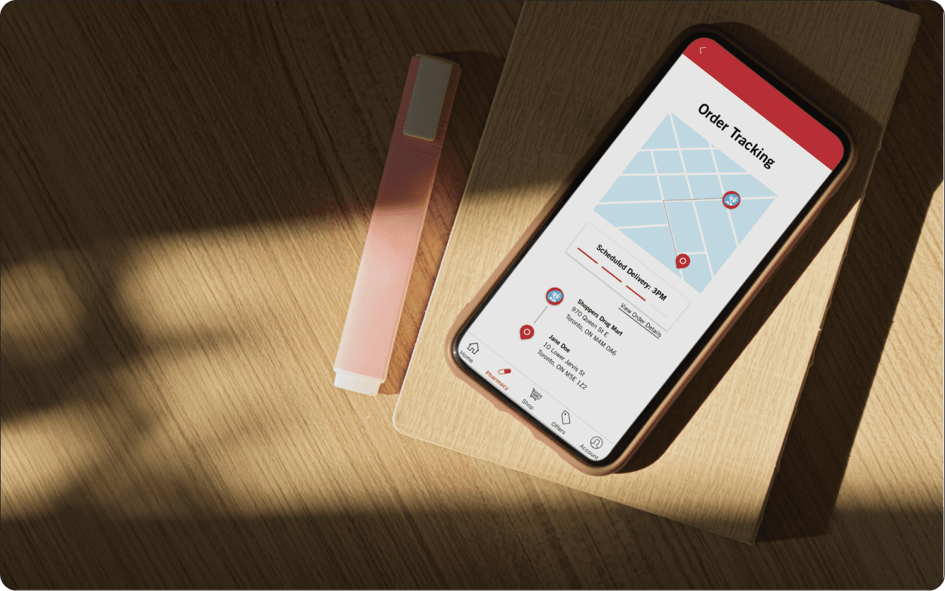
The shipped pitch covered a personalized dashboard, real-time order tracking, and barcode-scan prescription lookup — built on top of a visual system that felt distinctly SDM but stripped of its friction.
The SDM Digital Pharmacy is a comprehensive system for managing prescriptions — refills, family management, medication tracking. Despite being feature-rich, the platform was watching online transactions decline and patients drift toward competitor pharmacies. The brief was clear: rebuild the experience without rebuilding the trust.
During the pandemic, digital pharmacy services boomed. Post-pandemic, users started preferring in-person visits — they wanted the warmth of speaking to a pharmacist, and the app couldn't replicate it. On top of that, key services like prescription refills were buried in the navigation, so even motivated users gave up.
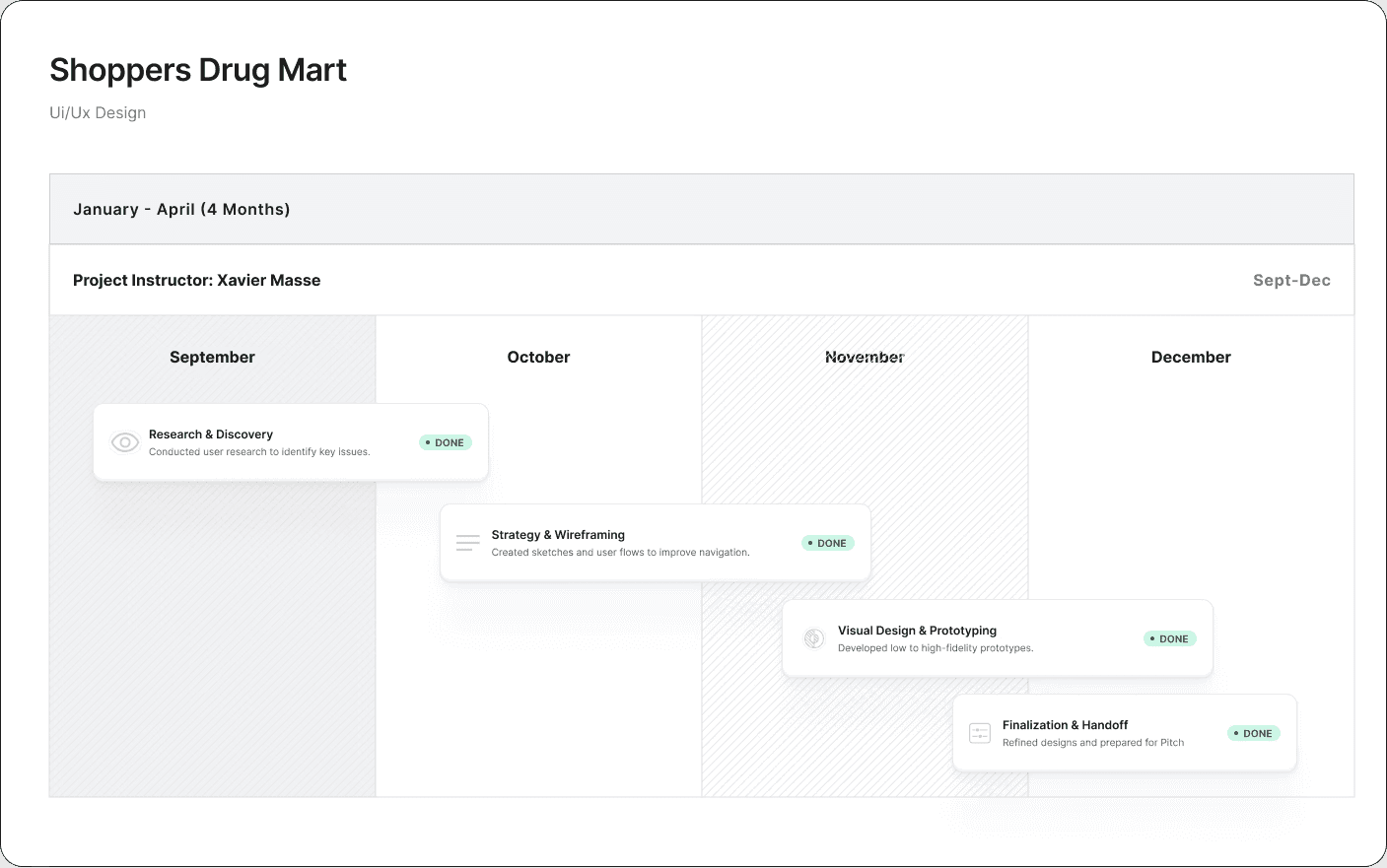
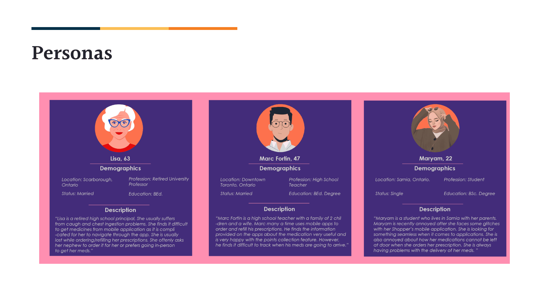
The team ran detailed user research alongside a competitor audit. Patient interviews surfaced the specific friction points; the competitive scan showed what people had grown to expect from a modern pharmacy app. Together they pointed at the same answers.
Refill tools — the most-used feature — were three taps from any obvious entry point. Users gave up before they got there.
Patients we spoke to had quietly started splitting prescriptions across providers — a clear signal of declining preference.
The app felt like a form. The pharmacy counter felt like a relationship. Bridging the two became the design north star.
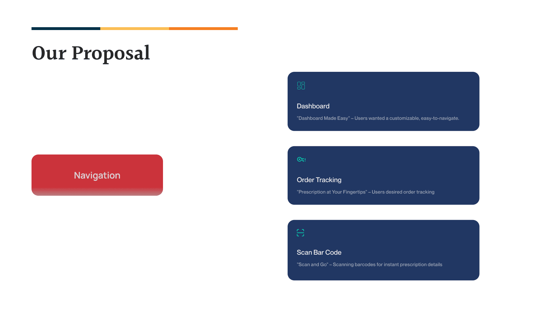
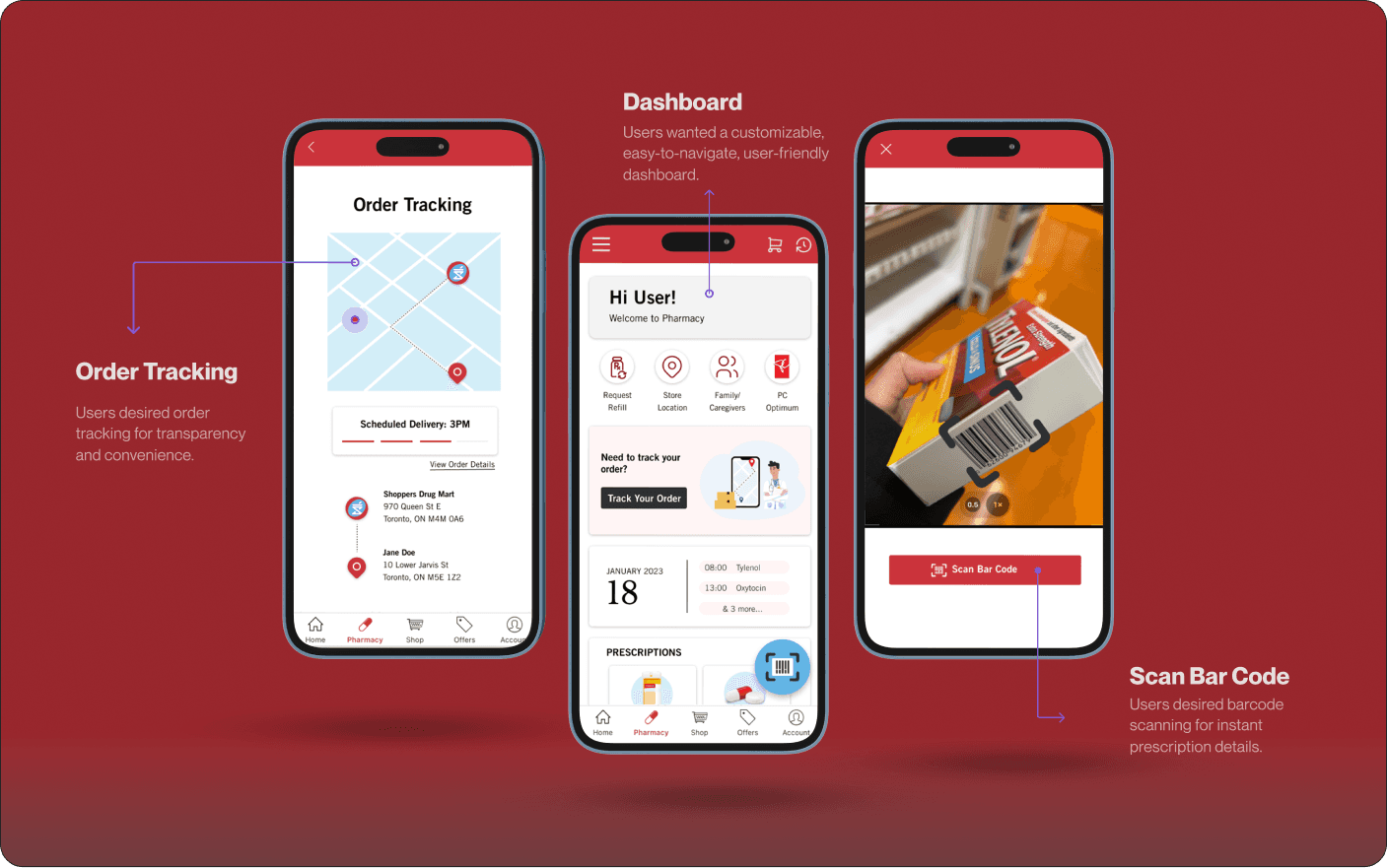
We focused the redesign on three concrete moves — a customizable dashboard, real-time order tracking, and barcode-scan prescription lookup. Each came directly from a recurring user request, and together they reframed the app as a tool that worked with the patient instead of around them.
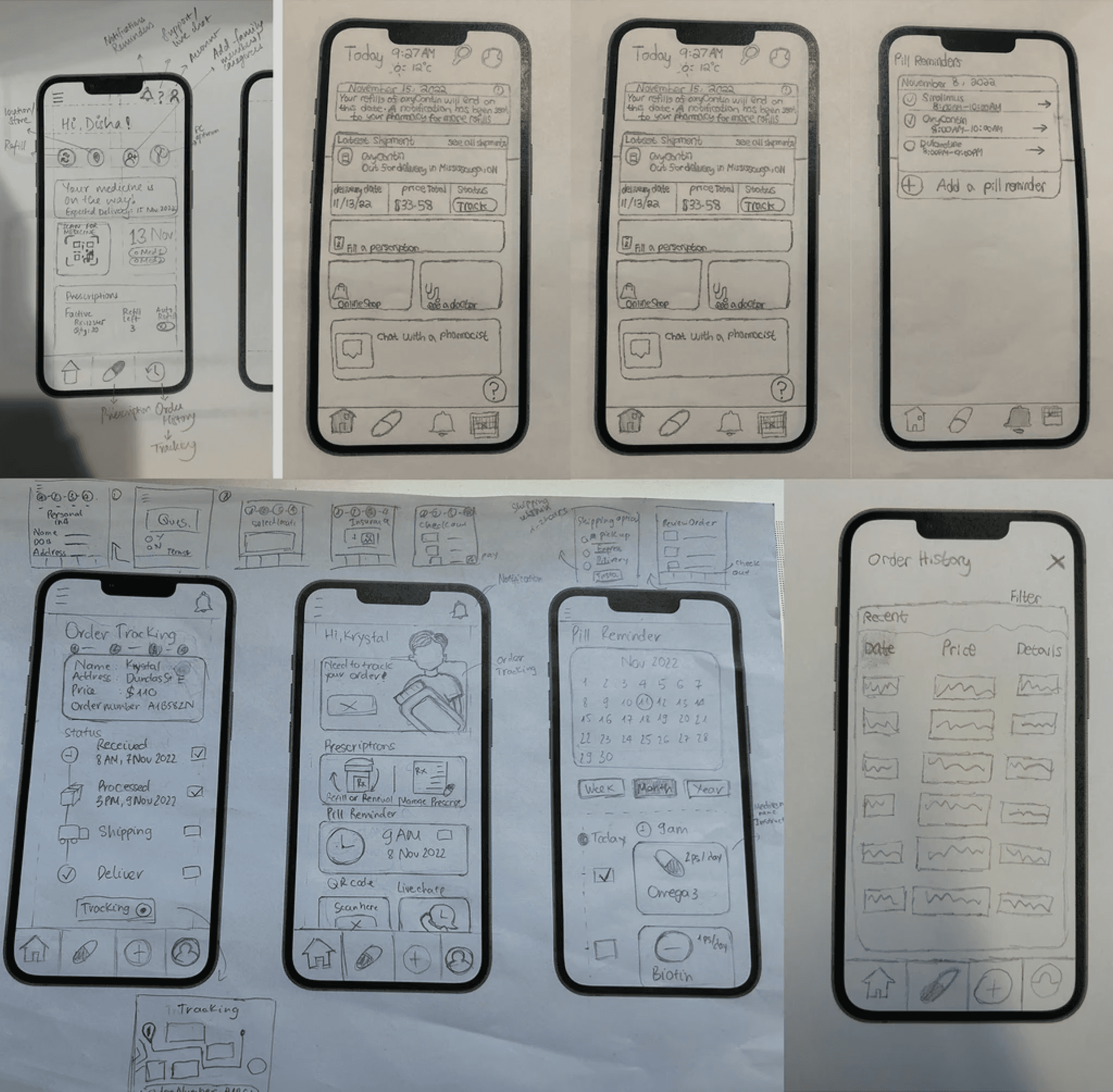
We worked through three fidelities — sketches to test ideas fast, wireframes to lock structure, then high-fidelity prototypes that felt close enough to the final product to test convincingly. The three pillars guiding every decision: clarity, accessibility, trust.
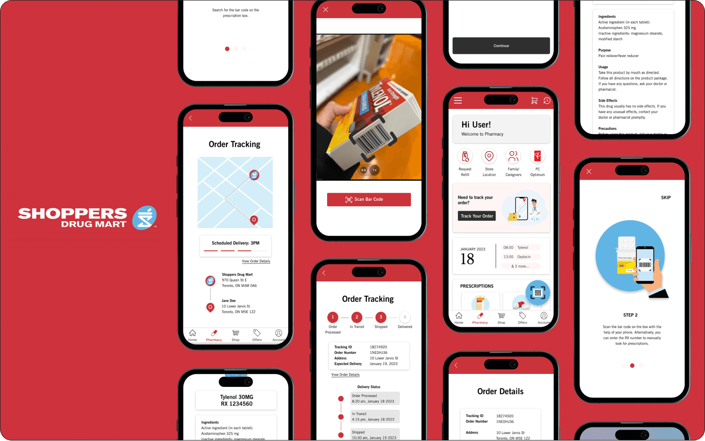
The final design pulls the three pillars together — clean streamlined dashboard, real-time tracking visible at a glance, and barcode scanning baked into the primary flow rather than tucked behind a menu.
Sticking to actual user needs — not assumptions about them — kept the team aligned even when scope pressure pushed toward shortcuts. The most-requested features became the most-shipped.
Working with three other designers and a PM brought tradeoffs into view earlier than I'd find them solo. The final design was sharper because of who pushed back on it.
Stripping back complexity isn't about removing things — it's about choosing the right thing to keep. Every screen we cut made the remaining ones do more work.
The complete pitch deck, wireframes, and high-fidelity prototypes — embedded here so you can pan and zoom through them yourself.