A SaaS, end-to-end.
Designing the full UX for Connektra.io at Syncromeda Technologies — a service-management SaaS platform — from research-led personas to high-fidelity prototypes ready for development handoff.
Designing the full UX for Connektra.io at Syncromeda Technologies — a service-management SaaS platform — from research-led personas to high-fidelity prototypes ready for development handoff.
The deliverable spanned a landing page, a service-management dashboard, a pricing screen built to convert, and the interactive prototypes that pitched the whole thing internally.
Connektra.io was my first UX design internship — joining Syncromeda Technologies to work on a SaaS platform aiming to simplify how businesses manage their services. The brief: design something intuitive enough for non-technical users, deep enough for operations teams, and on-brand throughout.
Working alongside developers and a product manager, I focused on balancing functionality with aesthetics — applying user-centered design to a product where every screen had to earn its place.
For Connektra, I led with a user-centered approach — aligning every design decision with user insights. The standout deliverable was a pricing screen that communicated value at a glance and felt true to the brand.
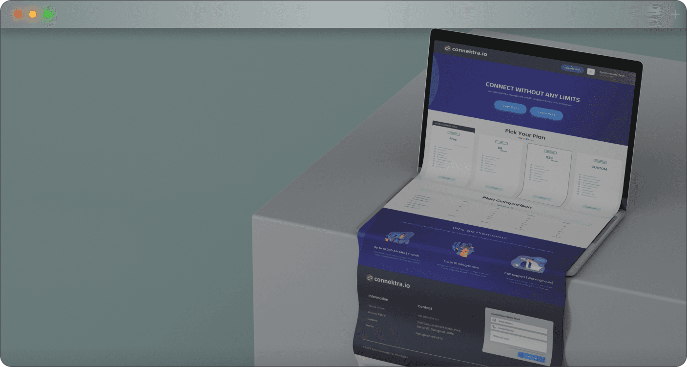
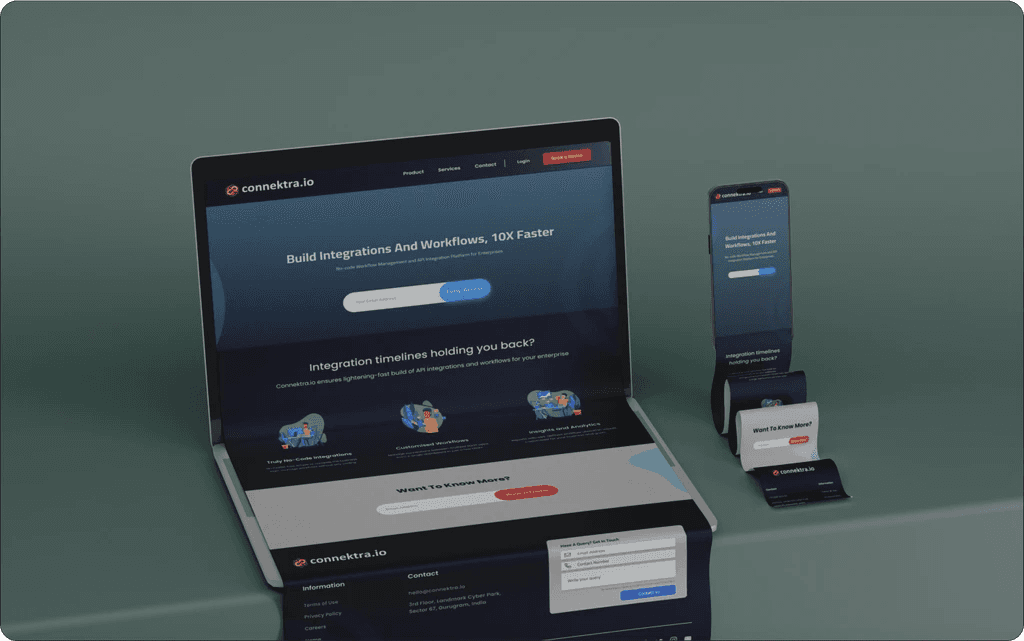
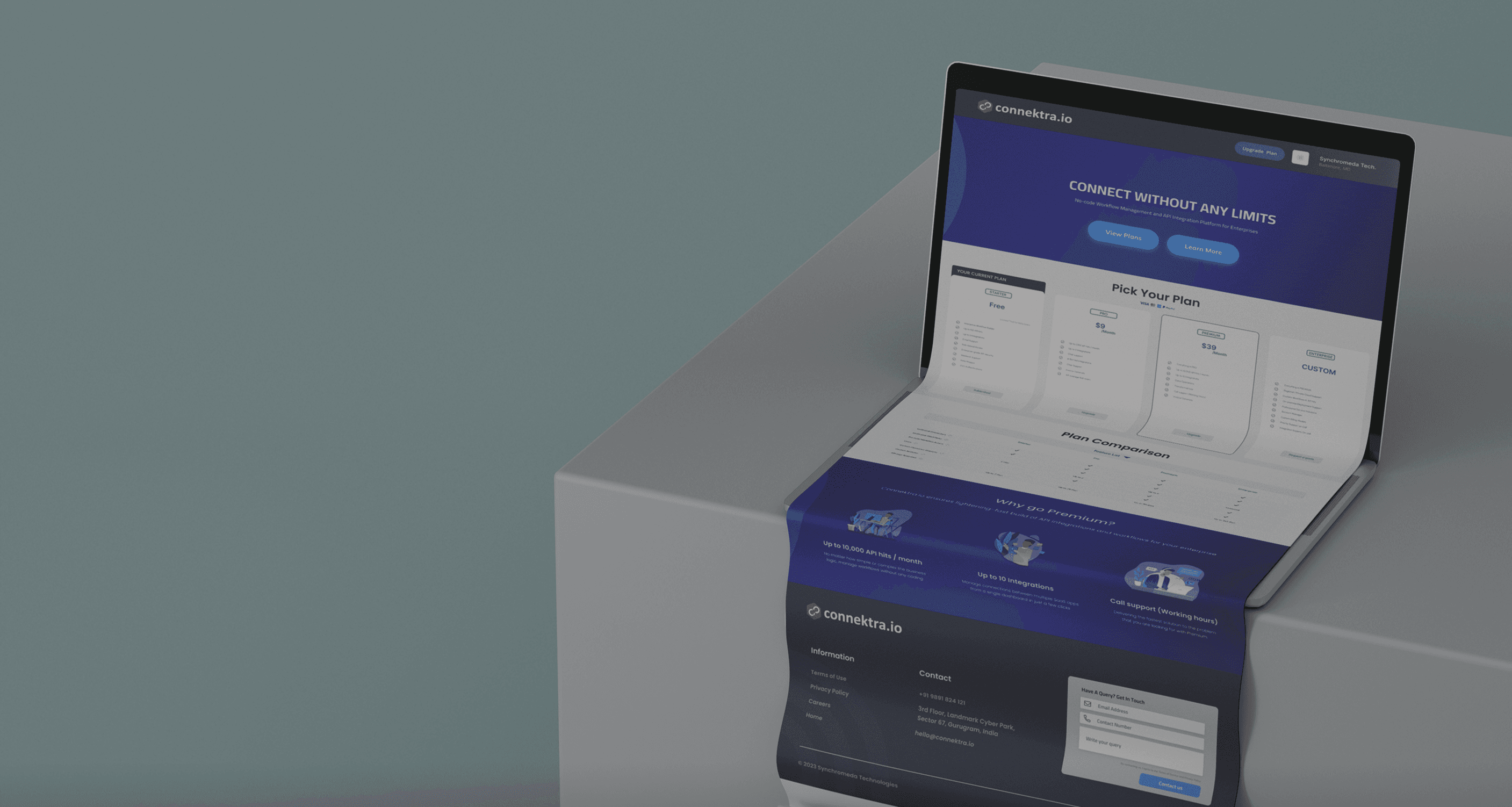
The landing page had one job: convey Connektra's value fast and send the right people deeper. A clean layout, deliberate visual hierarchy, and a single primary CTA carried the conversion logic.
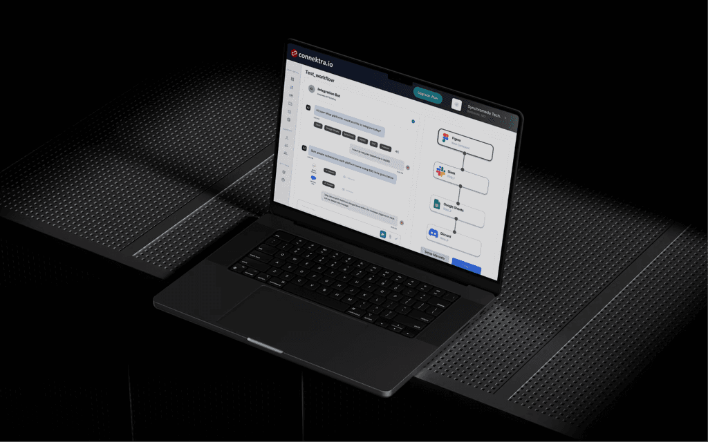
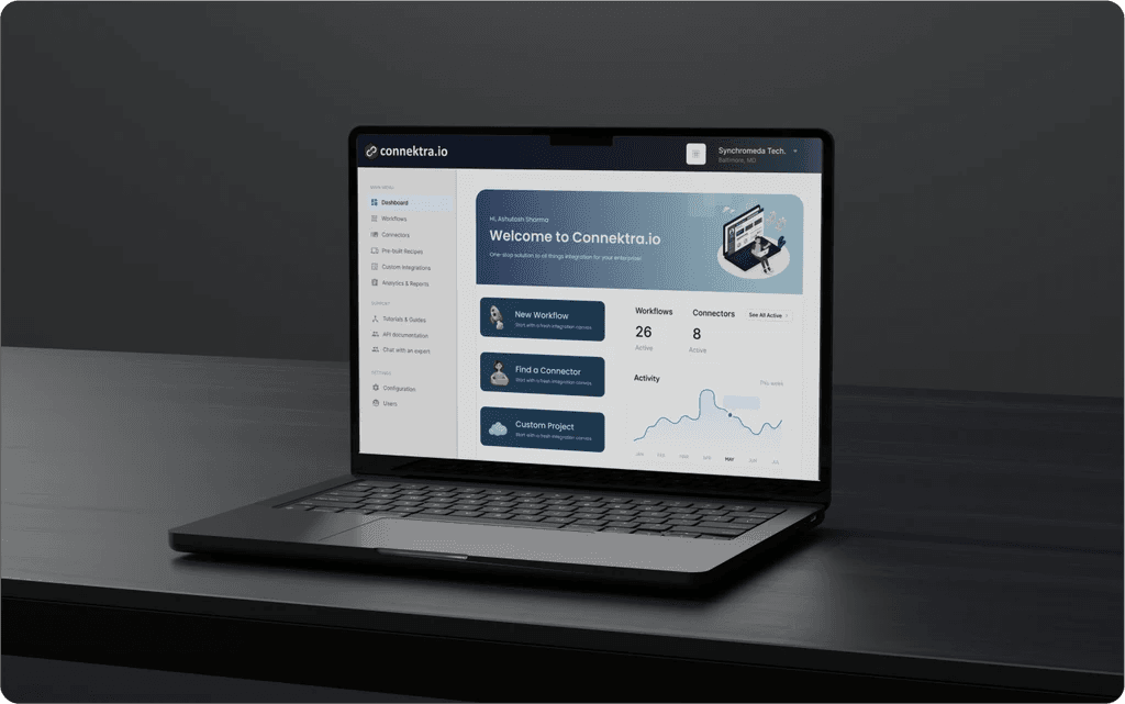
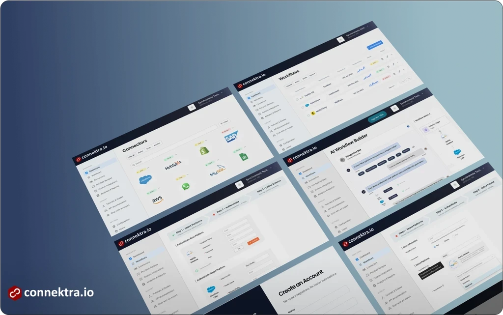
The dashboard is where users live. I designed it for intuitive navigation and clear focus — surfacing the most-used features and pushing the rest into clean secondary patterns so the home screen never felt overloaded.
The pricing screen was designed to align tightly with Connektra's brand and remove guesswork. Tiers laid out cleanly, value props up front per tier, and a visual treatment that drew the eye toward the recommended plan without screaming about it.
I built interactive prototypes that simulated the real user experience closely enough to test convincingly. Real-time feedback let me iterate fast — the gap between concept and sign-off shrunk dramatically.
Deep research and ongoing feedback led to designs that met real user needs — improving both functionality and perceived quality in ways assumptions never could have.
Strong partnerships with engineering and the PM kept execution smooth and ambitions aligned. Decisions made in conversation held up better than decisions made in isolation.
Moving from low to high fidelity in deliberate steps — and actually testing at each one — produced a final product that felt confident rather than over-defended.
The complete UX flows, prototypes, and dev annotations — pan, zoom, and click into frames directly here.