A meditation app, remeasured.
Four months inside InteraXon's product team — refining the dashboard, professionalizing biofeedback, and laying the groundwork for Alpha Peak across an app used by 700,000+ people.
Four months inside InteraXon's product team — refining the dashboard, professionalizing biofeedback, and laying the groundwork for Alpha Peak across an app used by 700,000+ people.
Browse all explorations, components, and final v39 designs in detail.
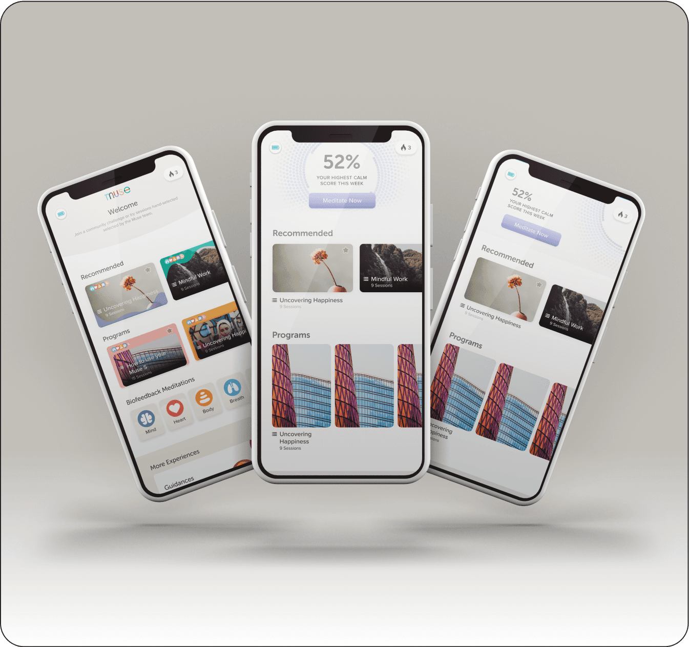
A snapshot of what shipped: dashboard explorations, refined biofeedback iconography, motion treatments for in-session flows, and a refreshed module identity used across the app and storefront today.
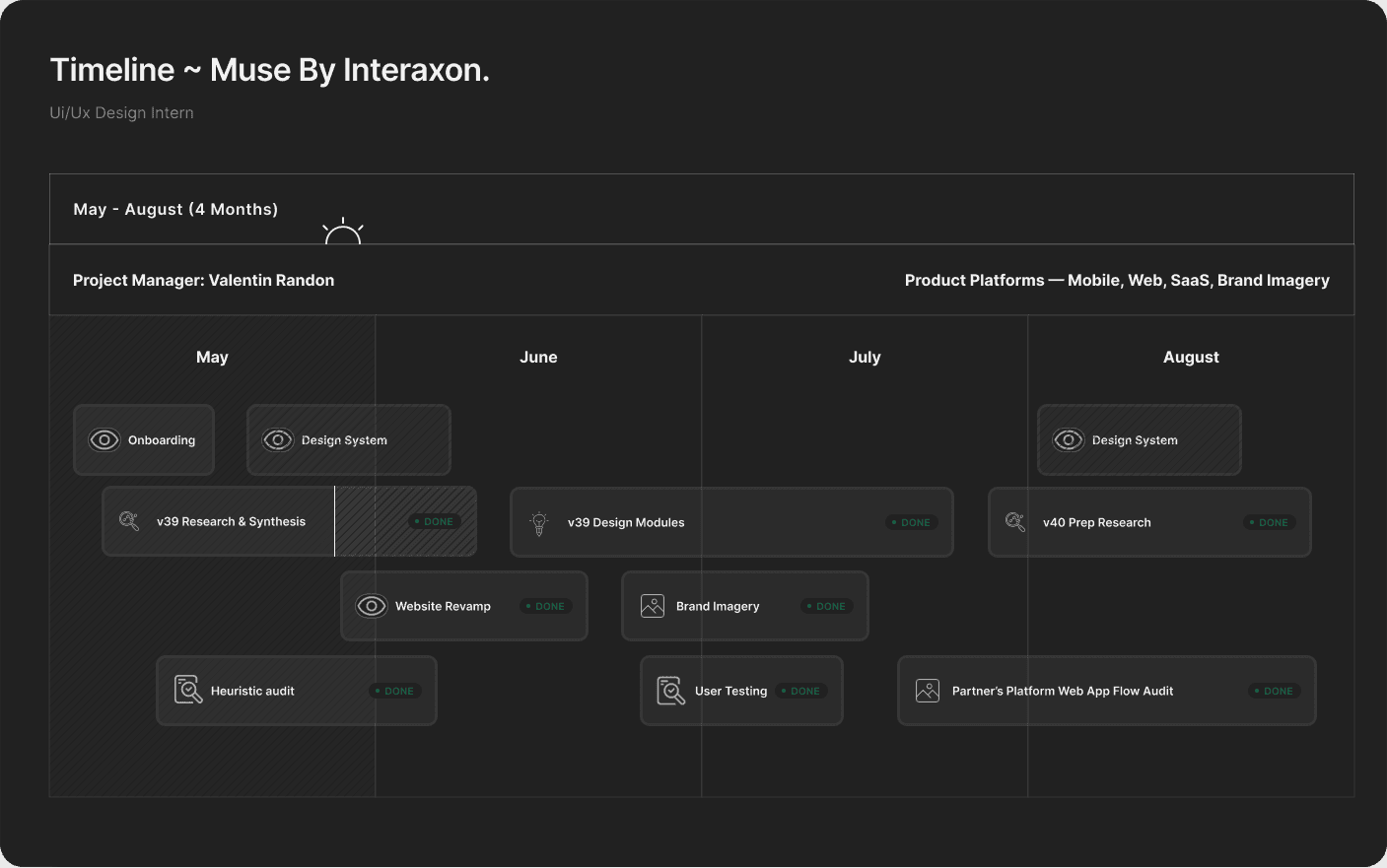
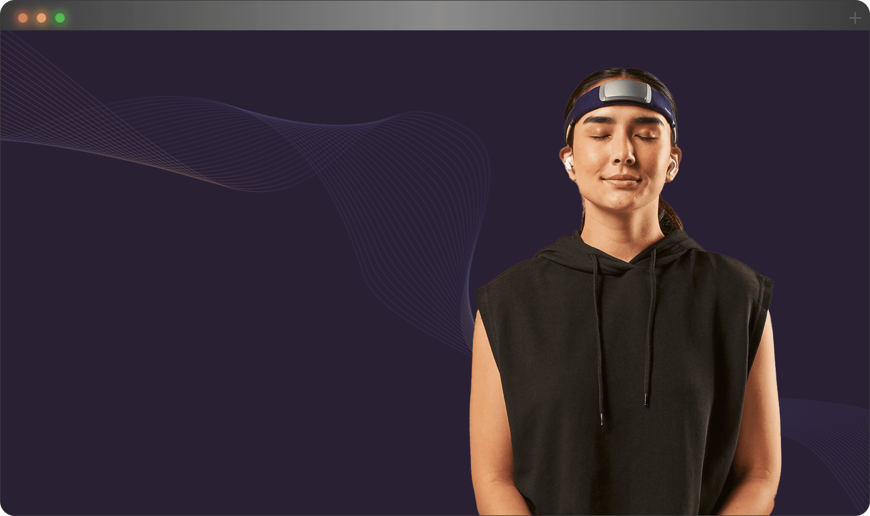
Muse makes EEG-based meditation hardware and a companion app that turns brain activity into ambient feedback. I joined for v39 — a release window where research had surfaced clear friction in the dashboard, weak discoverability for premium biofeedback, and an opportunity to set the stage for Alpha Peak, a new scientific feature shipping in v40.
My work crossed five threads: synthesizing existing user research, redesigning the dashboard with multiple modern directions, professionalizing the biofeedback icons and notification system, leading post-launch usability testing, and contributing to the Shopify storefront and Partners platform on the side.
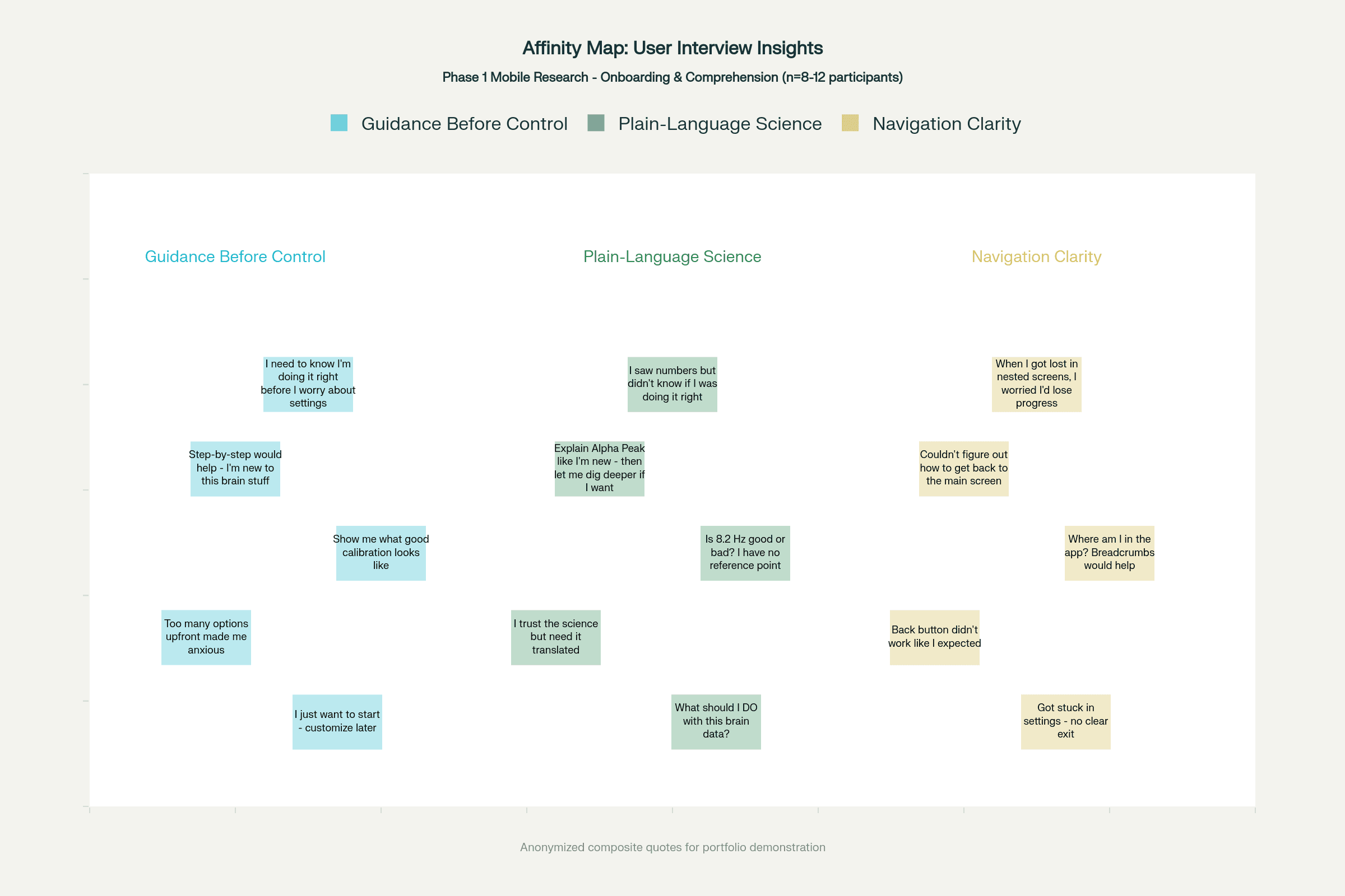
The team had already run semi-structured interviews with active users. I came in during synthesis, organizing feedback through dimensional affinity mapping across behavioral spectrums — moving raw quotes into archetypes, then into the patterns those archetypes shared.
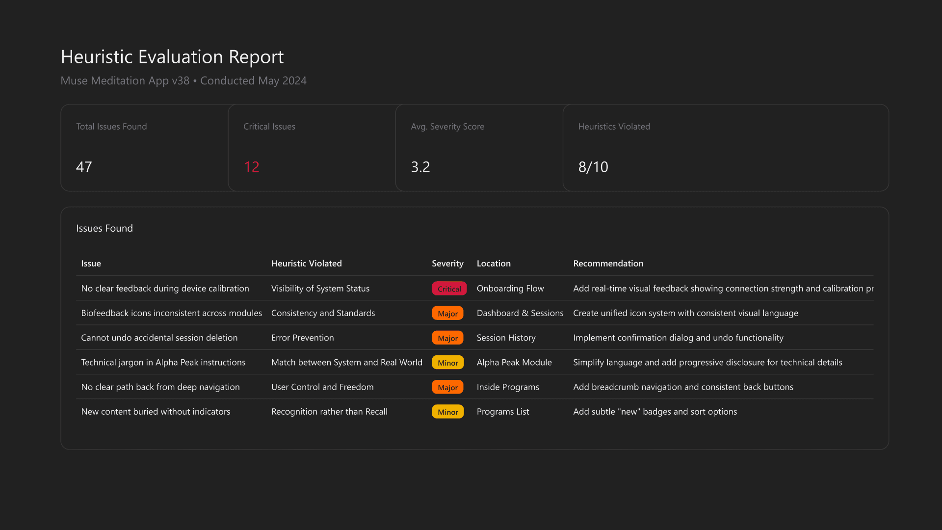
I ran a full mobile-experience audit against Nielsen's heuristics, cataloging 47 issues and ranking the 12 critical ones that touched core flows or premium adoption. The output became a shared priority matrix the team used to scope v39.
Rather than design one polished comp and defend it, I explored two distinct directions and let the team weigh the tradeoffs. Each respected Muse's brand themes but pulled toward a different mental model.
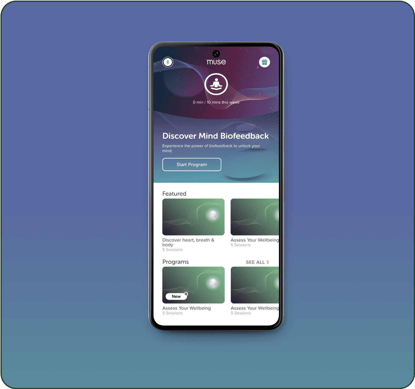
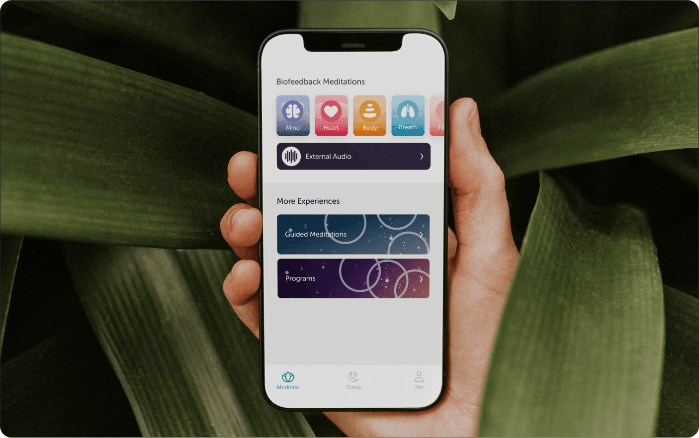
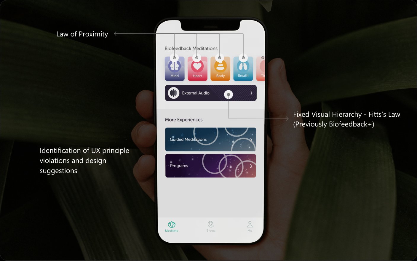
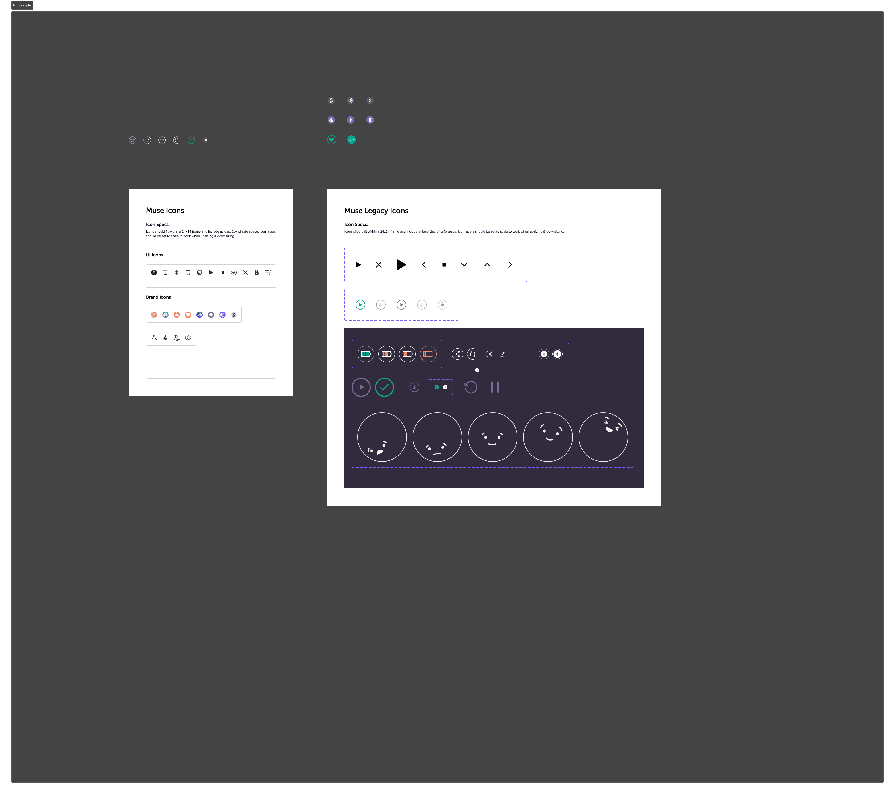
Biofeedback+, the external audio premium feature, was sitting flat in the visual hierarchy. Users weren't rejecting the upsell — they literally weren't seeing it. I redesigned the biofeedback icon set and the surrounding moment to give the premium tier a distinct visual treatment that read at a glance.
→ Tap a state to switch
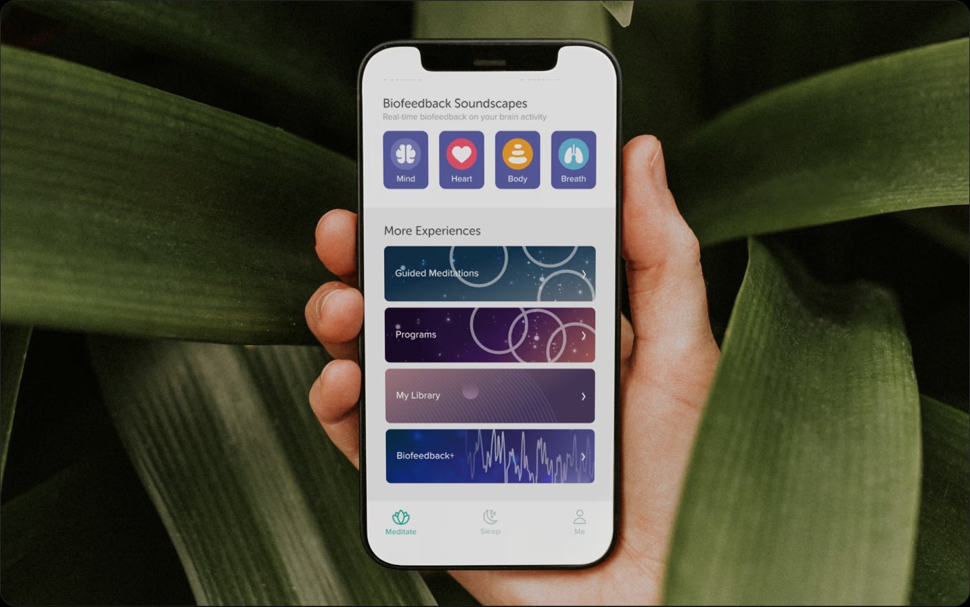
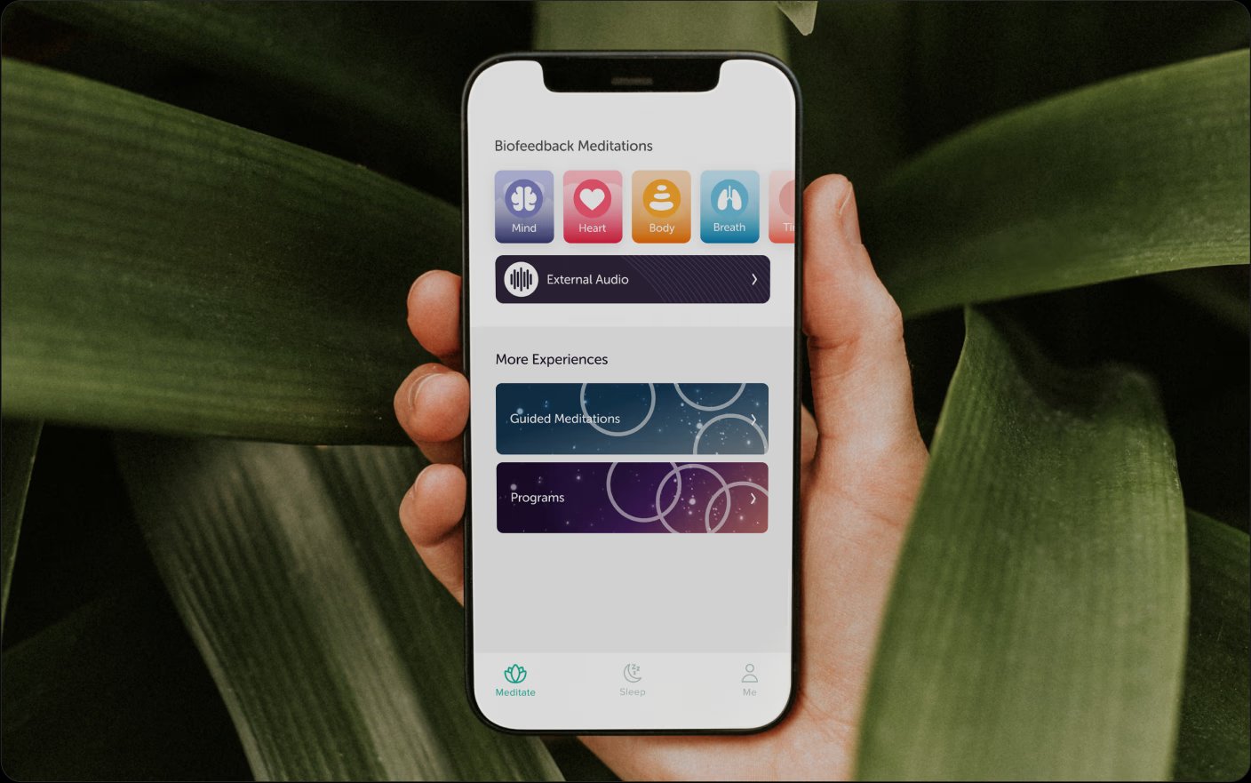
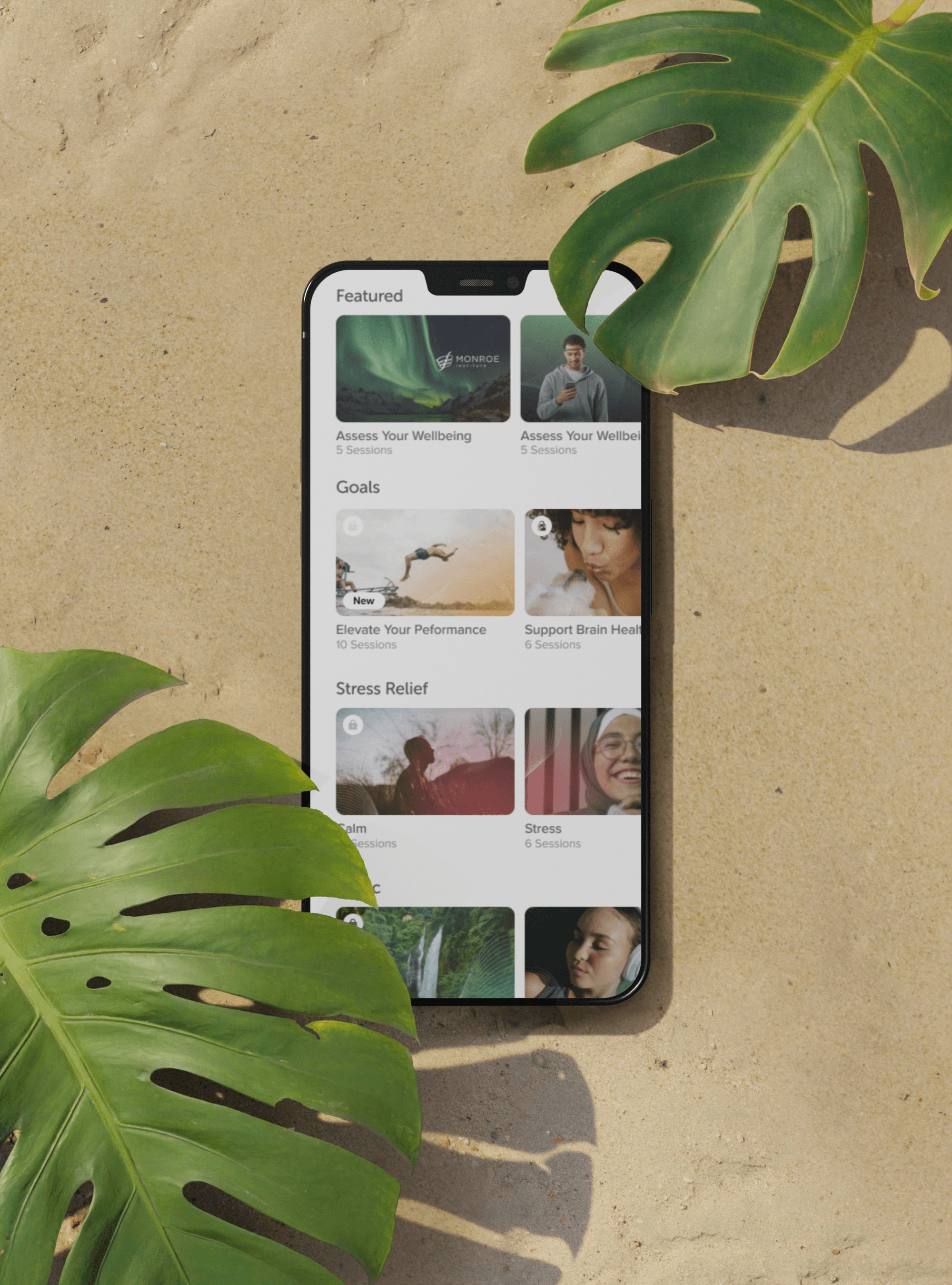
New content modules were under-engaging because users didn't know they existed. The fix had to surface novelty without breaking the calm tone Muse depends on. The pill-based notification system was quiet enough to belong in a meditation app and present enough to redirect attention.
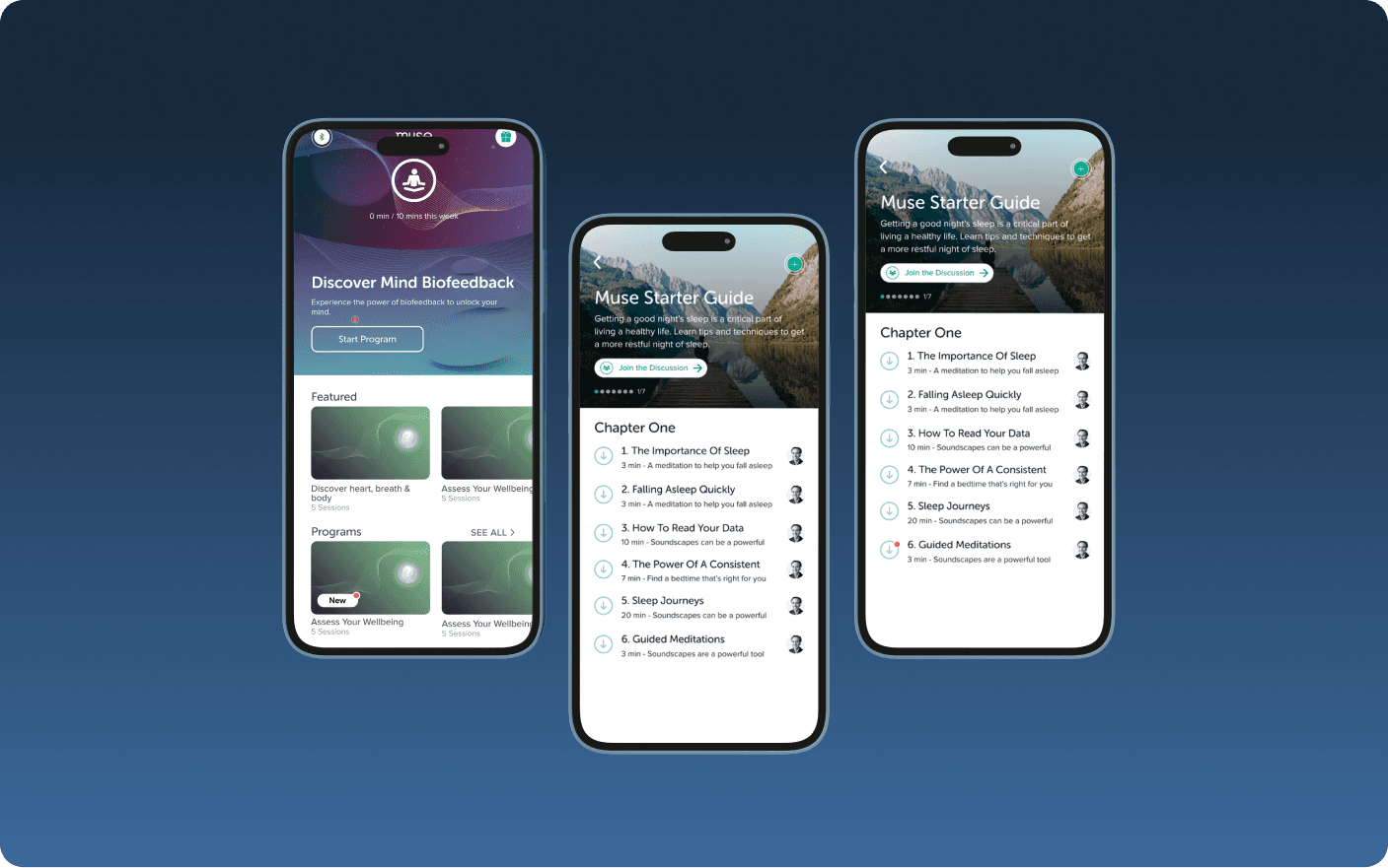
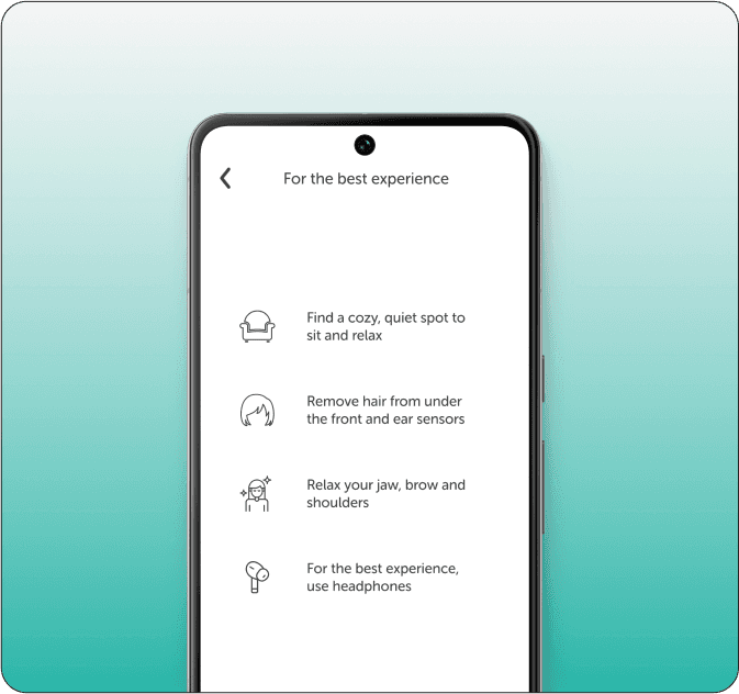
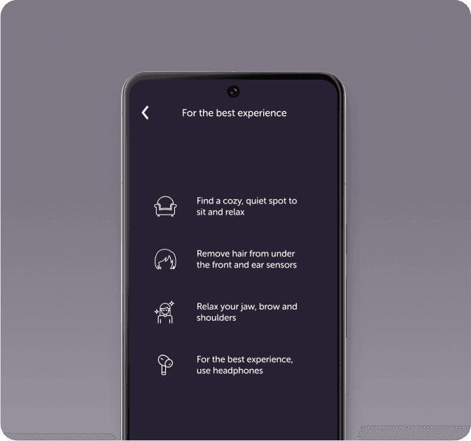
Sessions split sharply between meditation (daytime, alert) and sleep (nighttime, winding down). The instruction flow needed to match those states without forcing two separate flows. I built a dual-theme experience — light for meditation, dark for sleep — sharing the same underlying structure and copy patterns.
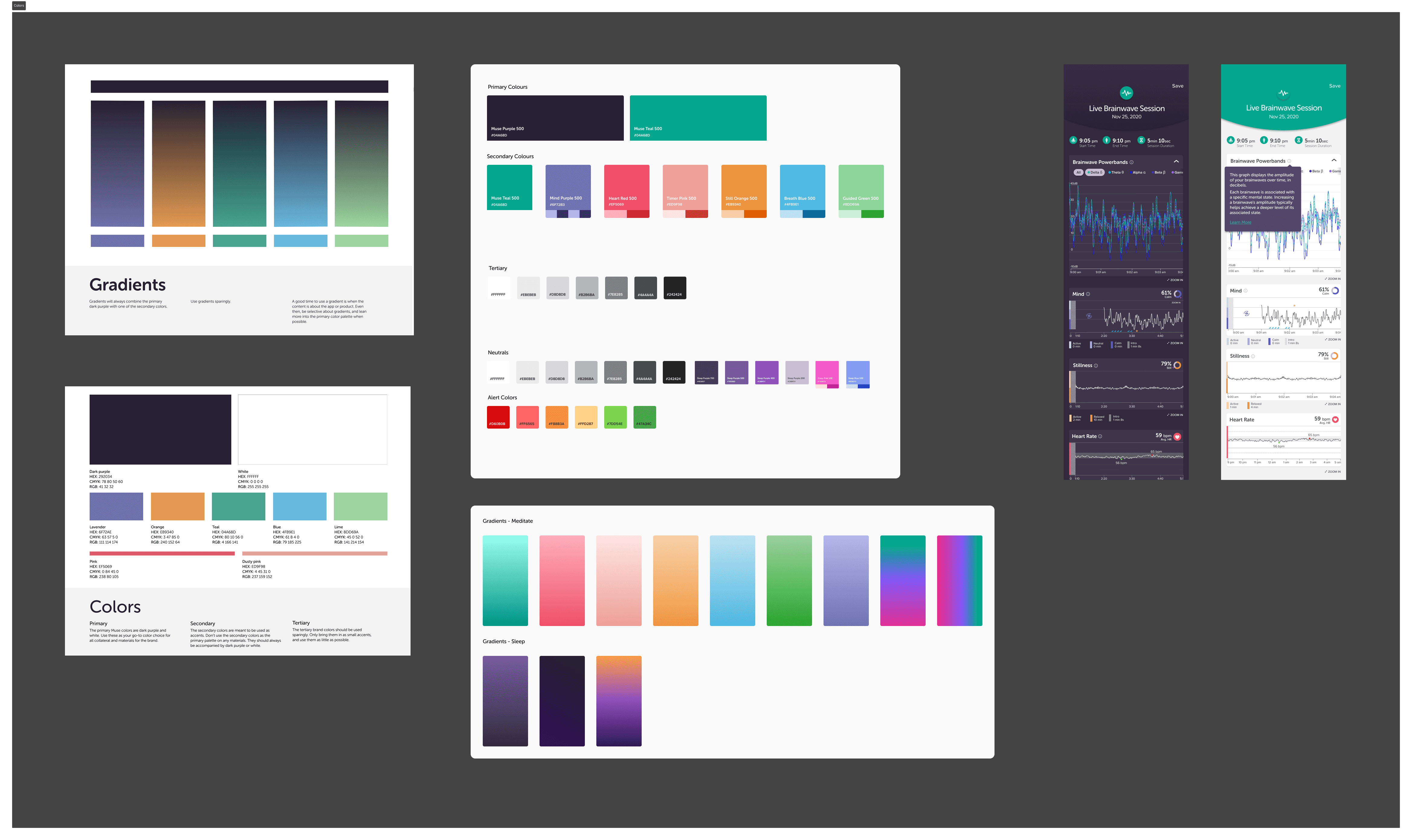
Working with Francisco Zembrano on the graphic side, I helped develop module-level branding that's still central to the app and marketing site today. We took a "better-best" approach — exploring scalable systems first, then refining a final language built around gradient overlays, human-centric imagery, and consistent type treatment.
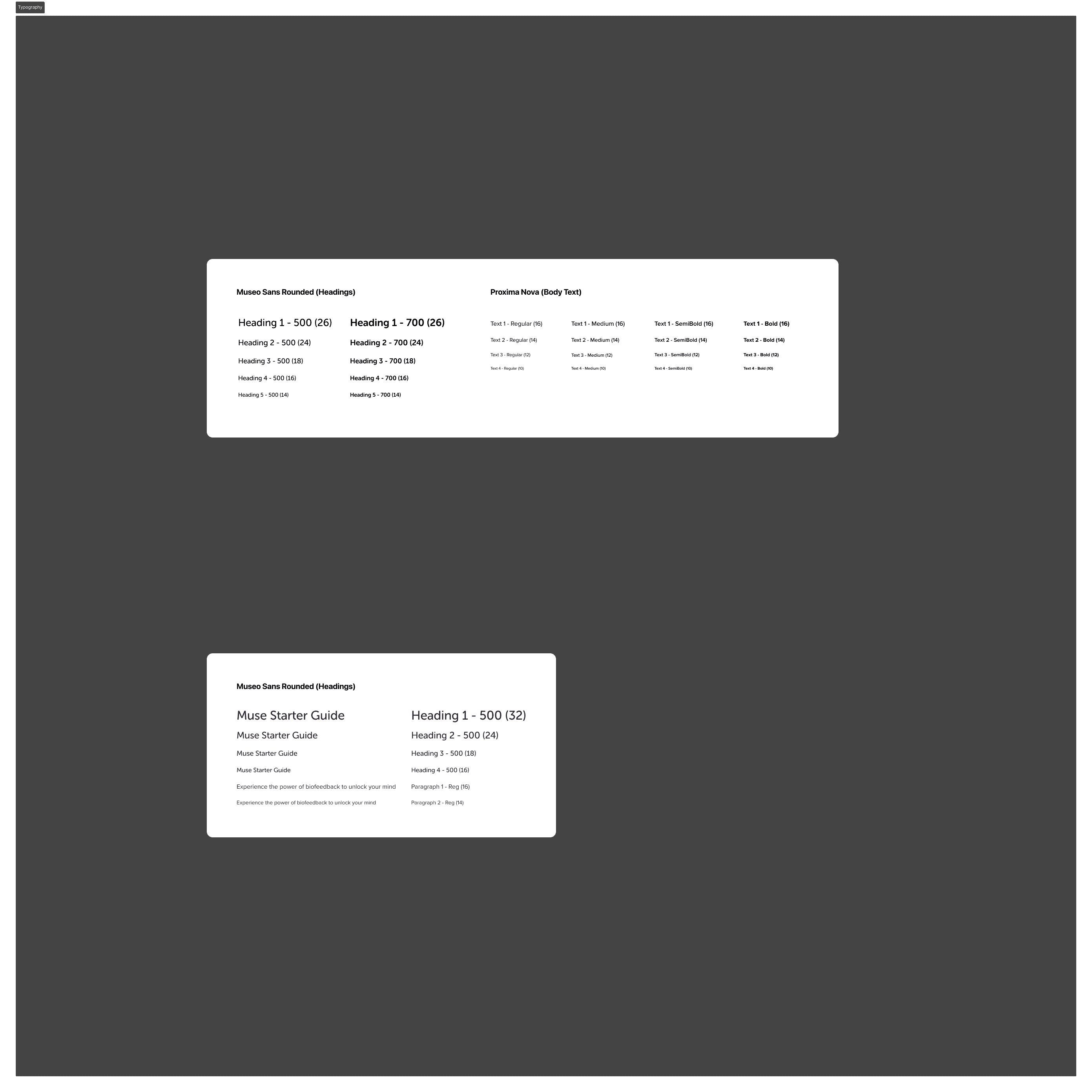
Before v39 work could move quickly, the system needed alignment. A light design-system pass on color, typography, and iconography cut visual drift across mobile, web, and SaaS surfaces, and gave handoffs a shared vocabulary. Smaller piece of work, outsized downstream effect.
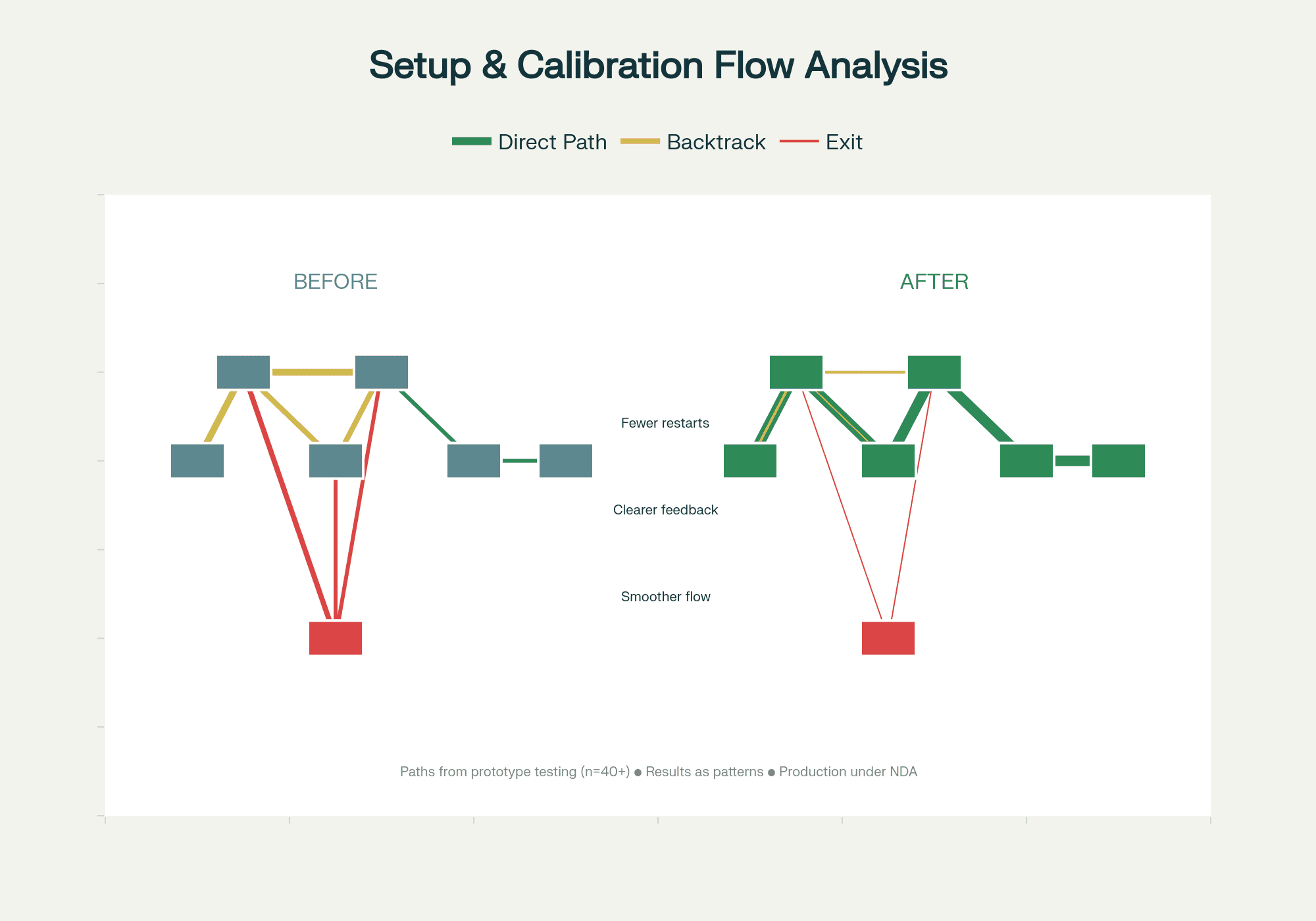
After the dashboard updates and brand work shipped, I led a usability testing protocol with a team of four — covering both the new fabric- electrode hardware and the refreshed app. Path analysis showed fewer backtracks and earlier completion of setup compared to v38. Qualitative findings fed directly back into the research team's roadmap.
Alpha Peak — frequency tracking — was scheduled for v40, and the question wasn't whether it worked, but how to introduce it. I led synthesis on A/B-tested explanation frameworks and timing experiments, looking for the pattern that built confidence rather than confusion.
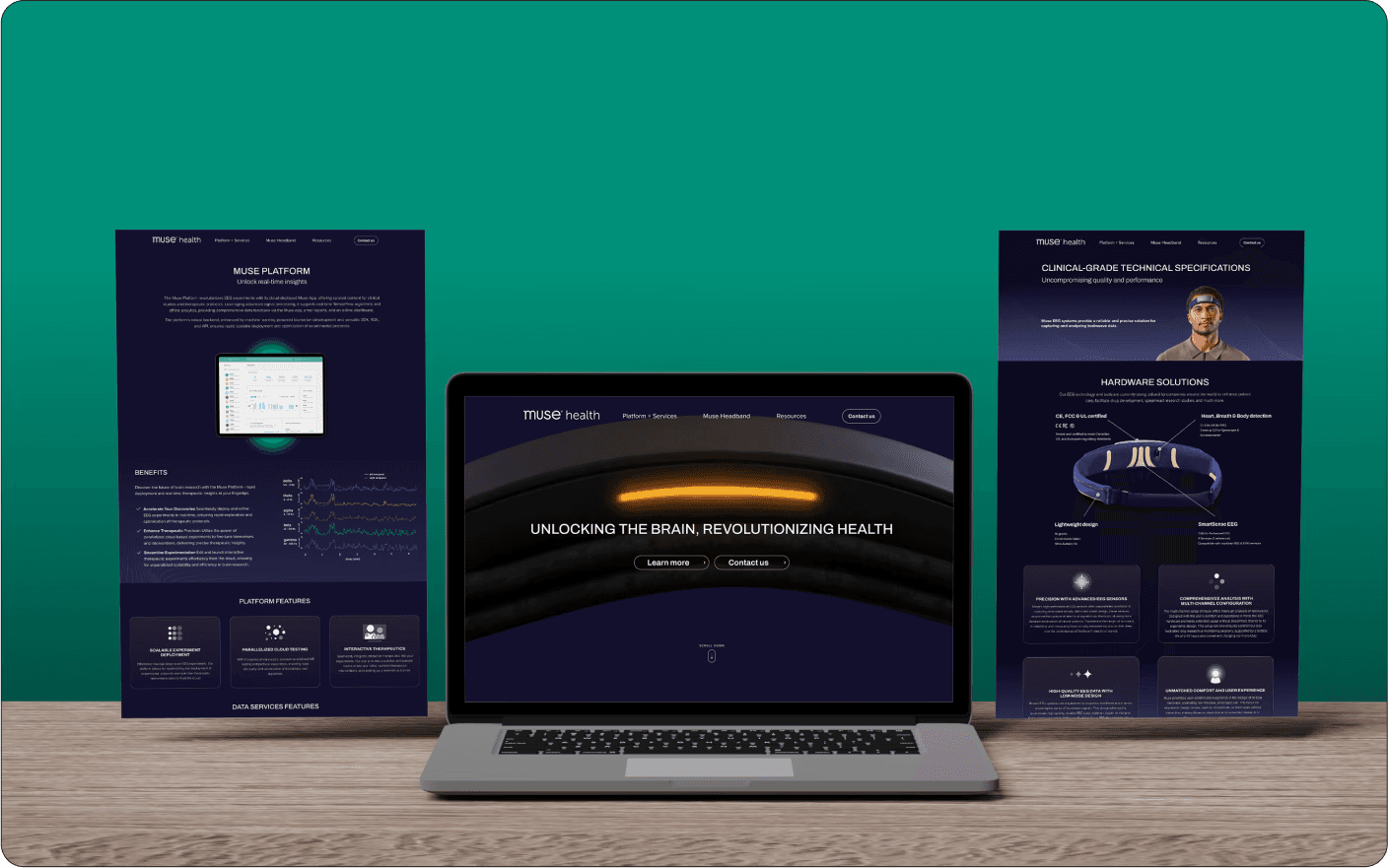
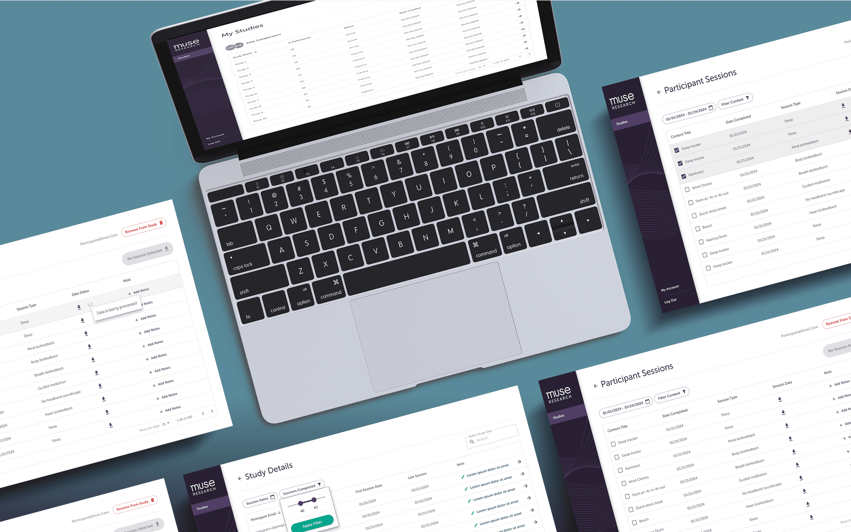
Outside the core app, I designed and built landing pages on the Shopify storefront — Figma to exported assets to HTML/CSS/JS, working closely with the dev team. I also contributed to the Partners platform, the tool university researchers use to run studies on Muse hardware, covering four distinct flows with developer annotations for handoff.
Revamping the biofeedback icons started as a small visual cleanup and ended up the most-leveraged piece of work I shipped — because it became reusable components everyone else built on top of.
Designing the notification pills taught me how thin the line is between "subtle" and "invisible." The right answer was discovery cues that were quiet in tone but unambiguous in placement.
The dual-theme instruction flow made it concrete: time of day, posture, intent — all of these are inputs to the design, not wrappers around it.
Pan, zoom, click into frames. Recruiters keep telling me they want to see how a designer thinks in Figma — so here's that, instead of just polished cover shots.