Analytics tools chart your revenue and hide the tables underneath it. Pollynate opens the database, and puts an AI in front of it that anyone can query in plain English. I joined as founding UX designer — owning the research, information architecture, core flows, prototypes, and the design system behind the redesign.
Walk the live product, or open the working Figma file behind the whole system.
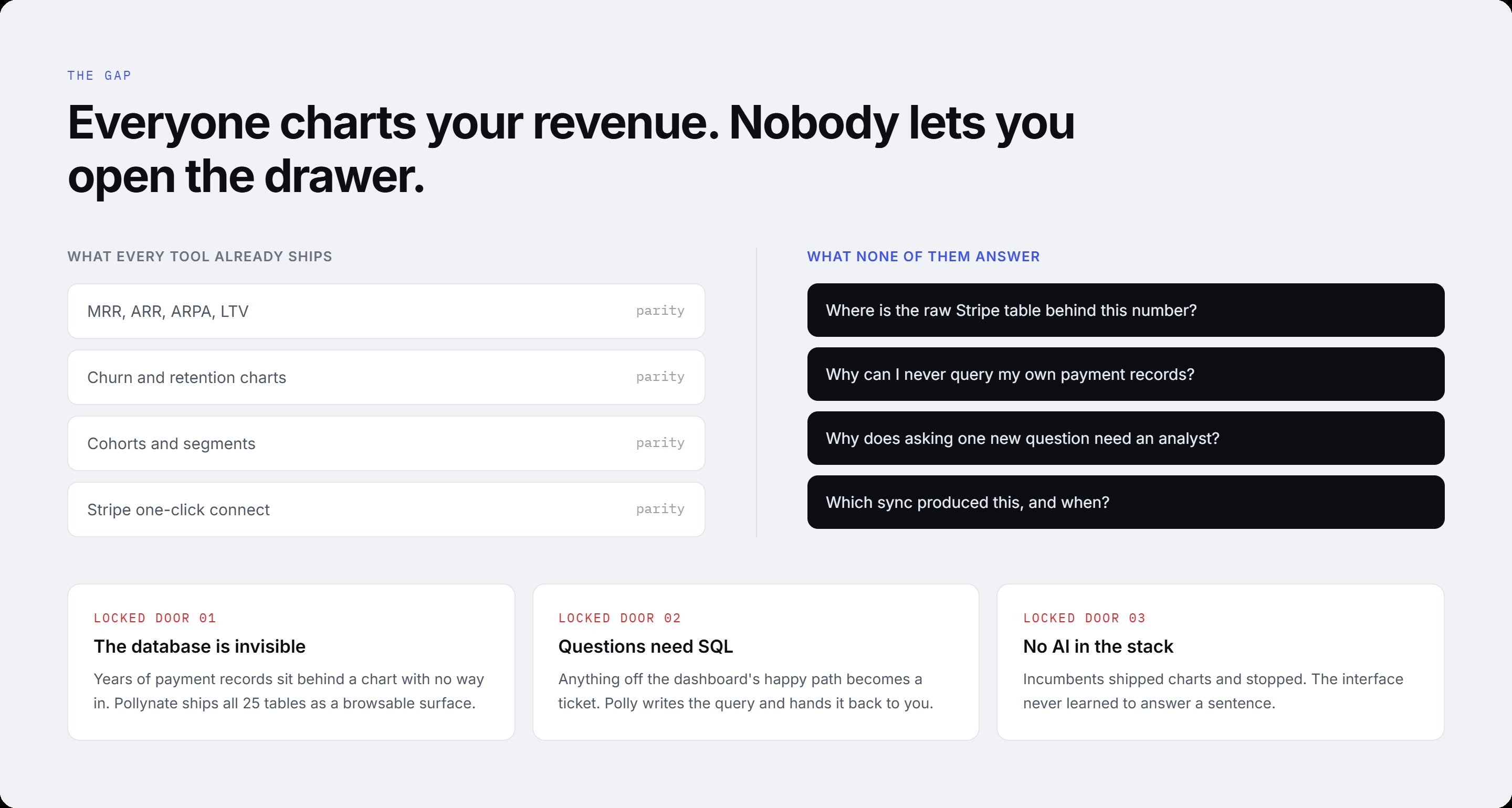
Stripe holds the truth about a subscription business — every charge, invoice, refund, and customer. But the analytics tools built on top of it only ever hand you the chart. The raw tables behind each number stay locked away, and the moment a business owner or finance lead asks a question the dashboard didn't anticipate, they're back to filing a ticket and waiting on an analyst who can write SQL.
This is the trust gap. A finance lead can see that MRR moved, but not why, or which exact charges drove it, or which sync produced the figure. The number is visible; the evidence behind it isn't. In a board meeting, "our MRR is $127k" isn't the hard part — defending it, tracing it to source, is. And that defence lives in a database nobody on the business side is allowed to touch.
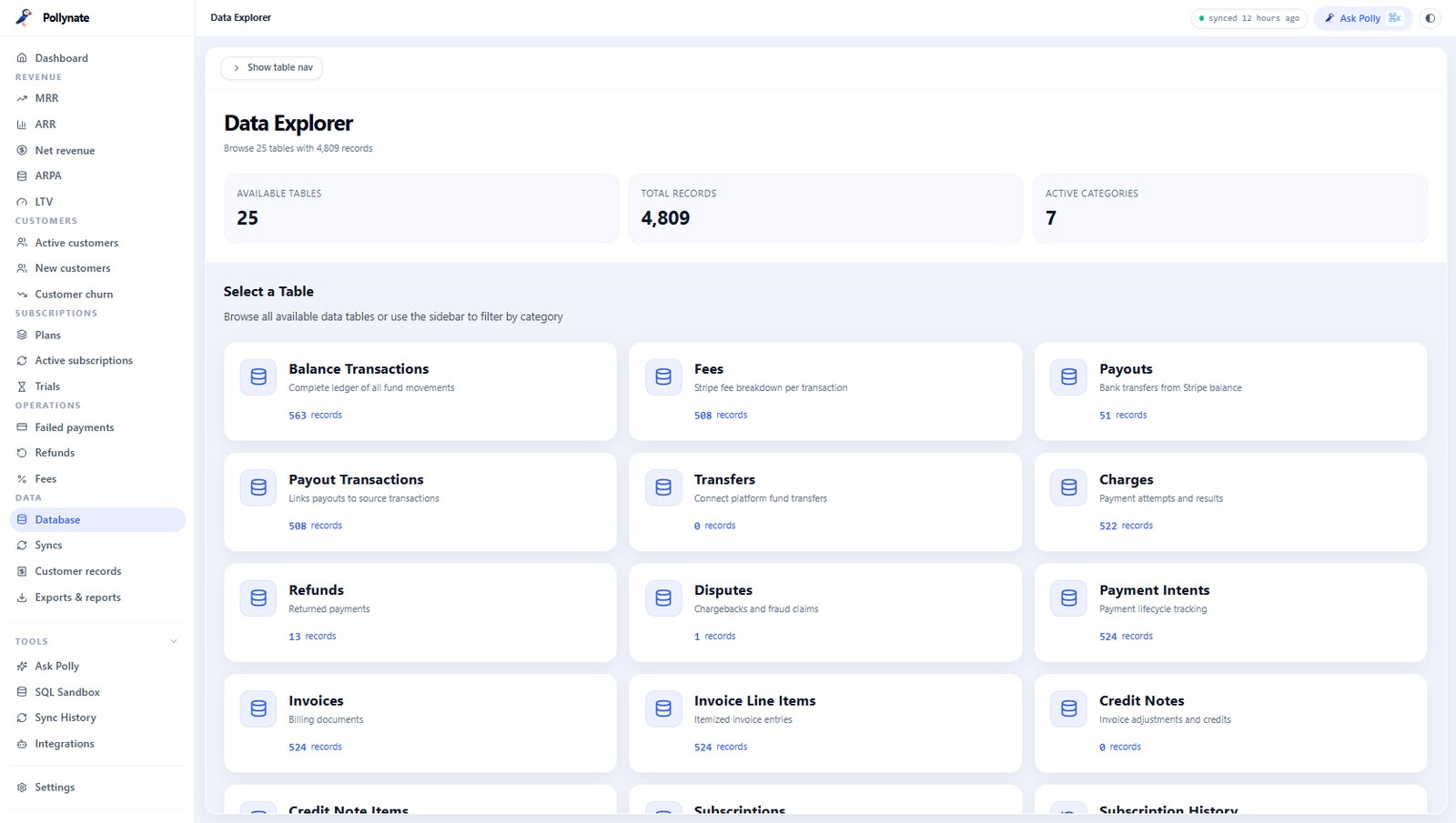
Pollynate's bet was that the raw Stripe tables aren't a support export to be buried — they're a product surface. Ship all 25 tables as a browsable, read-only database, then put an AI ("Polly") in front of it so anyone can ask a question in plain English and get an answer that traces straight back to the records. No SQL, no ticket, no analyst in the loop.
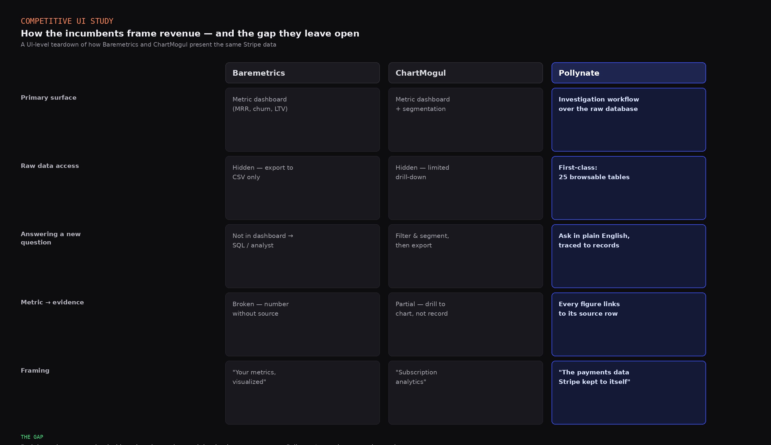
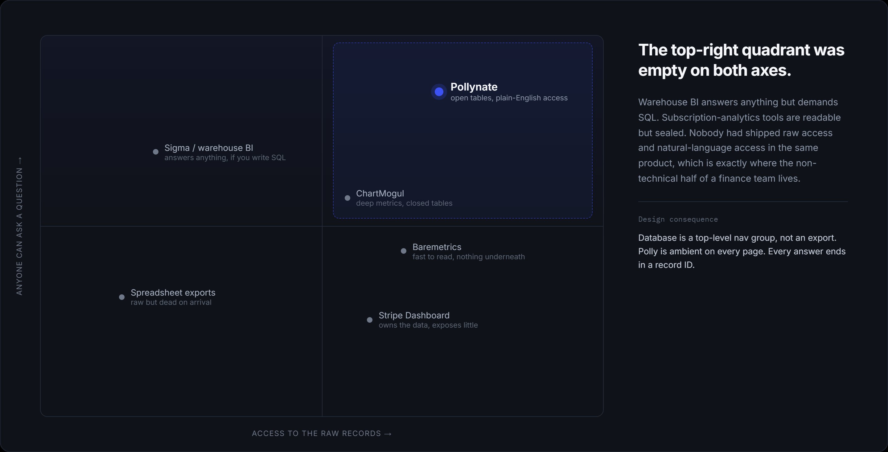
Pollynate's core positioning — raw database as the product, not the export — was set before I joined; it's the founder's bet, not mine to claim. What I could own was the UI research underneath it. So I ran a competitive teardown of how Baremetrics and ChartMogul present the same Stripe data at the interface level: what they lead with, what they bury, and where their own UI choices left a gap a better-designed product could walk through.
This is why market research matters even on a product whose strategy you inherit: it turns a positioning statement into concrete design direction. Seeing both incumbents treat the dashboard as the product and the database as an afterthought told me exactly what the redesign had to invert — and gave me a checklist of UI patterns to beat.
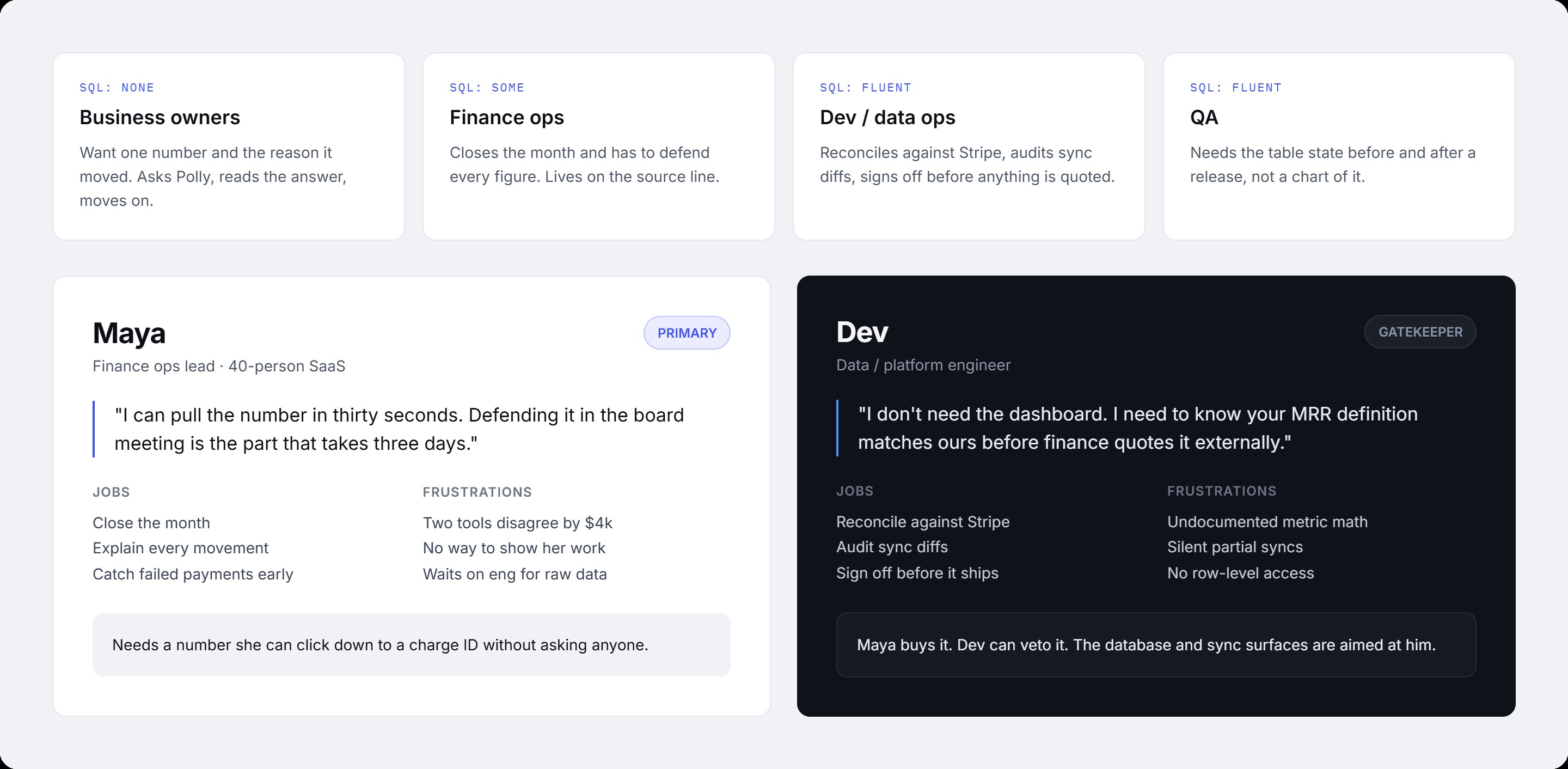
Instead of segmenting by job title, I segmented the audience by SQL fluency — because that's what actually predicts how someone uses the product. Business owners (no SQL) want one number and the reason it moved. Finance ops (some SQL) live on the source line and defend every figure. Engineers and data ops (fluent) reconcile against Stripe and sign off before anything ships. Two personas anchored the work: Maya, who buys it, and Dev, the engineer who can veto it.
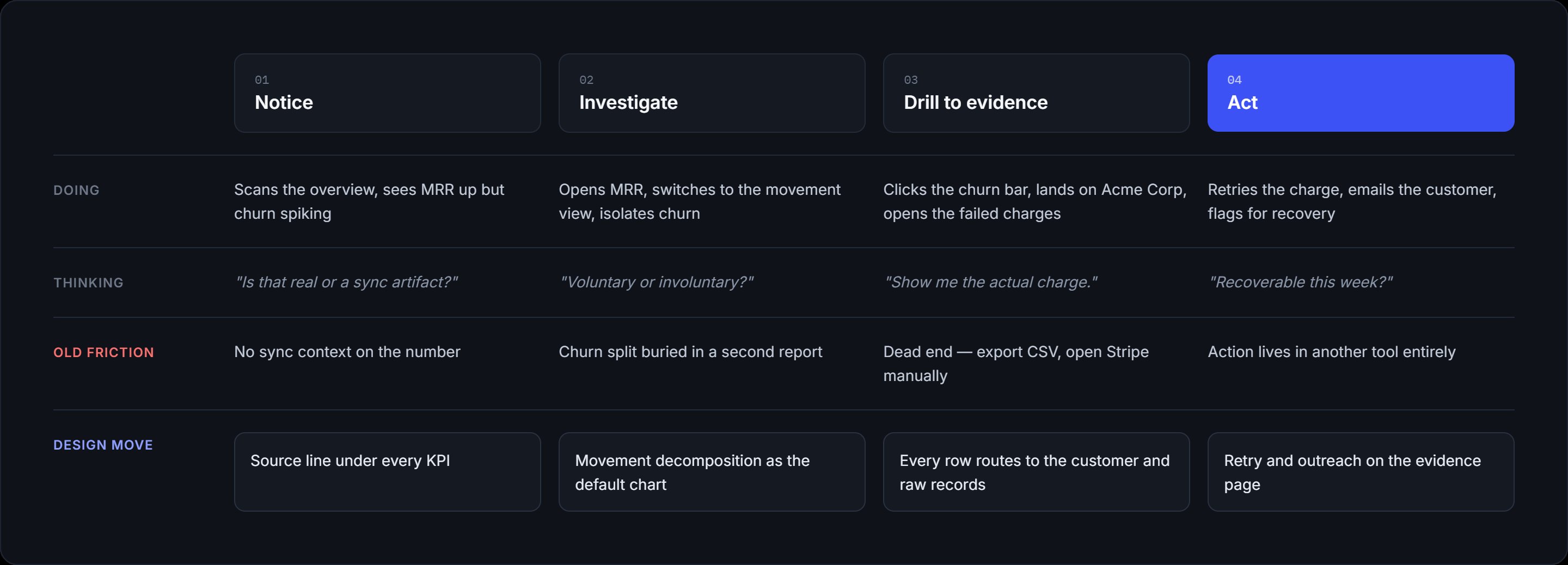
The journey isn't "open dashboard, see number, close." It's a loop: notice something moved, ask why, trace it to the underlying records, confirm the sync behind it, and move on with an answer you can defend. Mapping this loop is what told me the database and Ask Polly couldn't be secondary tabs — they're the destination of nearly every real task.
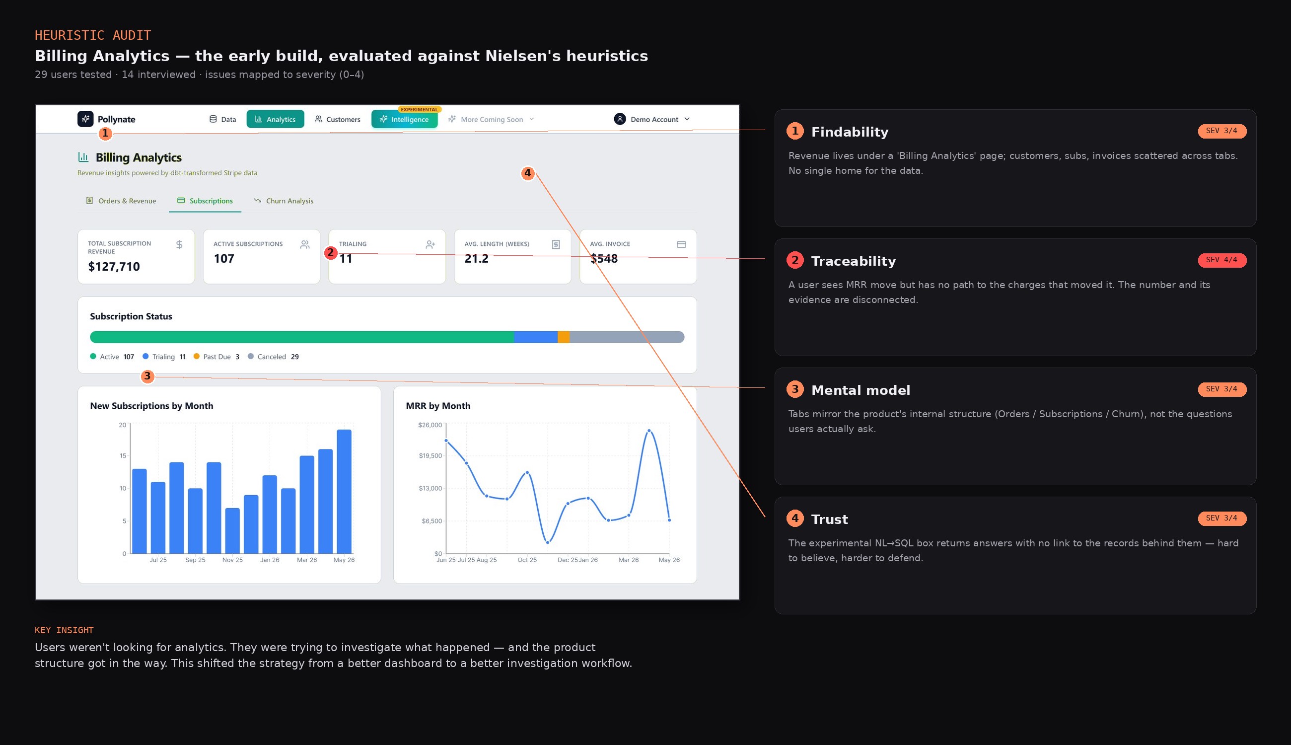
I audited the existing Pollynate flows against usability heuristics and mapped every issue back to the core investigation journey. Four themes surfaced — and the insight underneath them reframed the whole project: users weren't looking for analytics, they were trying to investigate what happened in their business and why.
Users struggled to understand where customer, subscription, and invoice information lived.
Users could see a metric but couldn't connect it to the records producing it.
Navigation reflected product structure, not the questions users were actually asking.
AI answers needed a clearer connection to the supporting financial data.
That insight shifted the strategy from building a better dashboard to designing a better investigation workflow — question → answer → supporting data → source record. Every design decision from here traces back to it.
The four themes also set the priorities: traceability (the only 4/4) became the spine of the redesign, findability and mental-model drove the IA restructure, and trust shaped how Ask Polly surfaces its evidence.
The core of my work: shaping the information architecture and navigation across the customer, invoice, and subscription views — resolving duplicate navigation patterns and the unclear data hierarchy that made the early product hard to reason about. I audited the flows for consistency and feasibility within Stripe's data constraints, flagged the structural gaps, and produced interaction specs to guide the redesign.
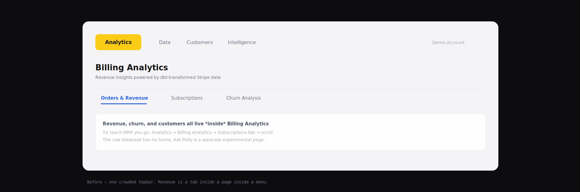
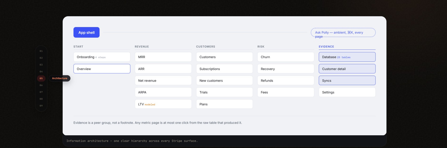
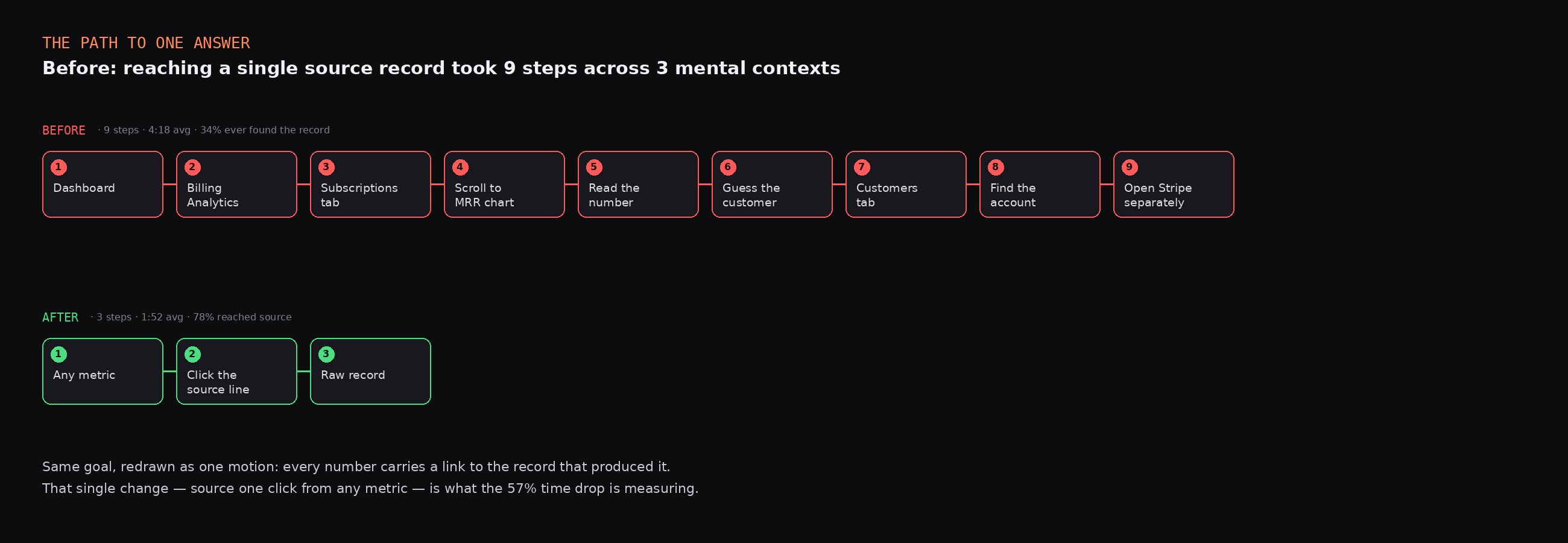
Before — one crowded topbar. To reach MRR you went Analytics → Billing Analytics → Subscriptions tab → scroll. The raw database had no home, and Ask Polly was a separate experimental page. After — a flat hierarchy where Revenue, Customers, and Risk are peers, the Database and Customer detail sit in an Evidence group, and Ask Polly is ambient on every page. Any metric is one click from the raw table behind it.
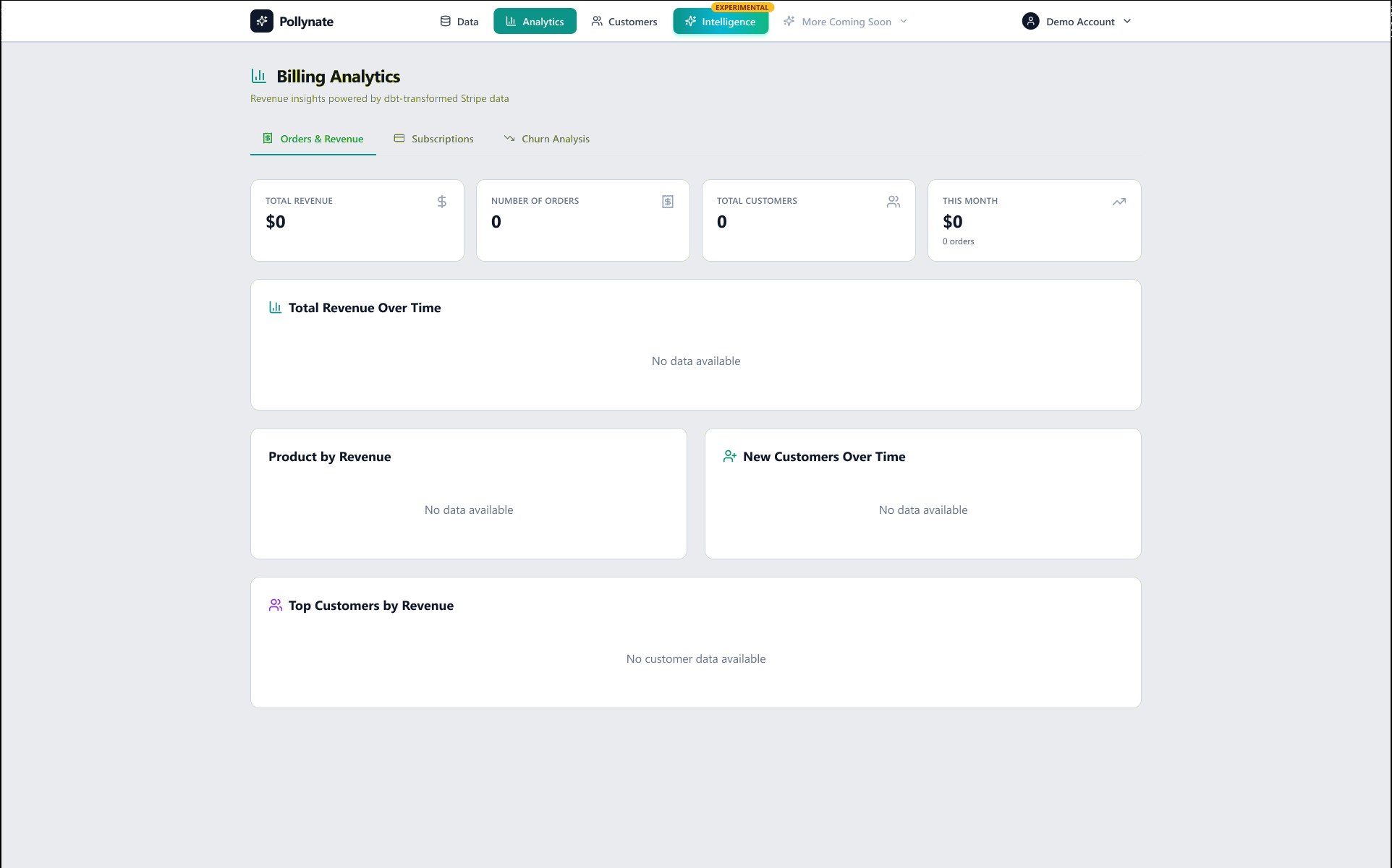
With the four findings driving priorities, the redesign took shape. The early product was a conventional billing-analytics tool: revenue charts on the topbar, churn and customer records a level down, and an "Ask Polly" that was little more than a prompt box wired to an experimental NL→SQL feature. Here's the same surfaces, before and after — toggle each to see the shift.
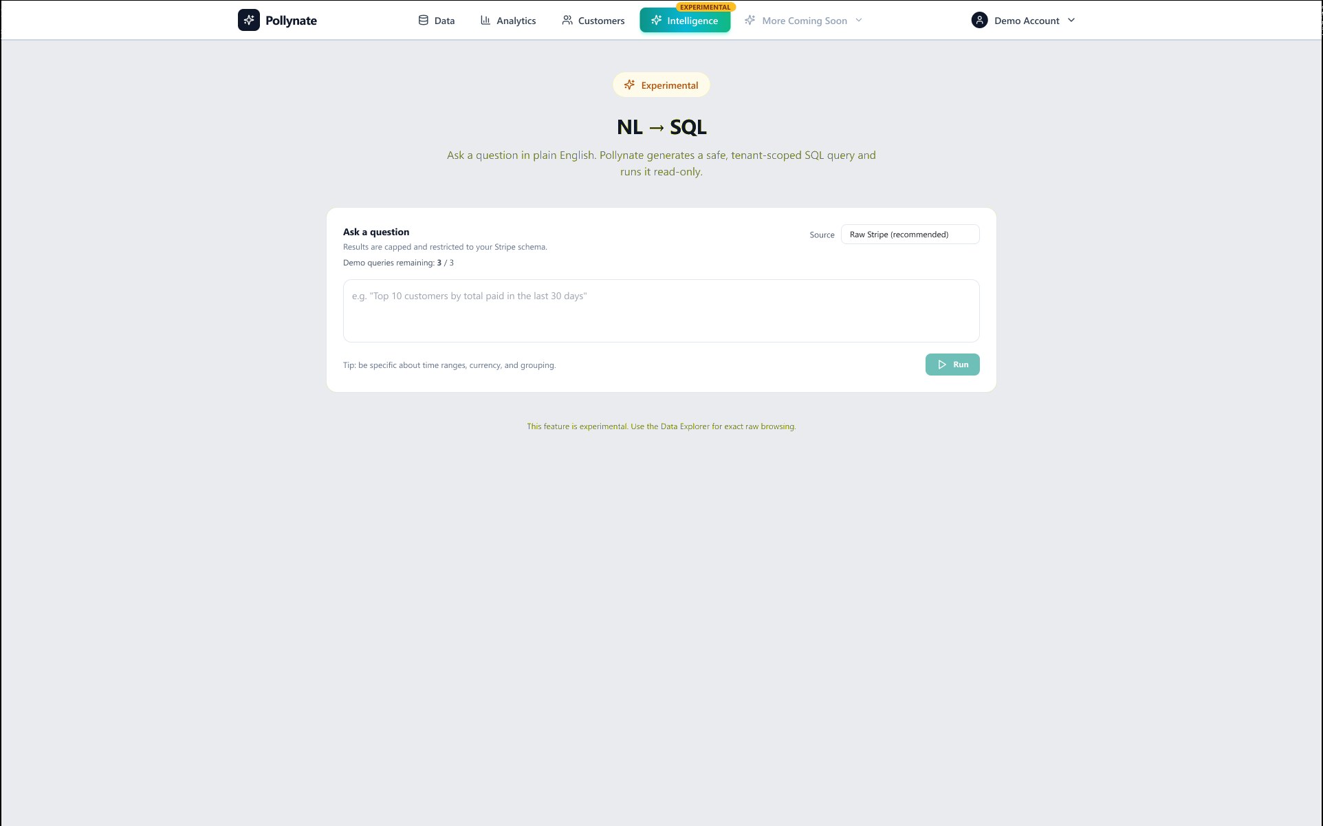
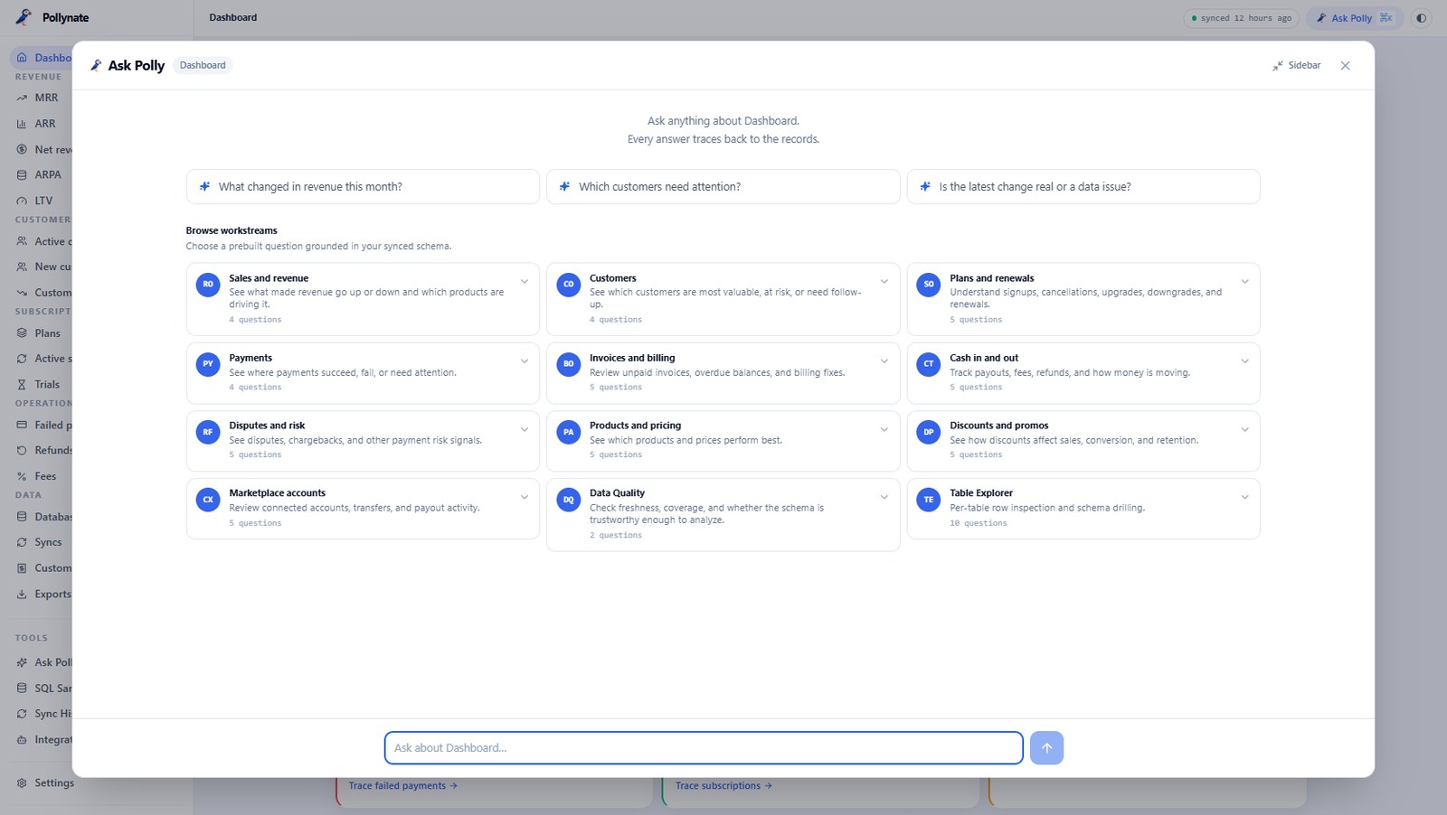
Before — one experimental page: a prompt box, a 3-query demo cap, the AI as a bolt-on. After — Polly is ambient, summoned from anywhere, with prebuilt workstreams grounded in your schema and every answer tracing to the records.
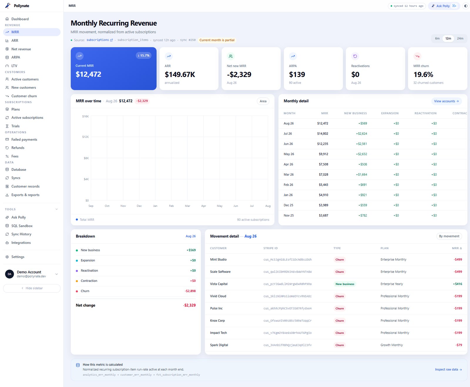
Before — chart-first billing analytics; the database was nowhere and empty states dominated the first run. After — MRR movement normalised from active subscriptions, every figure linked down to the customer and the sync behind it.
The shift wasn't cosmetic. Heuristic evaluation of the early build kept surfacing the same problems: the value proposition was invisible on first load, the AI felt untrustworthy because answers didn't trace to anything, and the information architecture forced users through chart-first views that finance ops and engineers didn't actually want. The research told me the database had to move from a hidden feature to the headline.
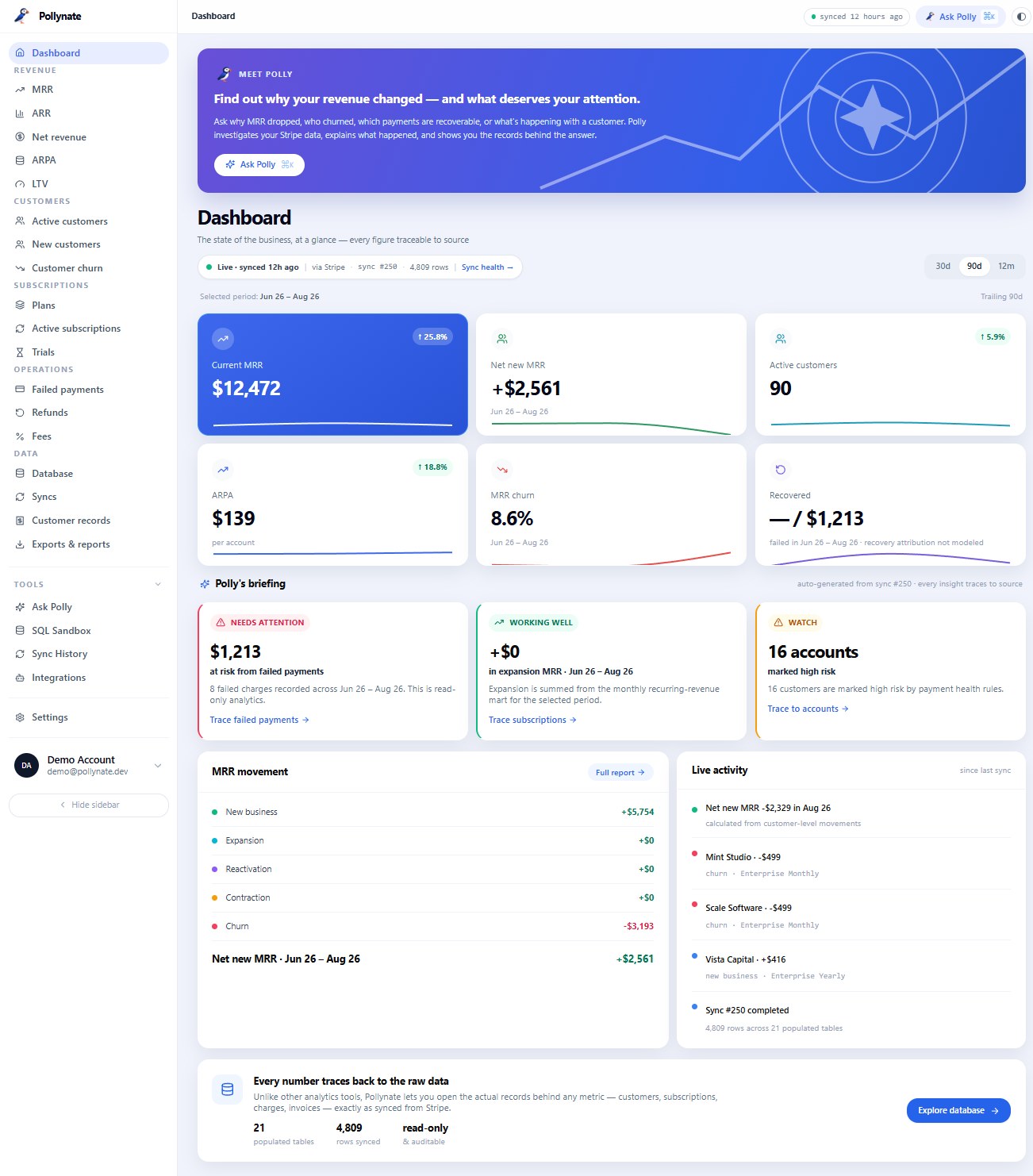
So I restructured the whole surface around traceability — sync state always visible, every figure linked to source, the database promoted to a browsable first-class page, and Polly rebuilt from a demo-capped experiment into an ambient layer over real records. That reframing — from dashboard to investigation tool — is what gave the product a clear, defensible point of view.
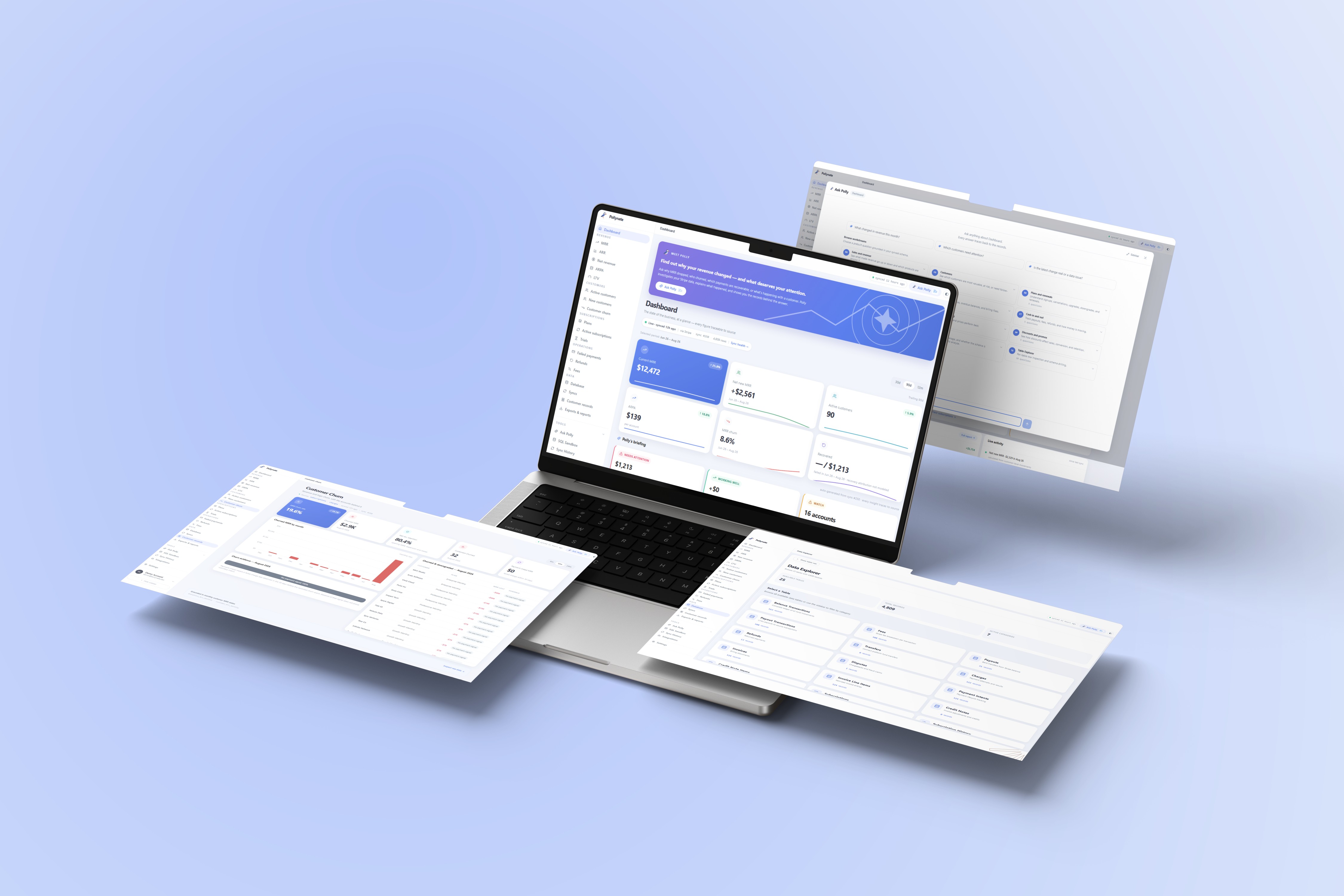
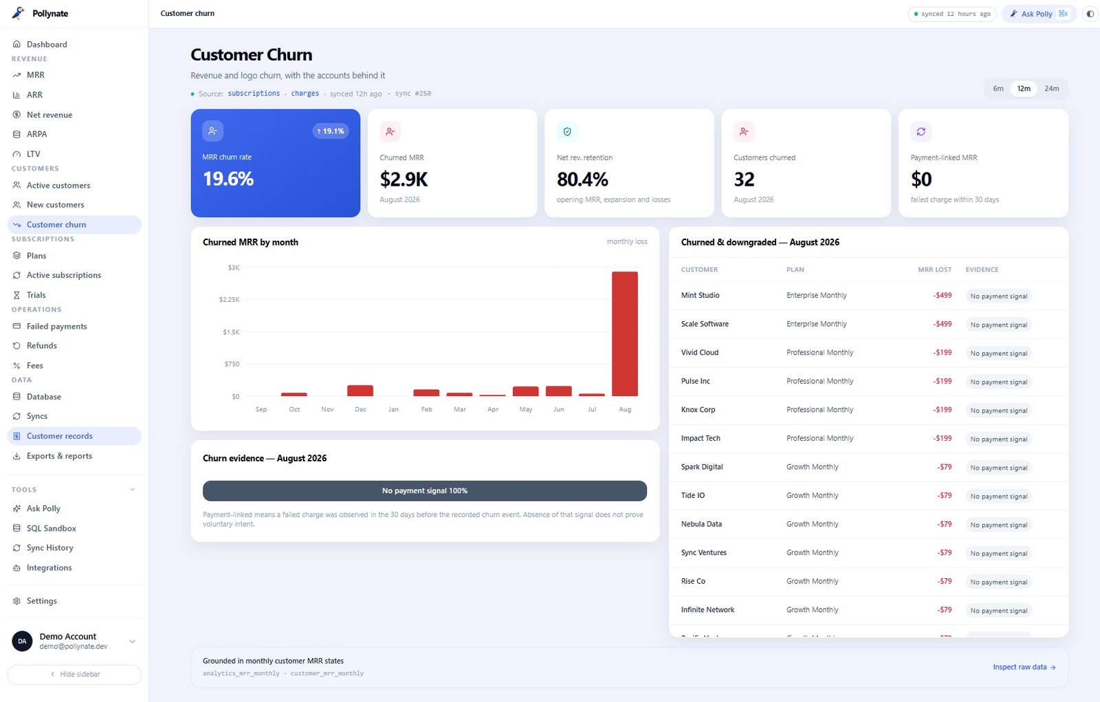
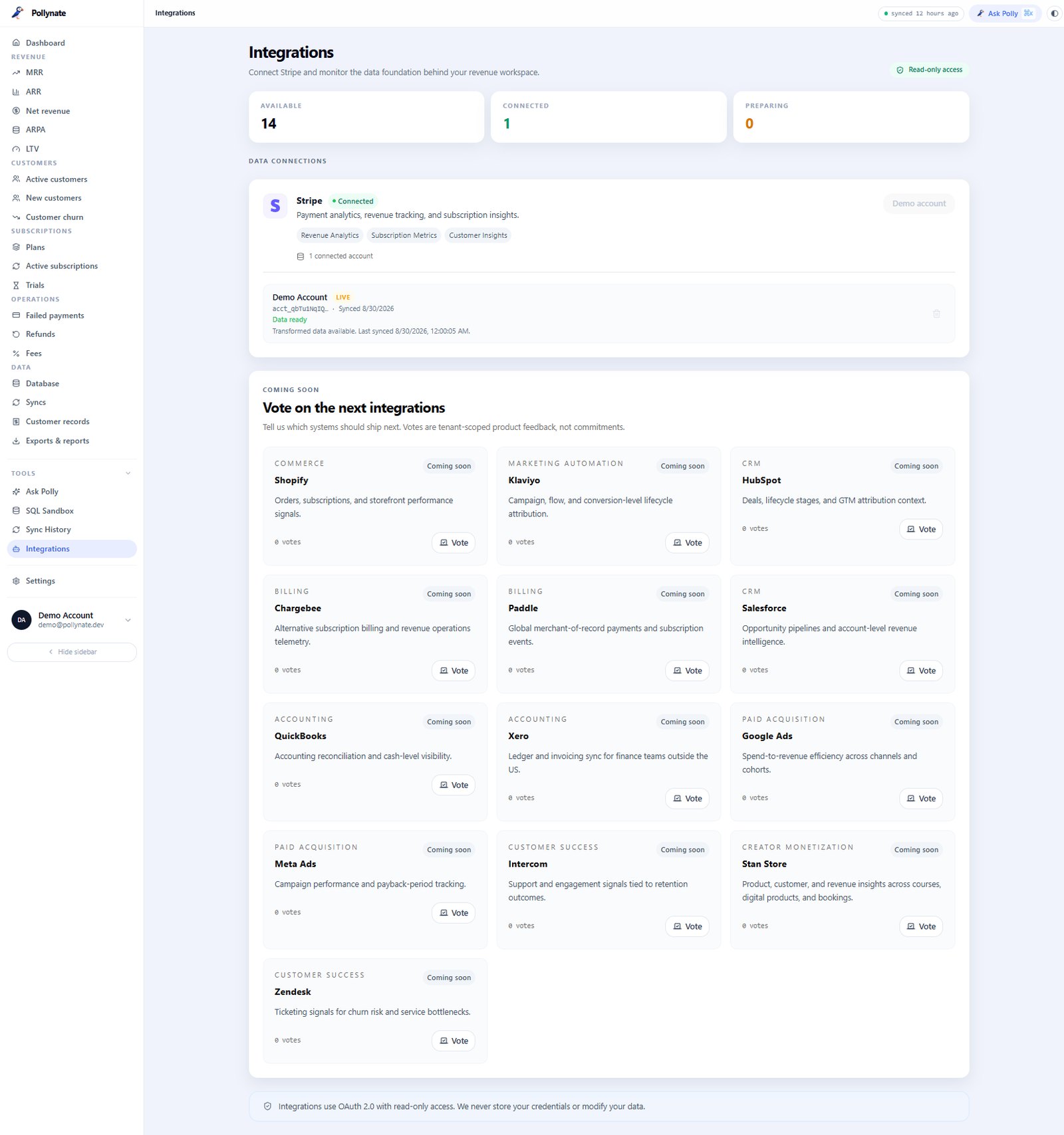
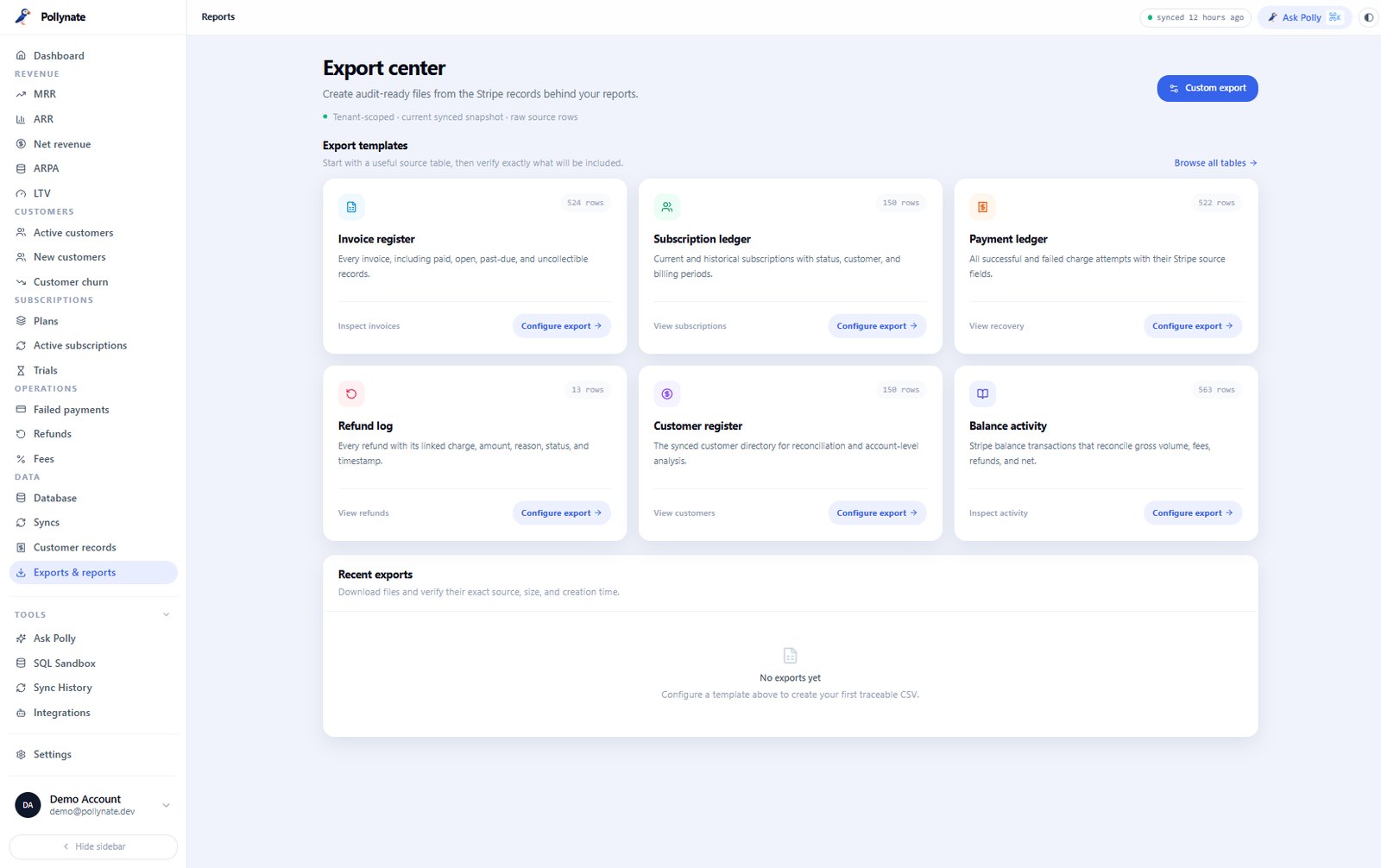
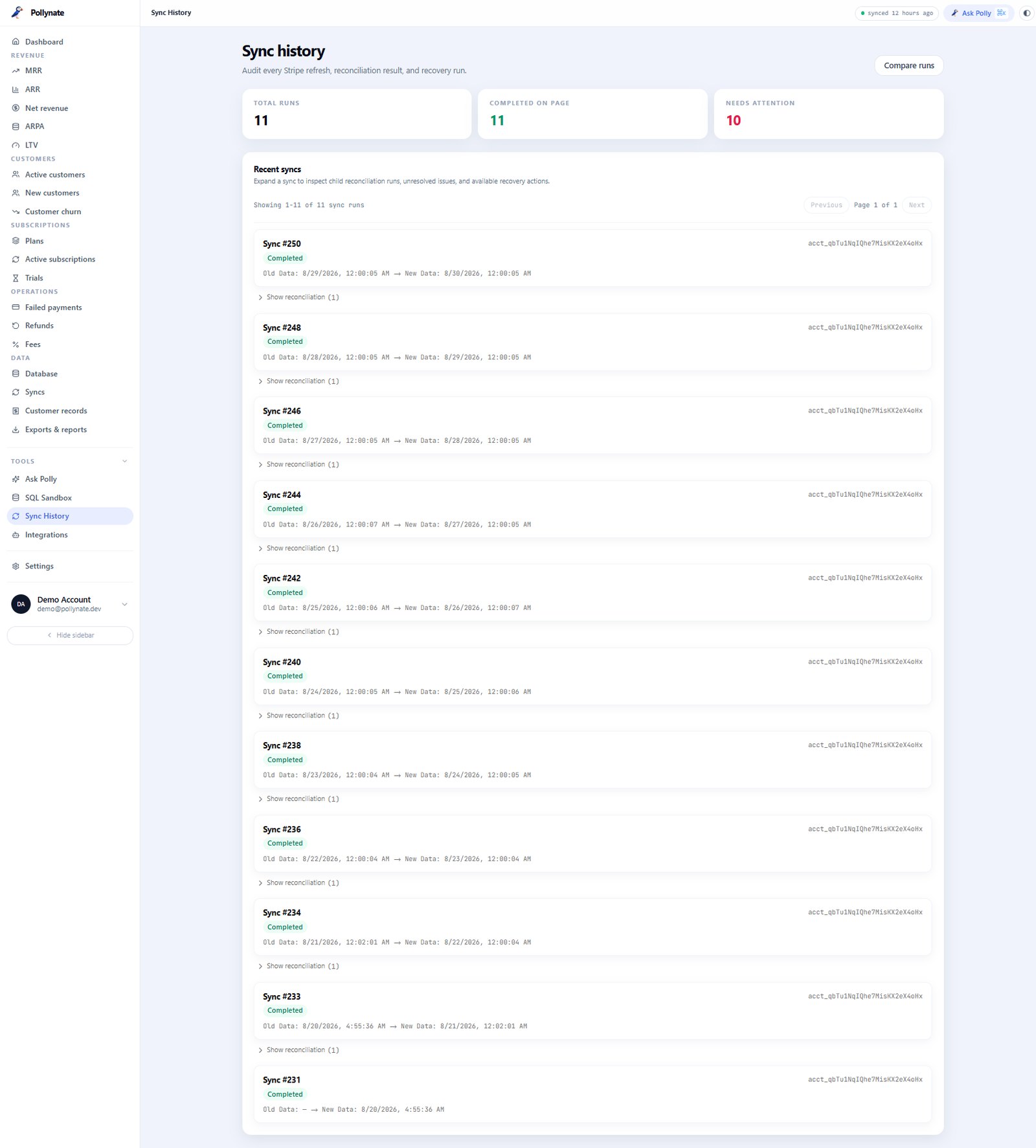
A walk through the screens that carry the product: the dashboard, the raw database, MRR, churn, Ask Polly, and the integrations foundation.
The old onboarding was one screen: connect Stripe, you're in. That dropped users into a dense dashboard with no sense of what made Pollynate different. The redesign turns the first five minutes into a guided rehearsal of the exact investigation loop the whole product runs on — connect, sync, trace, ask — so a user's first real action is the behaviour the product is built to reward.
Four steps, each closing a loop so the user always knows they're making progress: name the workspace, connect Stripe read-only (the pane answers "we never touch your money" before anyone asks), watch the first sync snapshot real tables live, then meet Polly and ask the first plain-English question — with the answer tracing straight back to the records that produced it. By the end, they've already done the investigation once, on their own data.
That's the point of the reframe. The dashboard is powerful but cold on a first visit; a four-step run that ends in a traced answer makes it powerful and understood. Onboarding stopped being a setup task and became the first lesson in how to read the whole product — and the moment Ask Polly earns trust instead of arriving as a mystery.
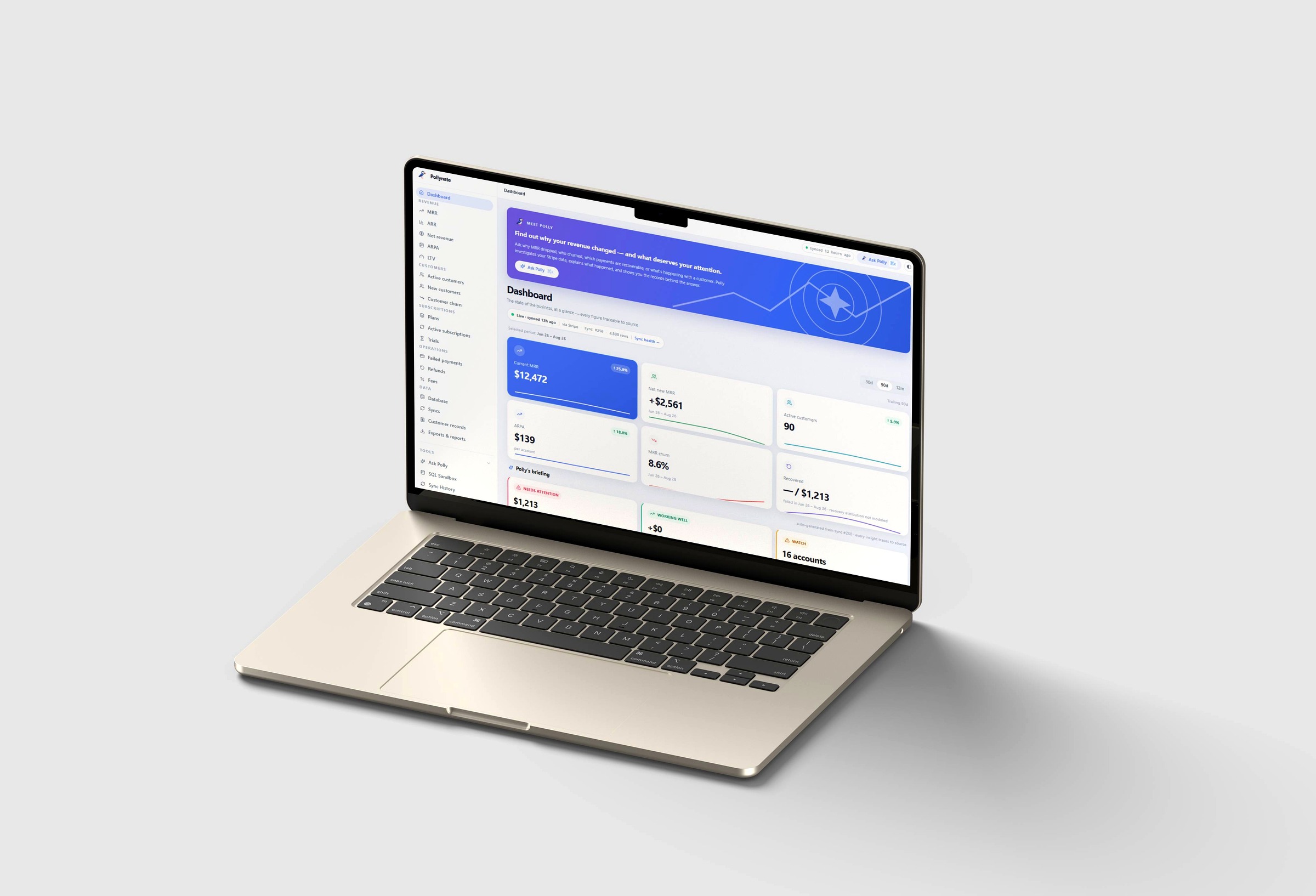
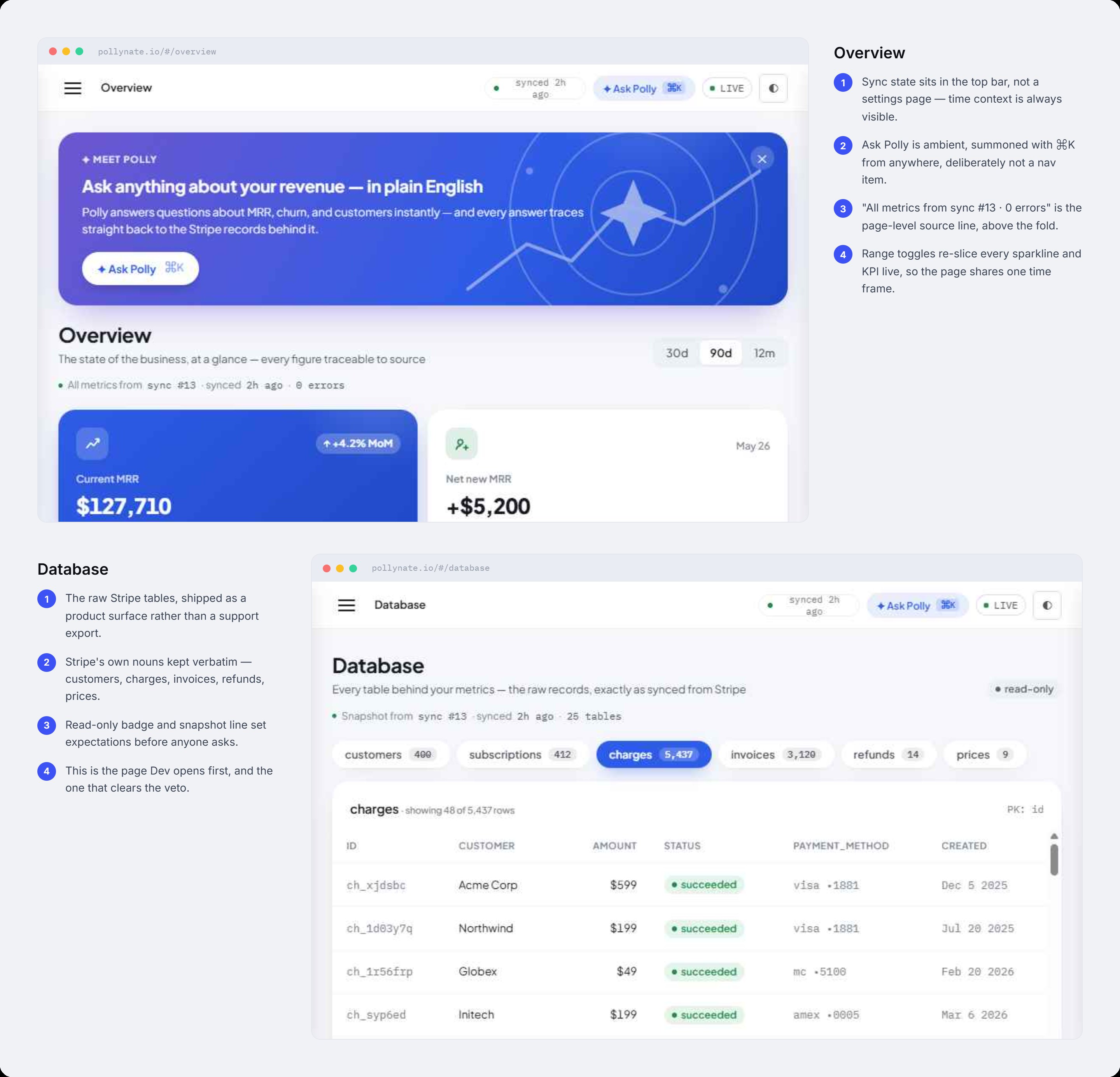
The Overview keeps sync state in the top bar so time context is always visible, and puts "all metrics from this sync, zero errors" as the page-level source line, above the fold. The Database ships Stripe's raw tables as a real product surface — customers, charges, invoices, refunds, prices — with Stripe's own nouns kept verbatim. This is the page Dev opens first, and the one that clears his veto.
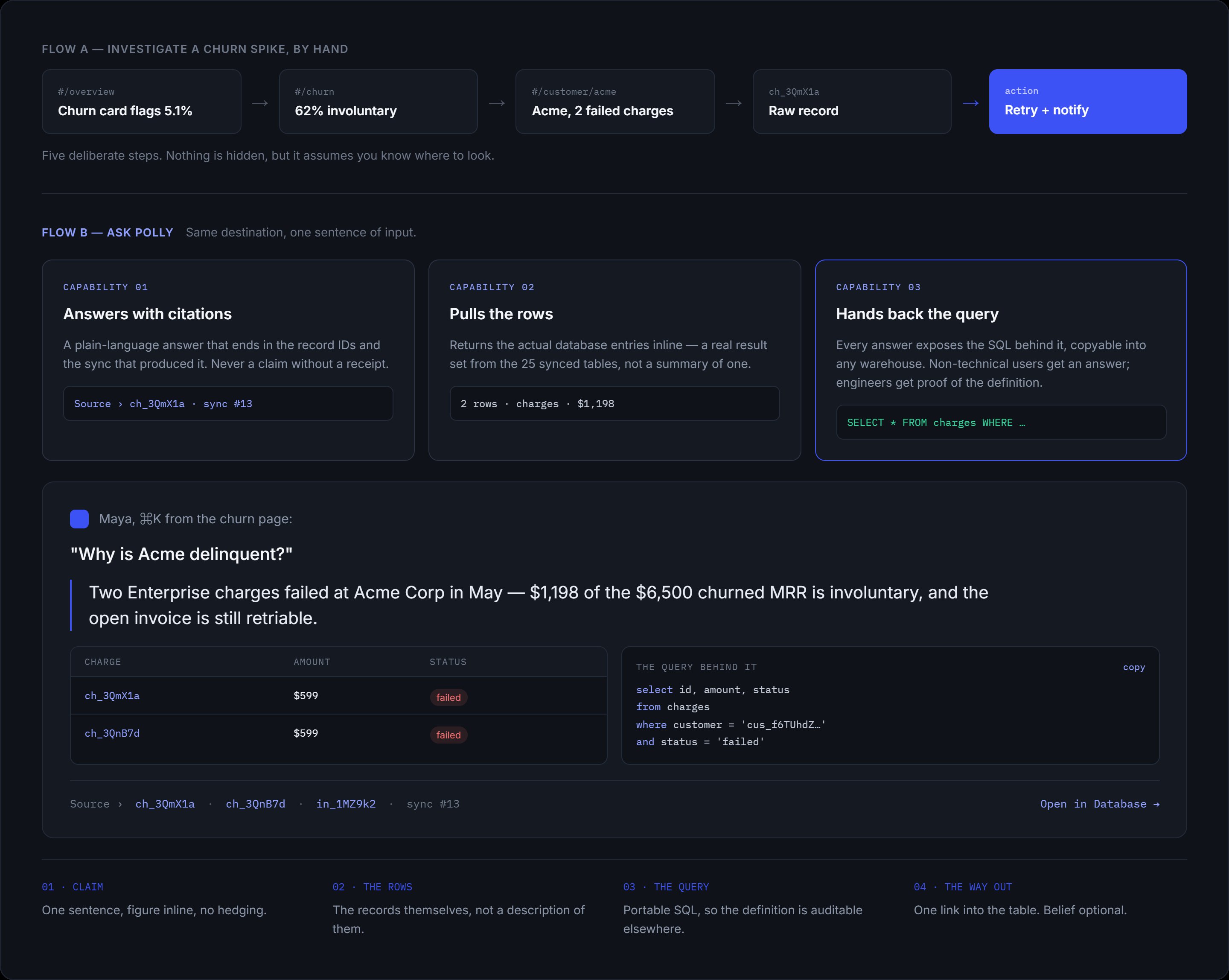
Ask Polly is deliberately ambient — summoned with ⌘K from anywhere, not buried as a nav item. It answers questions about MRR, churn, and customers instantly, and every answer traces straight back to the Stripe records behind it. The point isn't a chatbot bolted on; it's a query layer that treats the database as the source of truth.
The version live at pollynate.ai has evolved since my founding work — the founder has shipped and iterated further. What's shown here is the design foundation I built: the IA, the flows, and the system the live product grew from.
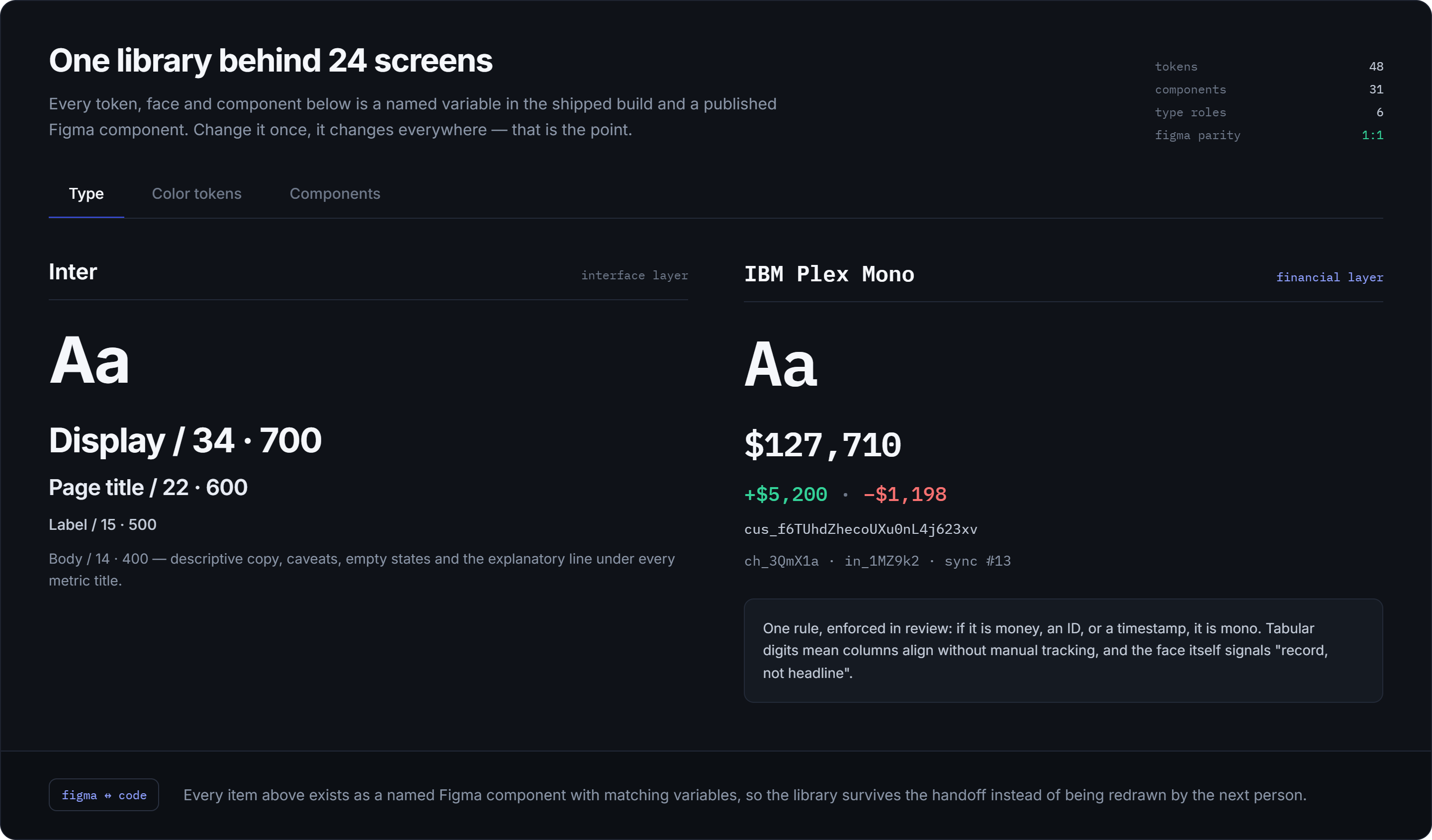
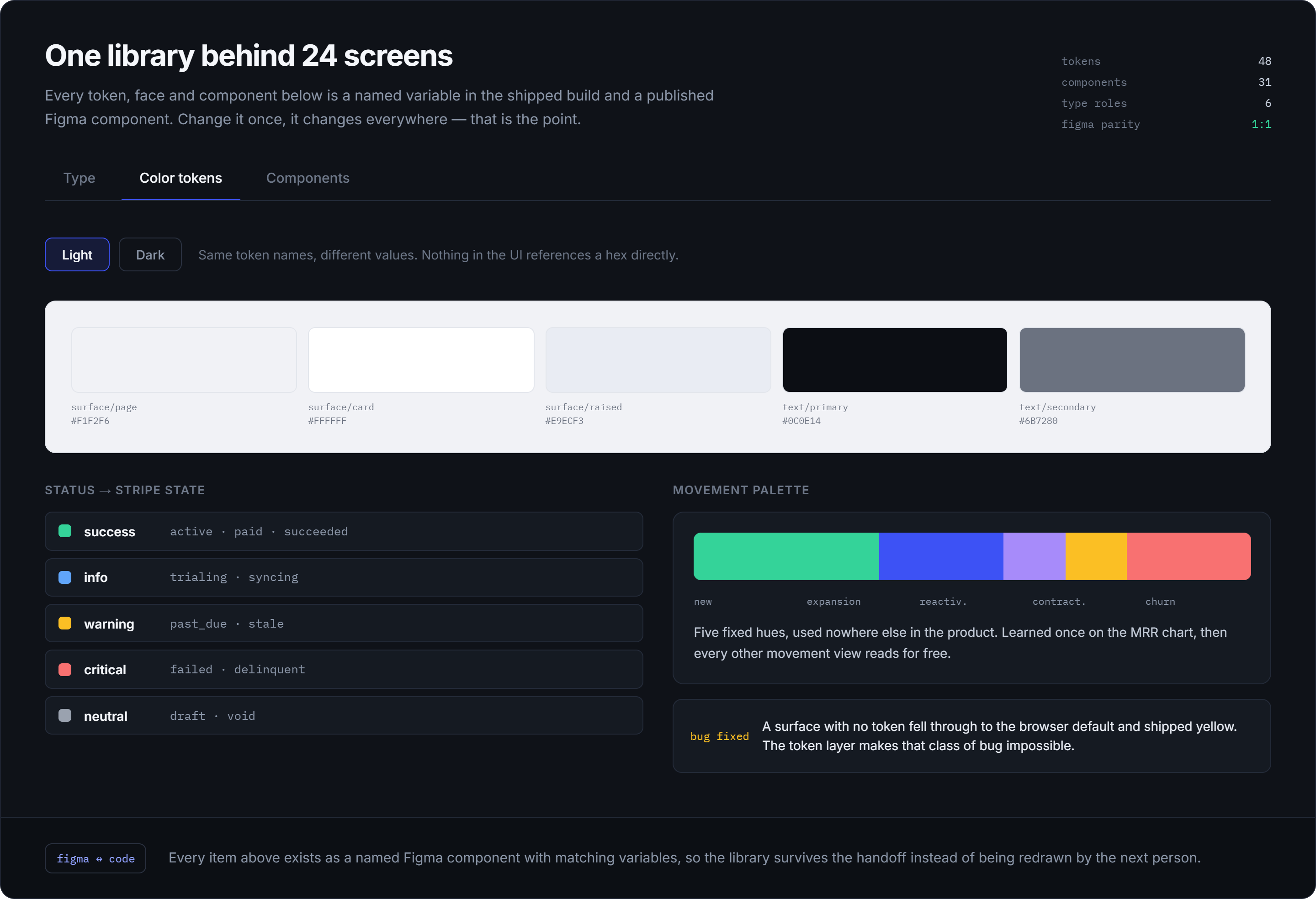
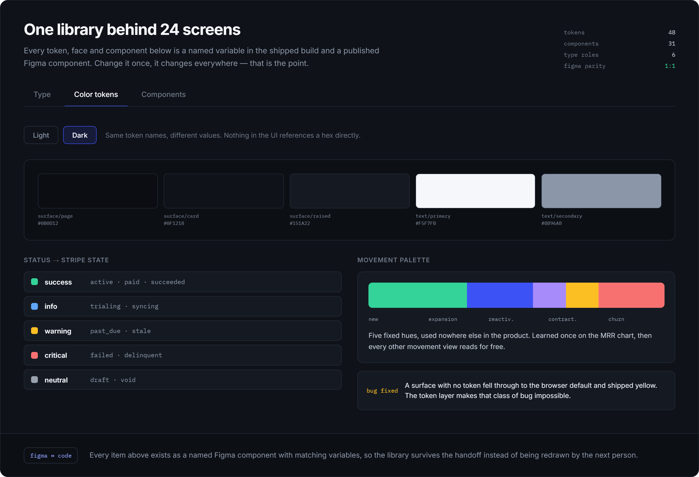
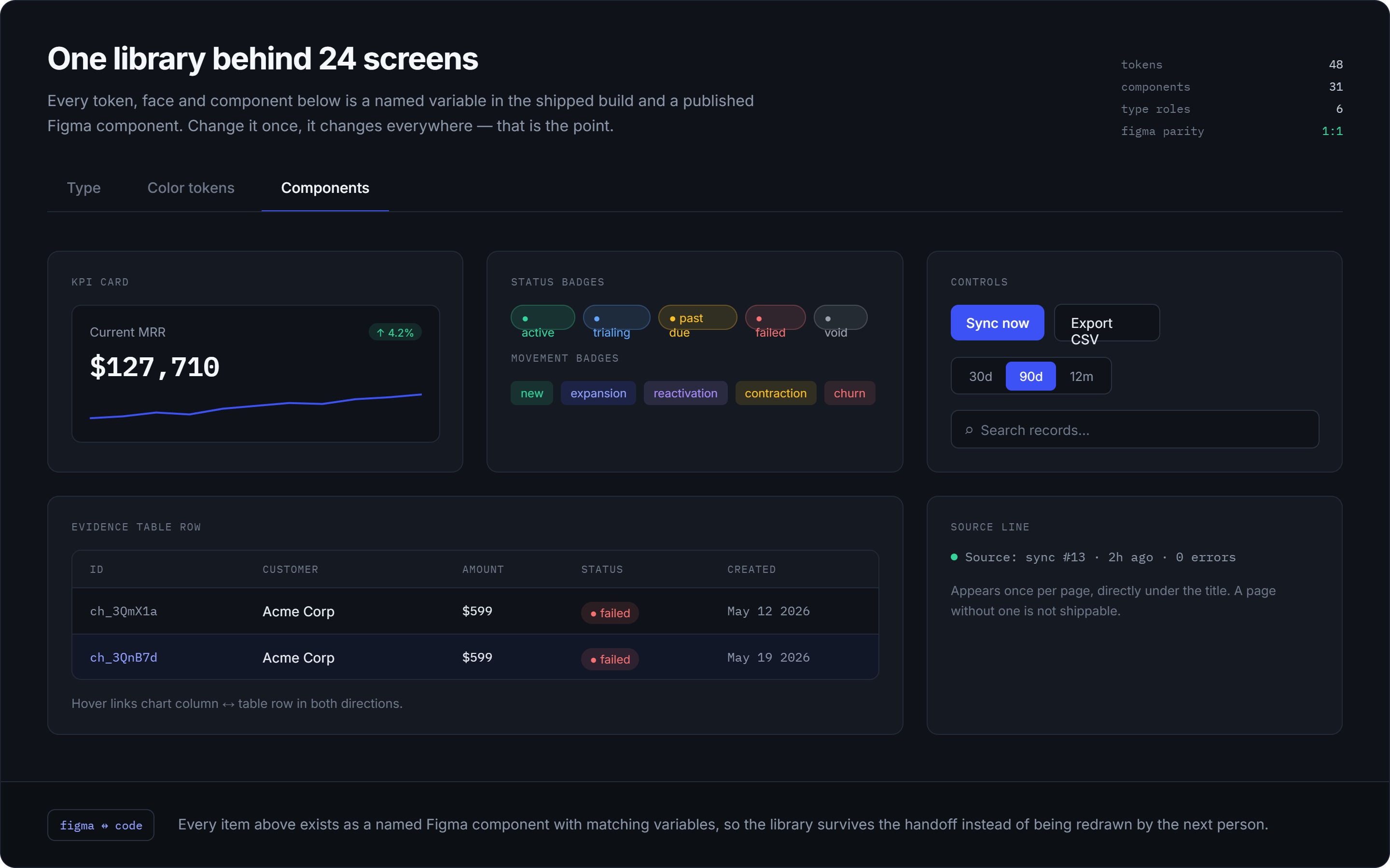
Type scale, colour tokens in both themes, and a component library — the connective tissue that keeps 24 screens consistent.


I ran a baseline test of three representative investigation tasks — find why MRR changed, identify the customer responsible, locate the underlying Stripe record — across five participants, then re-tested the same tasks against the redesign.
| Measure | Before | After |
|---|---|---|
| Task completion | 52% | 89% |
| Investigation time | 4:18 | 1:52 |
| Navigation actions | 9.2 | 4.3 |
| Source discovery | 34% | 78% |
| Confidence | 2.6/5 | 4.1/5 |
The redesign cut investigation time by roughly 57% — but the real result was that users could move from a high-level metric to the underlying evidence without needing to understand the product's internal data structure.
Testing the same three tasks against both the old build and the redesign is what turned "this feels better" into evidence. The lift was consistent across every measure — completion, time, source discovery, and confidence — giving the redesign a defensible before/after rather than an assertion.
The natural next step is instrumenting the shipped product to confirm the same lift at scale — but as a validation of the direction, the signal was unambiguous: the restructure worked.
The biggest opportunity on Pollynate was never adding more analytics. It was making the relationship between insight, investigation, and evidence understandable — so that every important number had a path back to the data that explains it. Get that right and the product reads as an investigation tool; get it wrong and it's just another dashboard.
That's the reframing I'm proudest of here: not a prettier chart, but a shift in what the product is. Watching it ship and evolve into a live product at pollynate.ai — where finance and ops users can trace any figure to source without an analyst in the loop — is the part that makes it real.